Graphic & Type Designer
Belo Horizonte, Brazil
Belo Horizonte, Brazil
info@pedrodealbergaria.com
linked.in/pedrodealbergaria ︎︎︎
linked.in/pedrodealbergaria ︎︎︎


Exhibition
In Plantin's footsteps ︎︎︎, Aug-Sep 2022
Museum Plantin-Moretus, Antwerp, Belgium
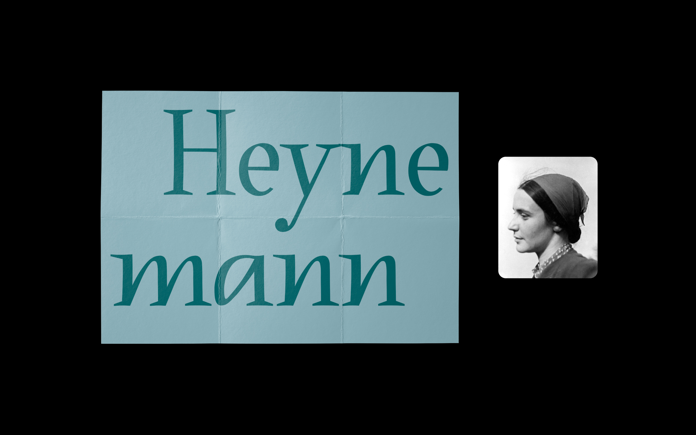
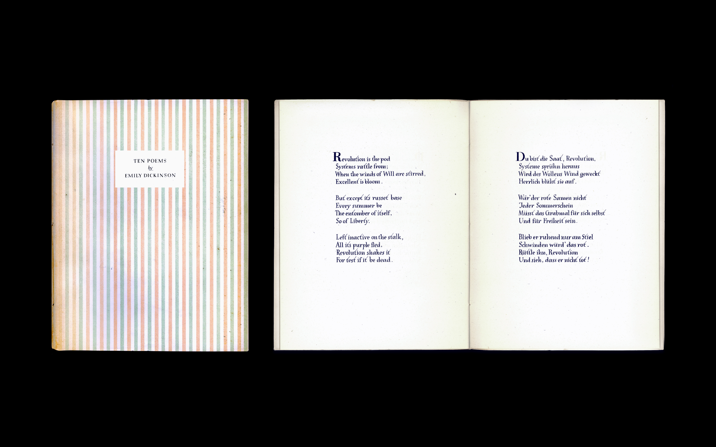
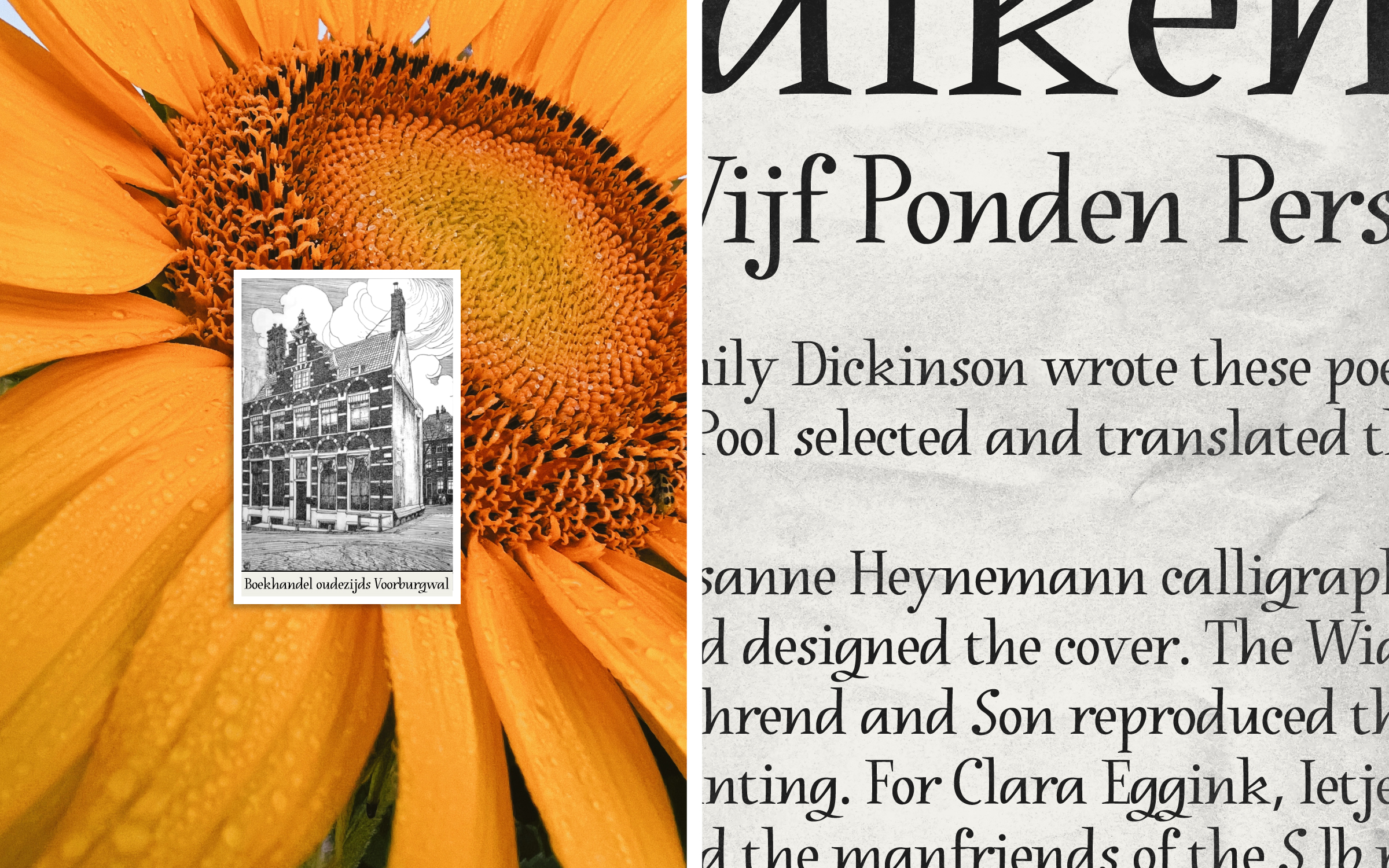
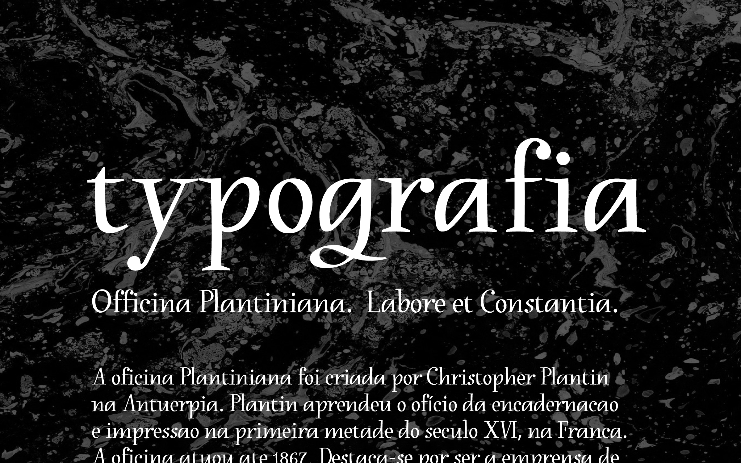
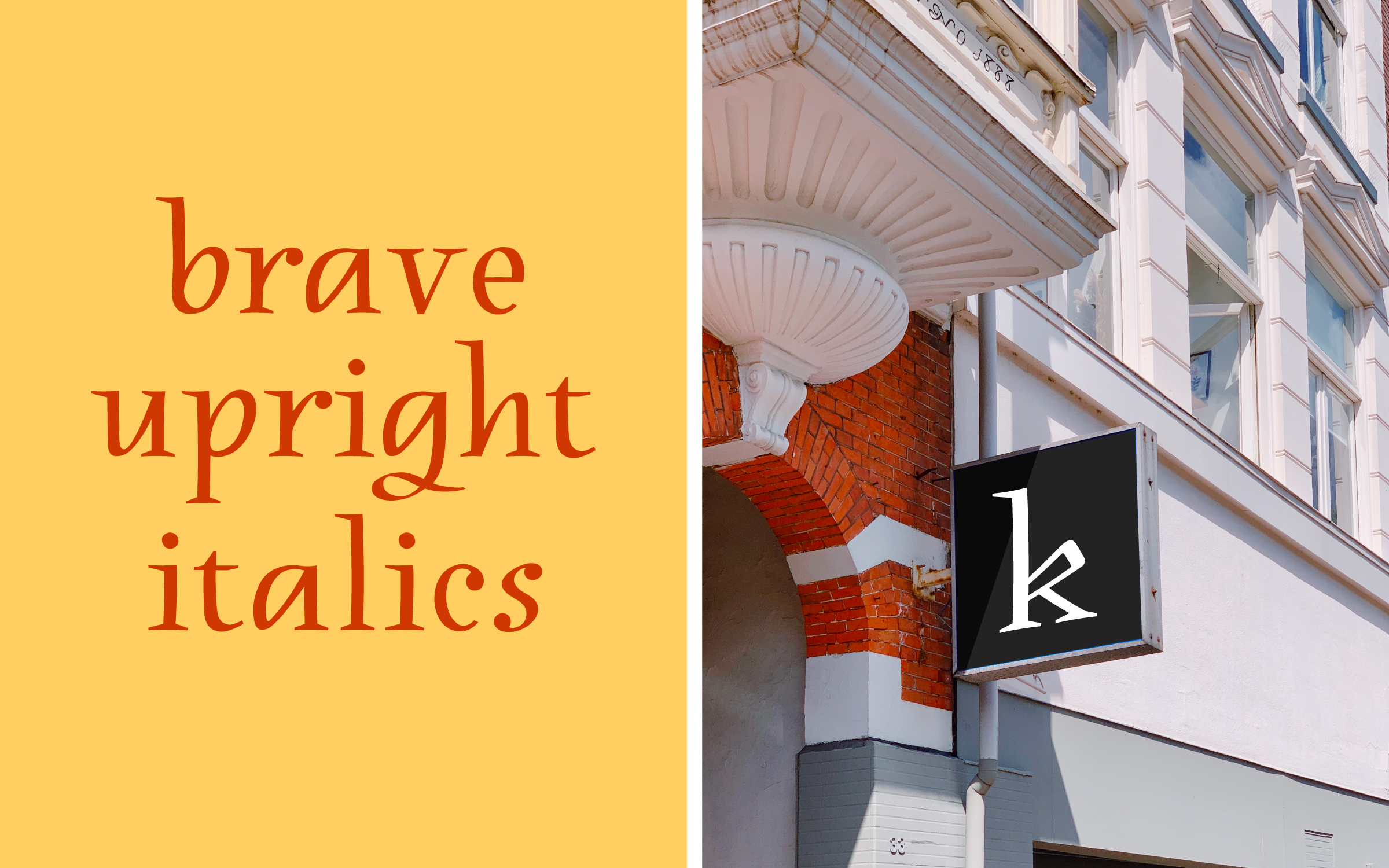
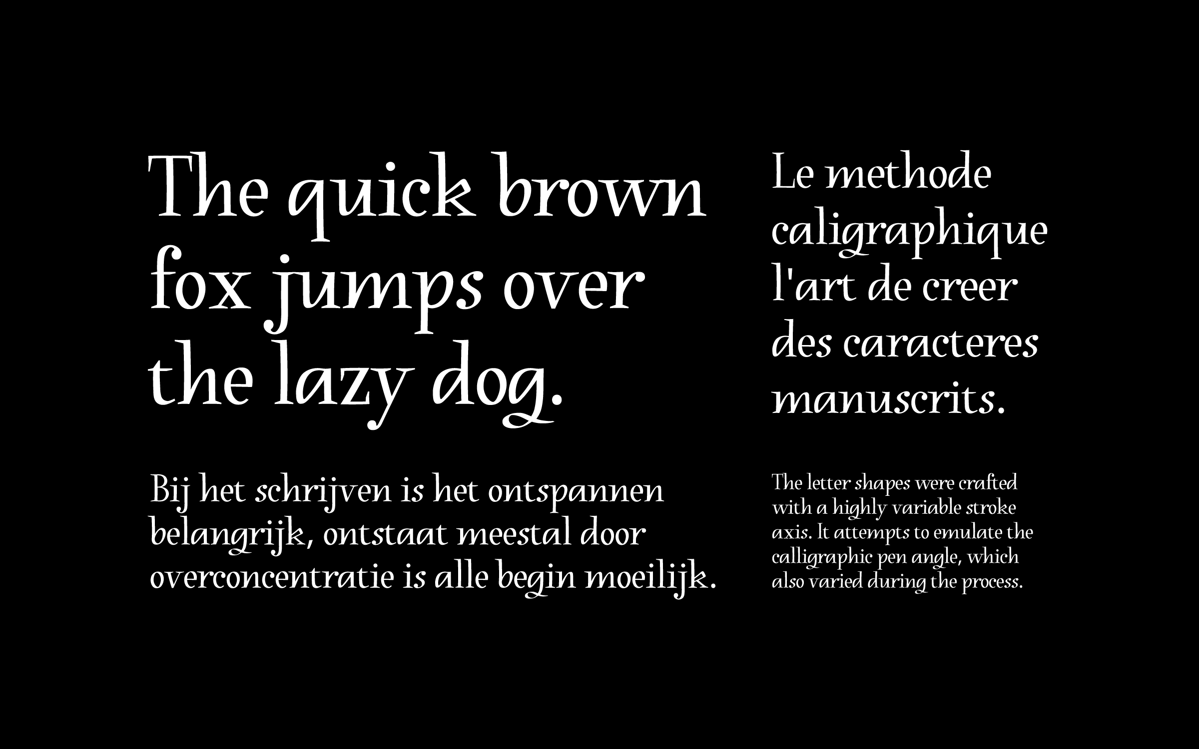
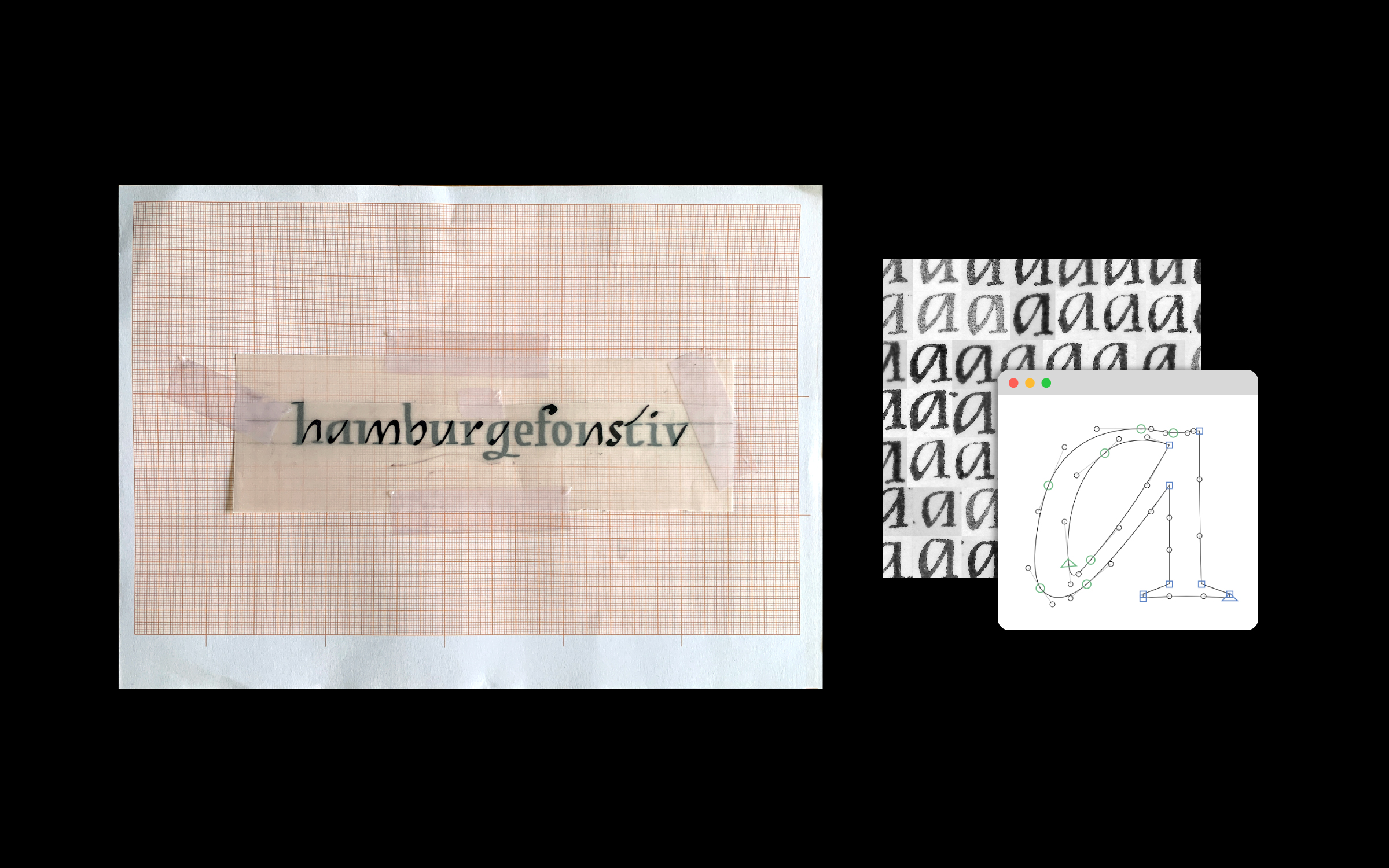
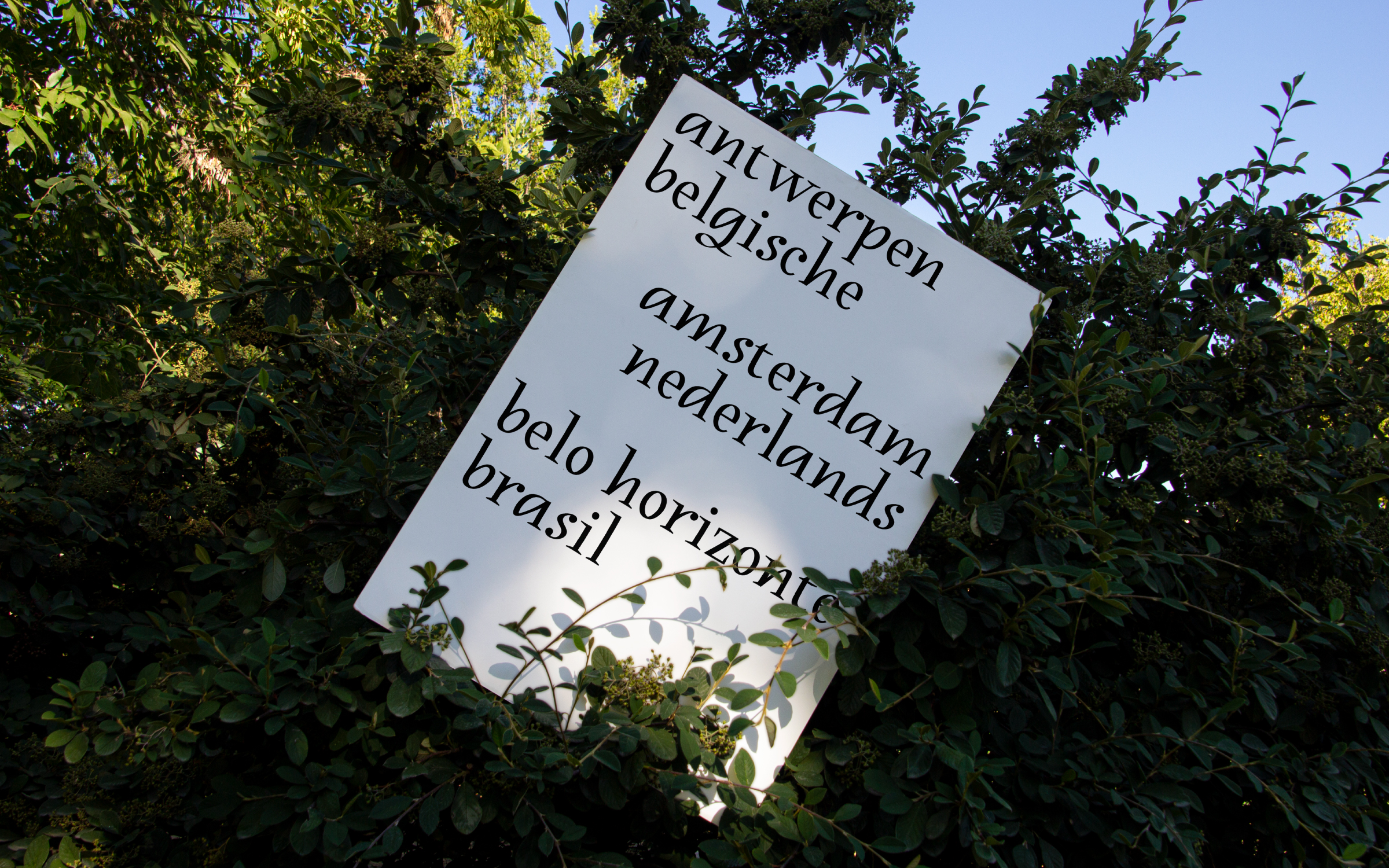
Heynemann is a typographic revival of Susanne Heynemann's (1913-2019) calligraphy for the publication "Ten Poems by Emily Dickinson". Published in 1944, the booklet was illegally printed by the Vijf Ponden Pers in nazi occupied Amsterdam. What stands out are the unique upright italics created to typeset the poems. The digital interpretation was fully standardized and crafted with a variable stroke axis emulating the broad nib angle, which varied significantly during Heynemann's handwriting process. By reproducing some of the charming anatomical features of the original, the contemporary version preserves a fresh calligraphic feel and pays homage to Susanne Heynemann's natural talent.
The result of a year-long research project, this typeface was conceived in the Expert class Type design 2021–22 at the Plantin Institute of Typography, under the supervision of Frank E. Blokland. The institute is hosted inside the Museum Plantin-Moretus, the foremost printing-publishing house of the 16th century, and a UNESCO World Heritage site.


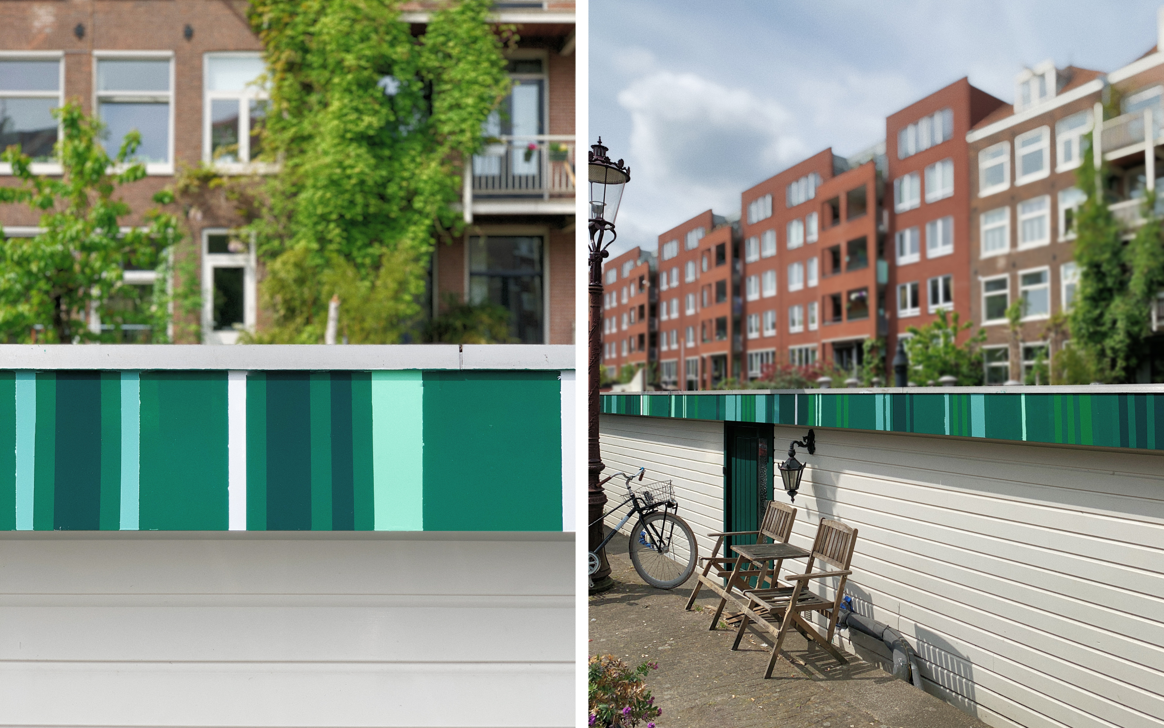
Graphic intervention for a floating house facade in Amsterdam's Jordaan district. A green-spectrum striped panel that echoes the surrounding nature inspiring a funky urban vibe. Collectively painted on a sunny spring day.
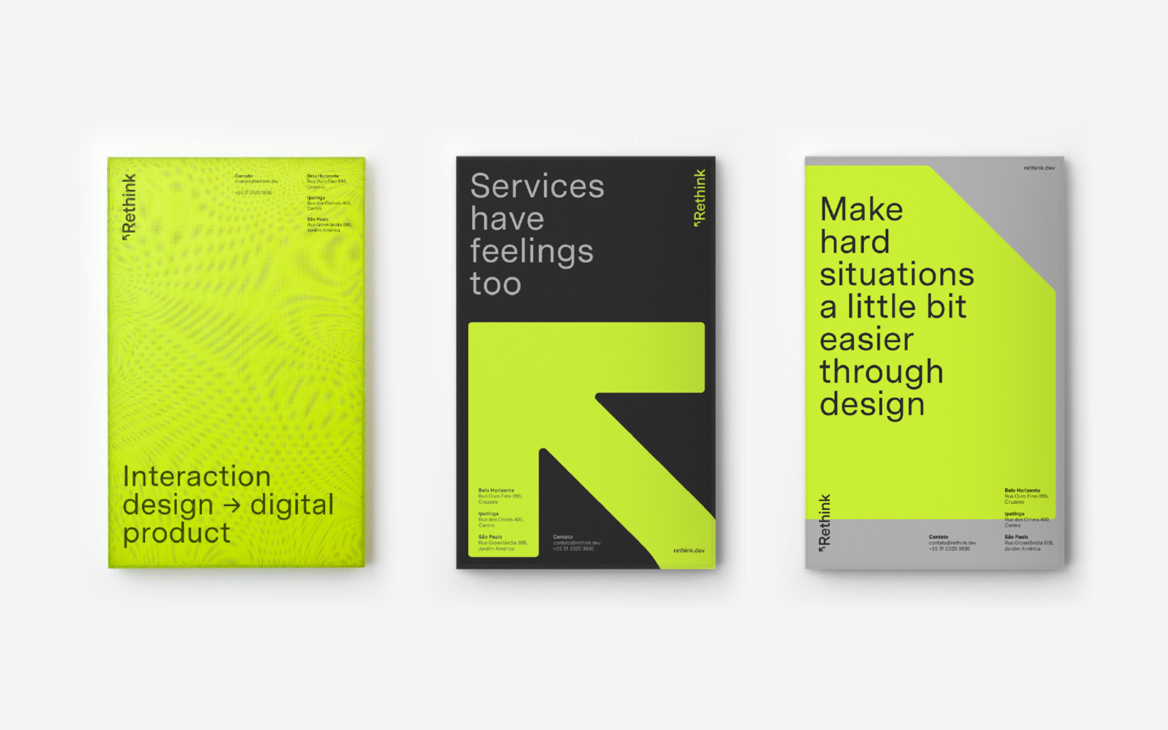
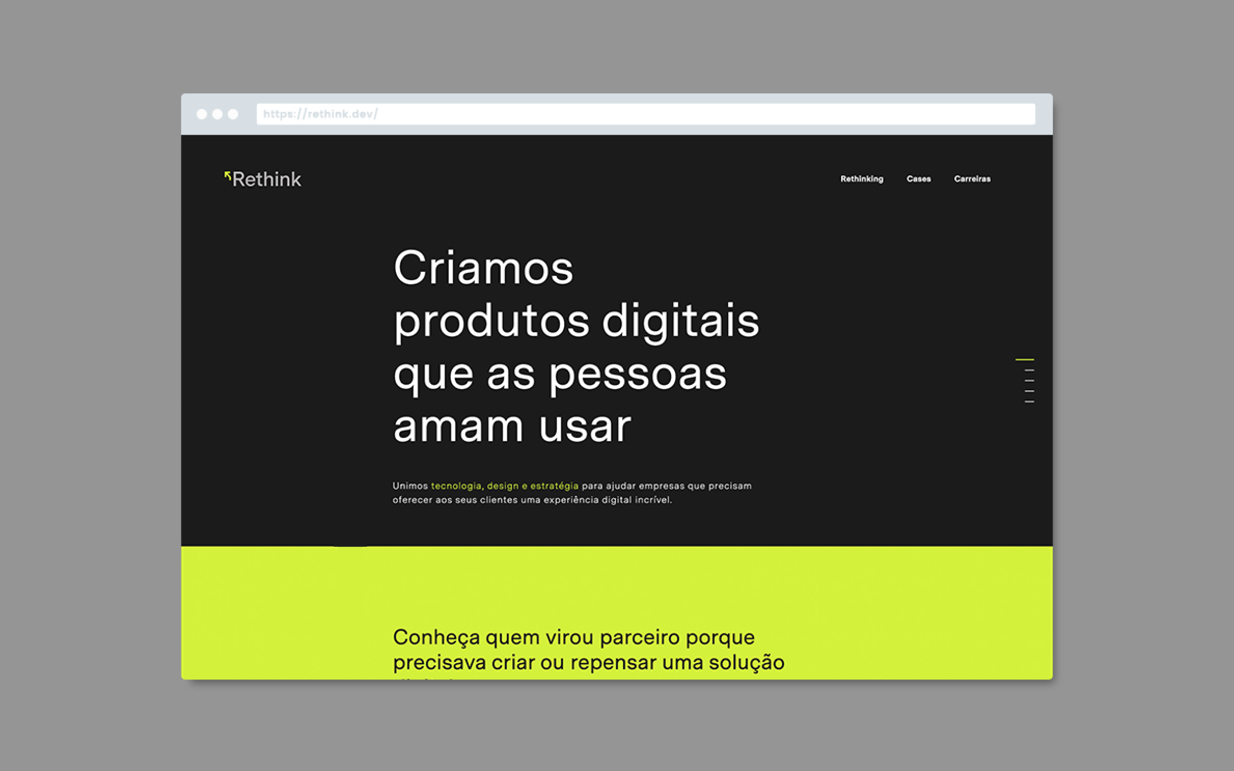
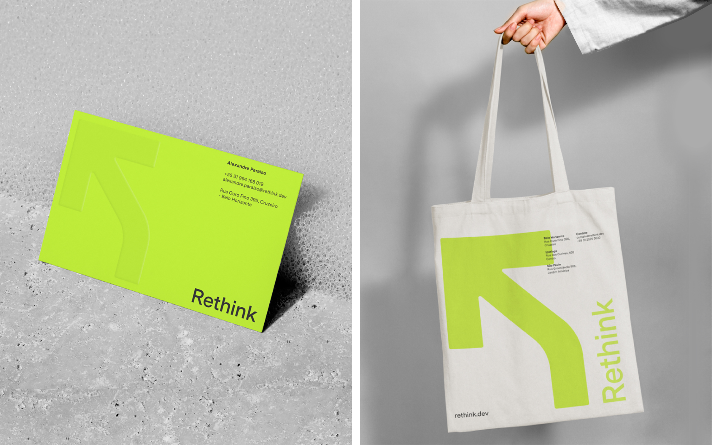
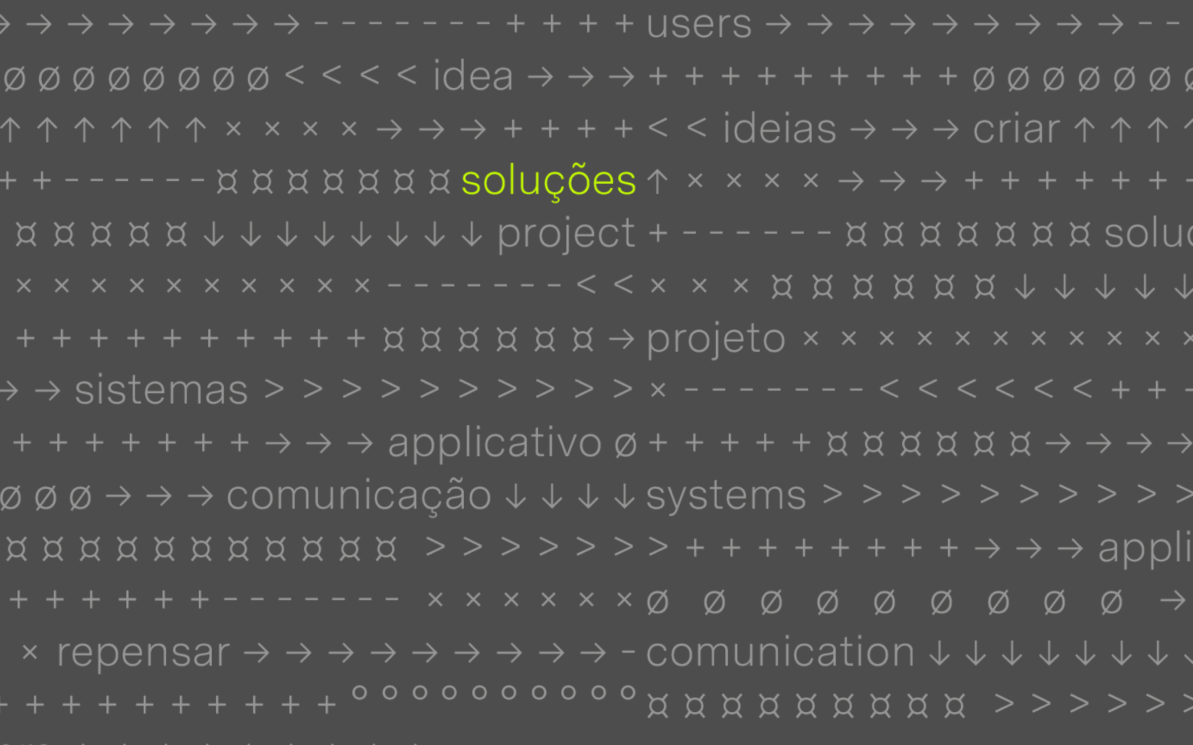
Brand identity for Rethink, a technology company that creates digital products. The new identity brings a more contemporary and fluid language that refers to the digital environment’s symbols and icons—reinforcing the idea of continuous transformation and evolution.
Hardy Design
Creative direction: Mariana Hardy
Executive direction: Cynthia Massote
Design Lead: Pedro de Albergaria
Design: Felipe Barbosa
Project Management: Marcelo Pantuzza
Hardy Design
Creative direction: Mariana Hardy
Executive direction: Cynthia Massote
Design Lead: Pedro de Albergaria
Design: Felipe Barbosa
Project Management: Marcelo Pantuzza
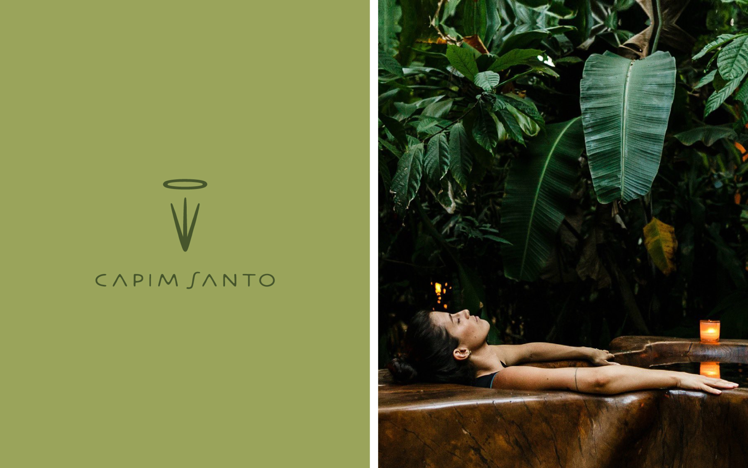
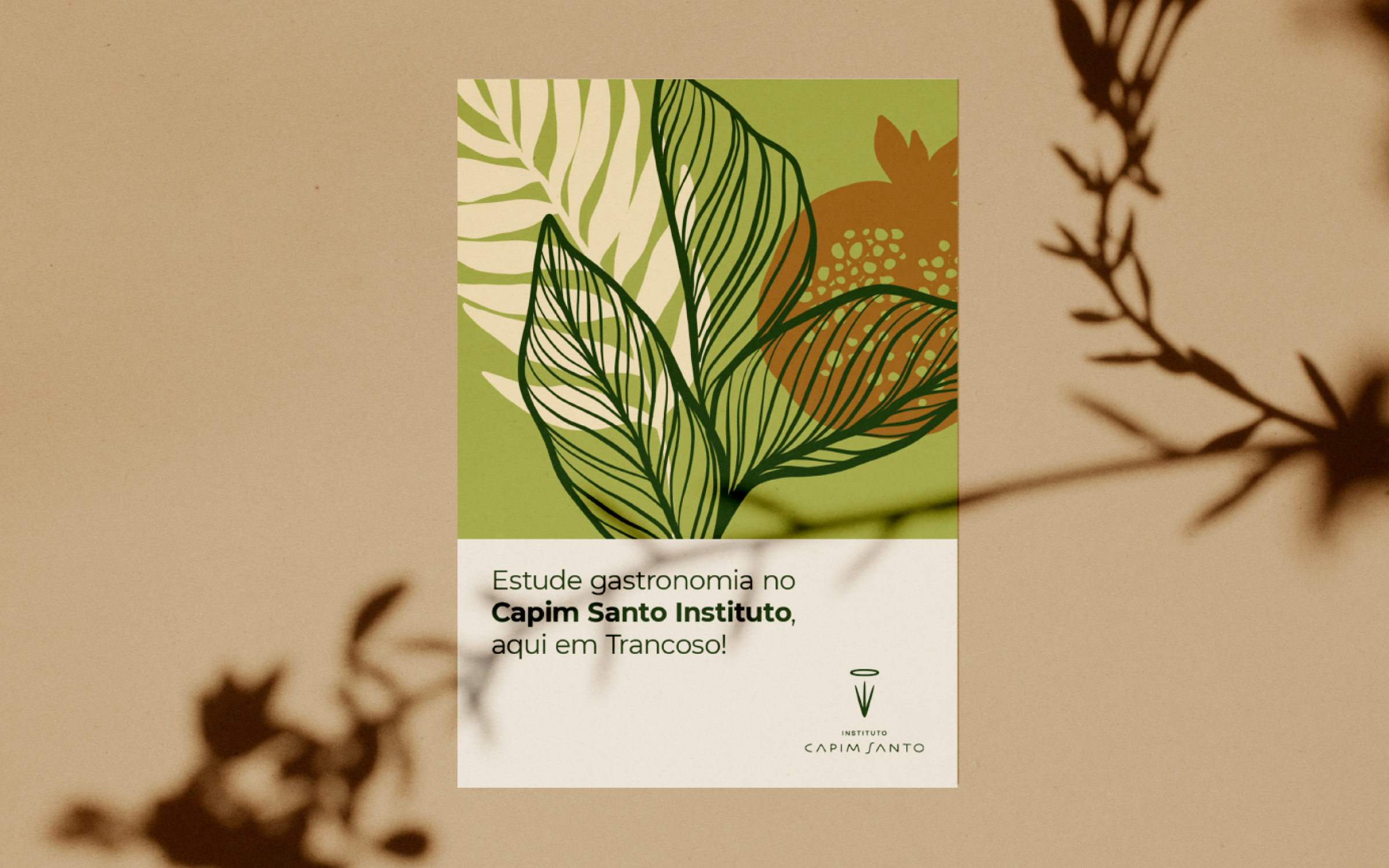

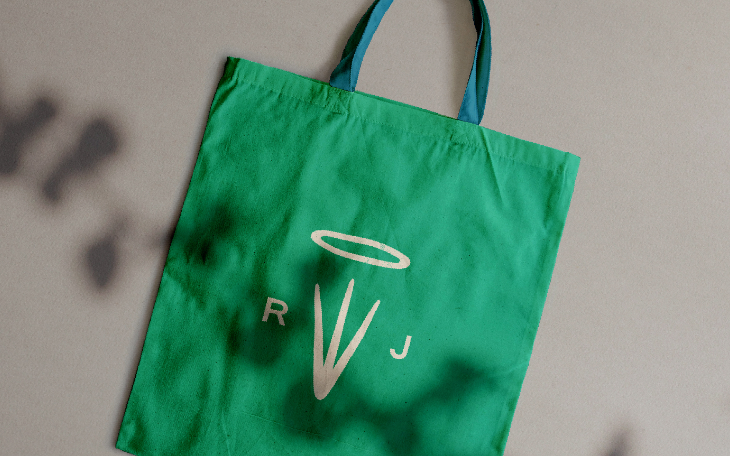
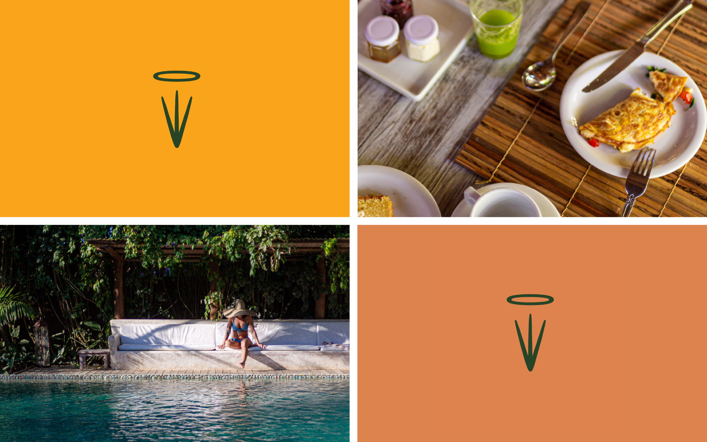
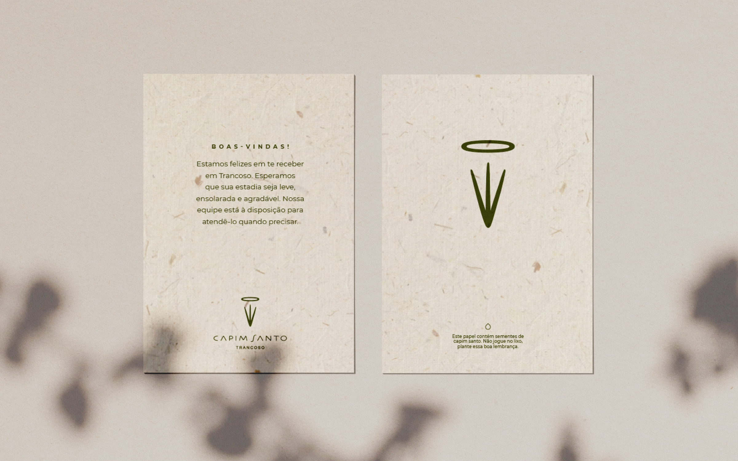
Brand and visual identity redesign for Capim Santo, an eco-friendly pousada and restaurant situated in the charming historical center of Trancoso, a former fishing village in Brazil's coastal state of Bahia. Opened as a macrobiotic cafe in 1981, it became renowned for revisiting traditional Bahian seafood dishes. Over the years, Capim Santo has expanded, with restaurant units in São Paulo and Rio de Janeiro, a Social Institute, and a Gastronomy School. The new visual system brings a cohesive language throughout all business fronts reinforcing fundamental themes to the brand's universe, such as hospitality, sustainability, tradition, and respect for the local culture.
Hardy Design
Creative direction: Mariana Hardy
Executive direction: Cynthia Massote
Design Lead: Pedro de Albergaria and Fernando Dias
Design: Hermano Lamas
Project Management: Joana Rocha
Print Production: Daniele Pires
Hardy Design
Creative direction: Mariana Hardy
Executive direction: Cynthia Massote
Design Lead: Pedro de Albergaria and Fernando Dias
Design: Hermano Lamas
Project Management: Joana Rocha
Print Production: Daniele Pires
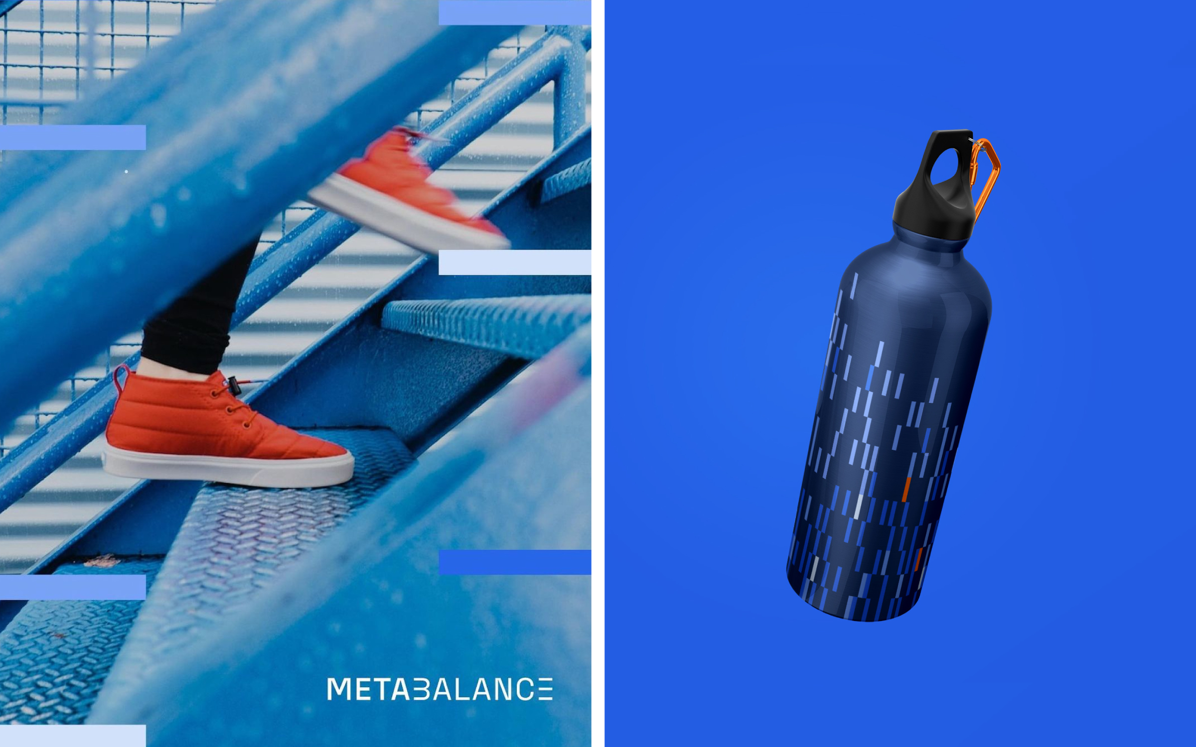
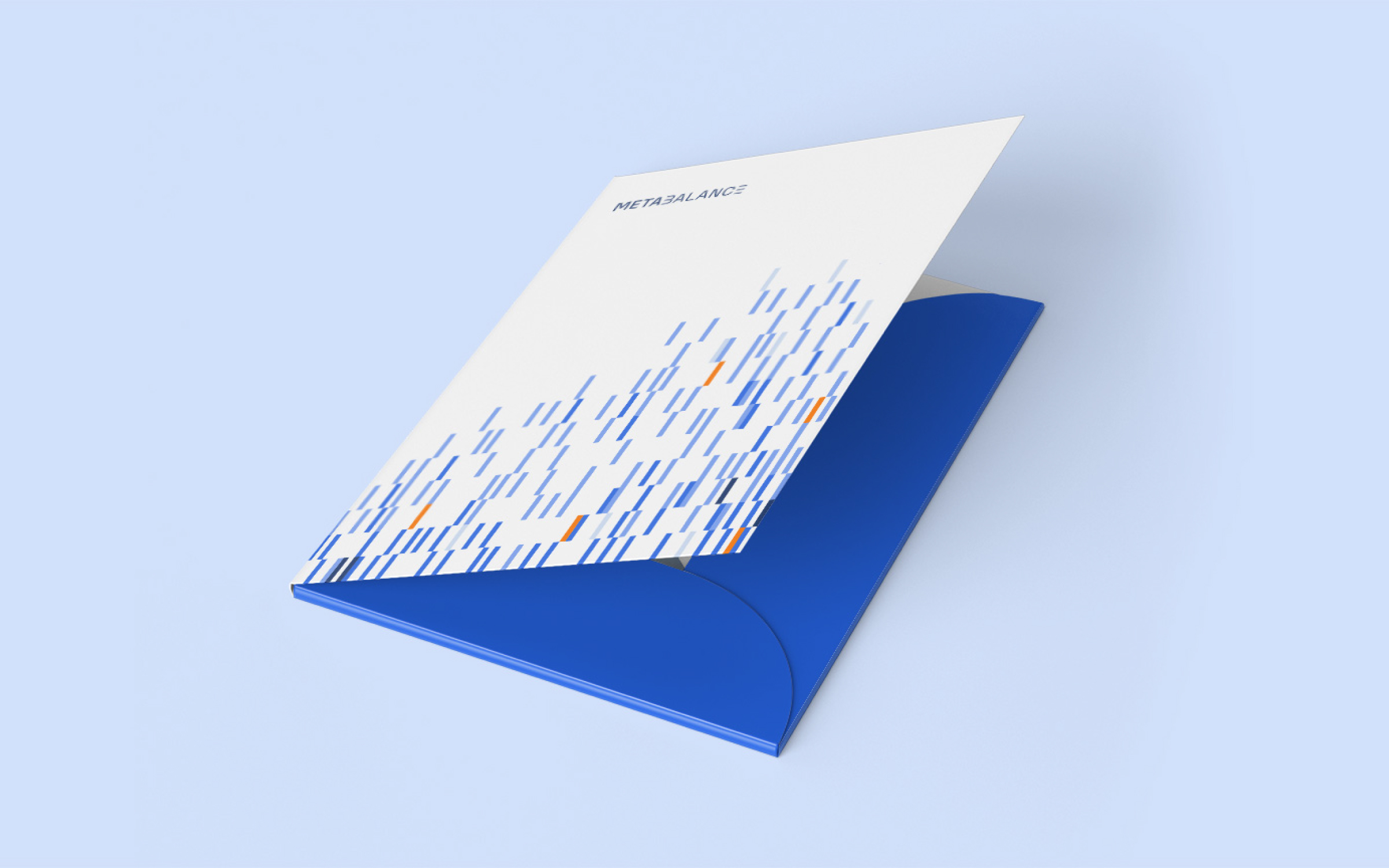
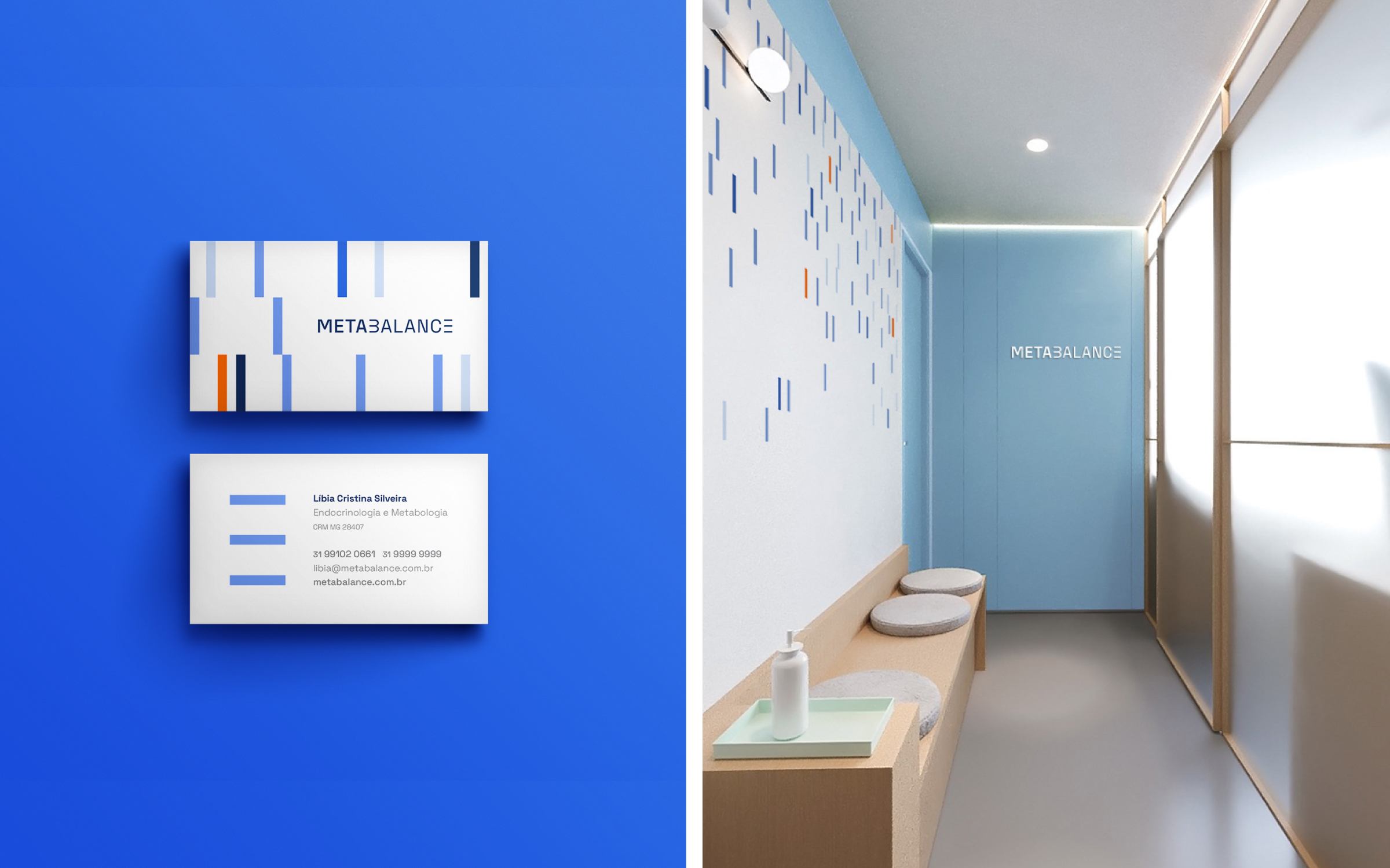
Brand identity for Metabalance, a diagnostic
clinic that uses
innovative technology and tools
to provide accurate data on the
metabolic performance of each
patient’s body. Concepts such as
movement, precision, energy, and
technology guided the visuality of
the logo.
Hardy Design
Creative direction: Mariana Hardy
Executive direction: Cynthia Massote
Design Lead: Pedro de Albergaria
Design: Matheus de Souza Viana
Project Management: Beatriz Fonseca
Hardy Design
Creative direction: Mariana Hardy
Executive direction: Cynthia Massote
Design Lead: Pedro de Albergaria
Design: Matheus de Souza Viana
Project Management: Beatriz Fonseca