Graphic & Type Designer
Belo Horizonte, Brazil
Belo Horizonte, Brazil
info@pedrodealbergaria.com
linked.in/pedrodealbergaria ︎︎︎
linked.in/pedrodealbergaria ︎︎︎
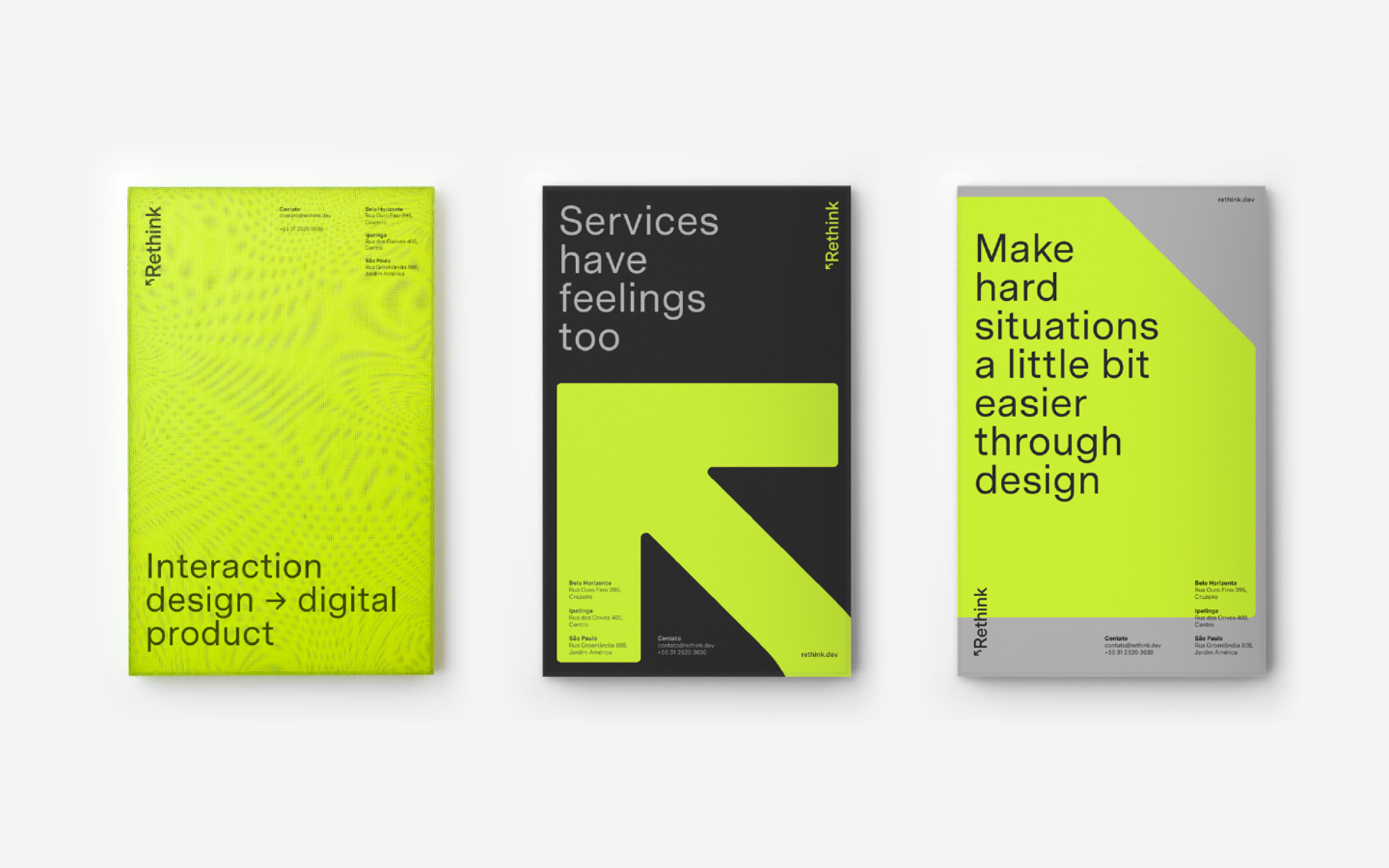
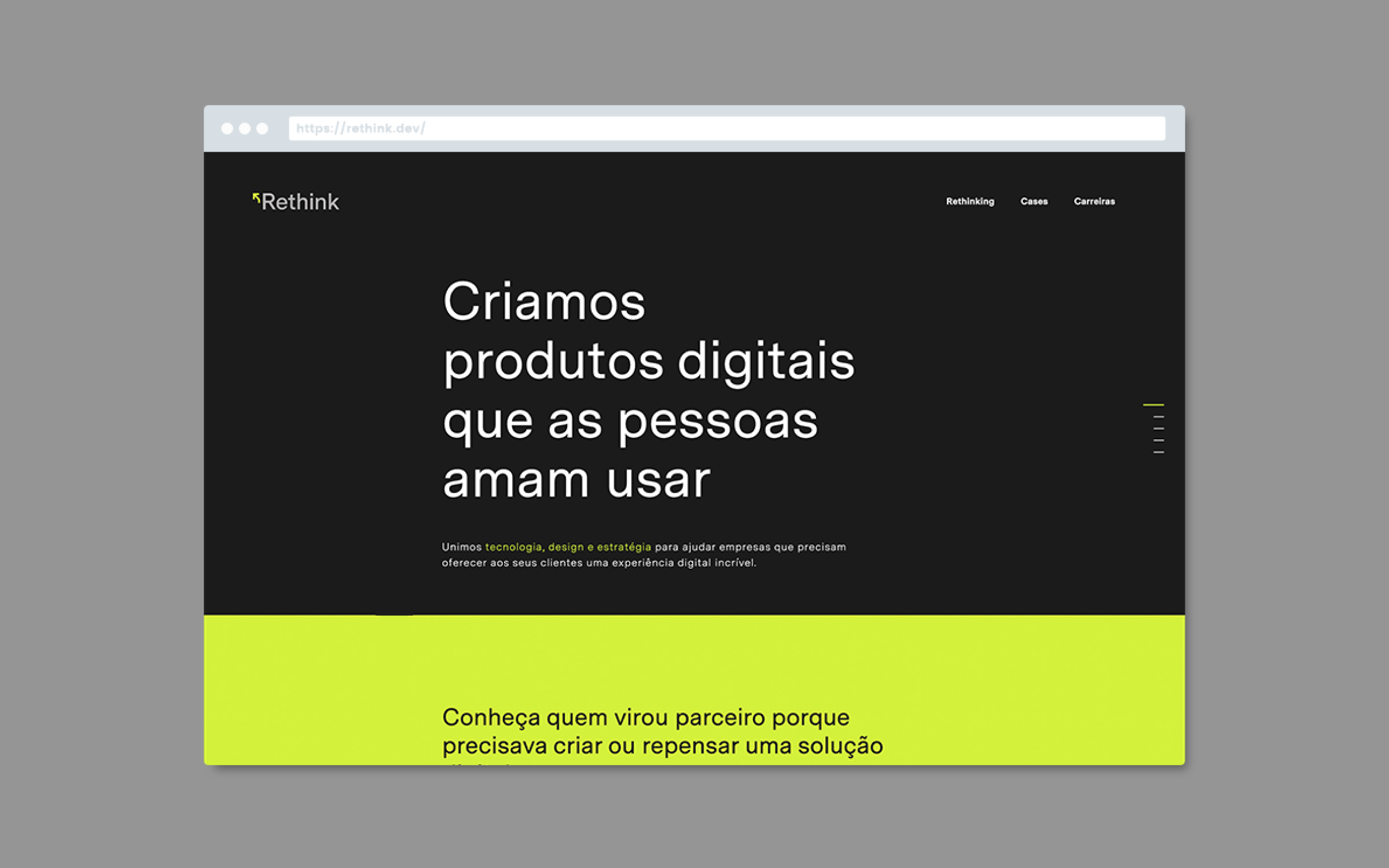
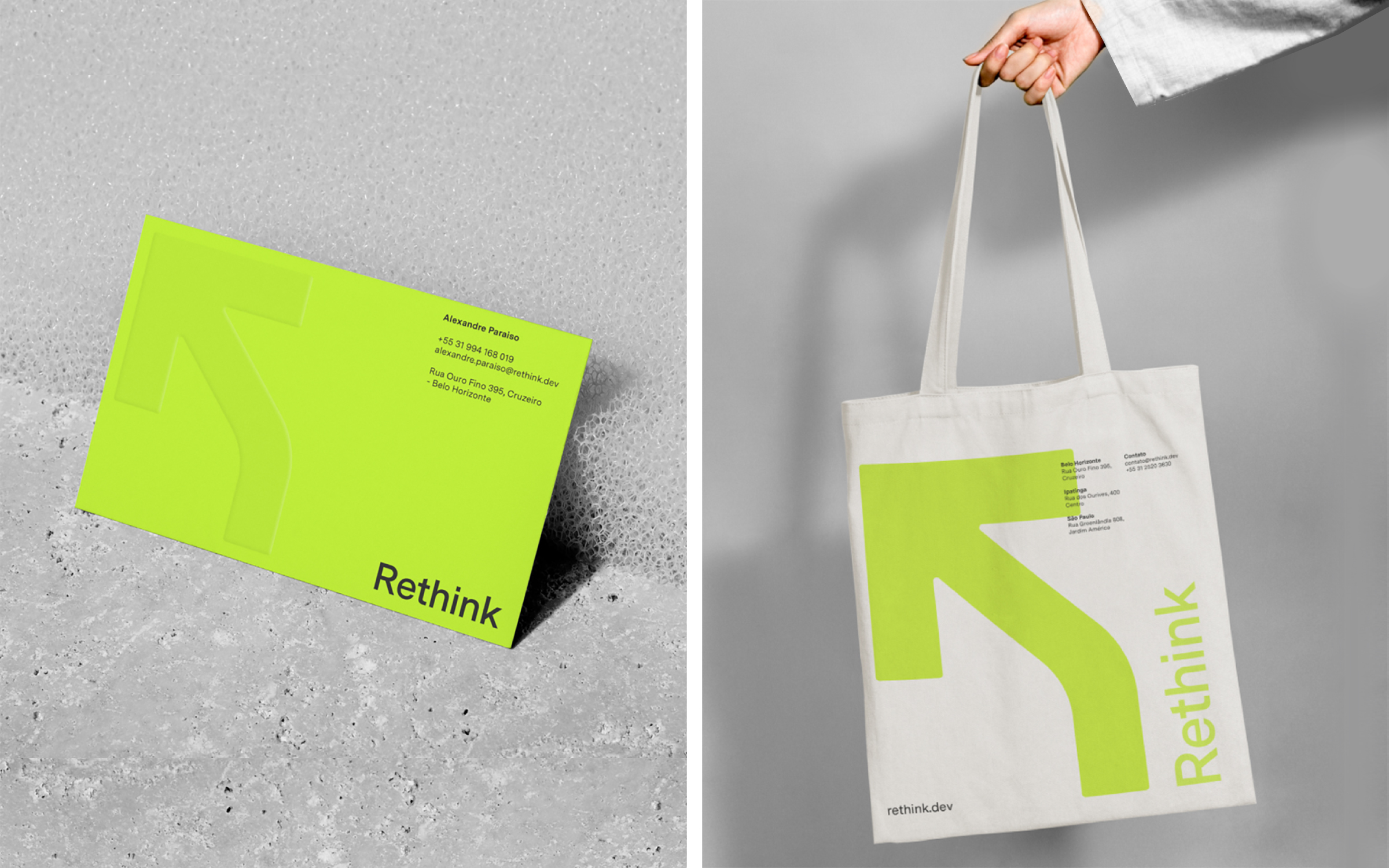
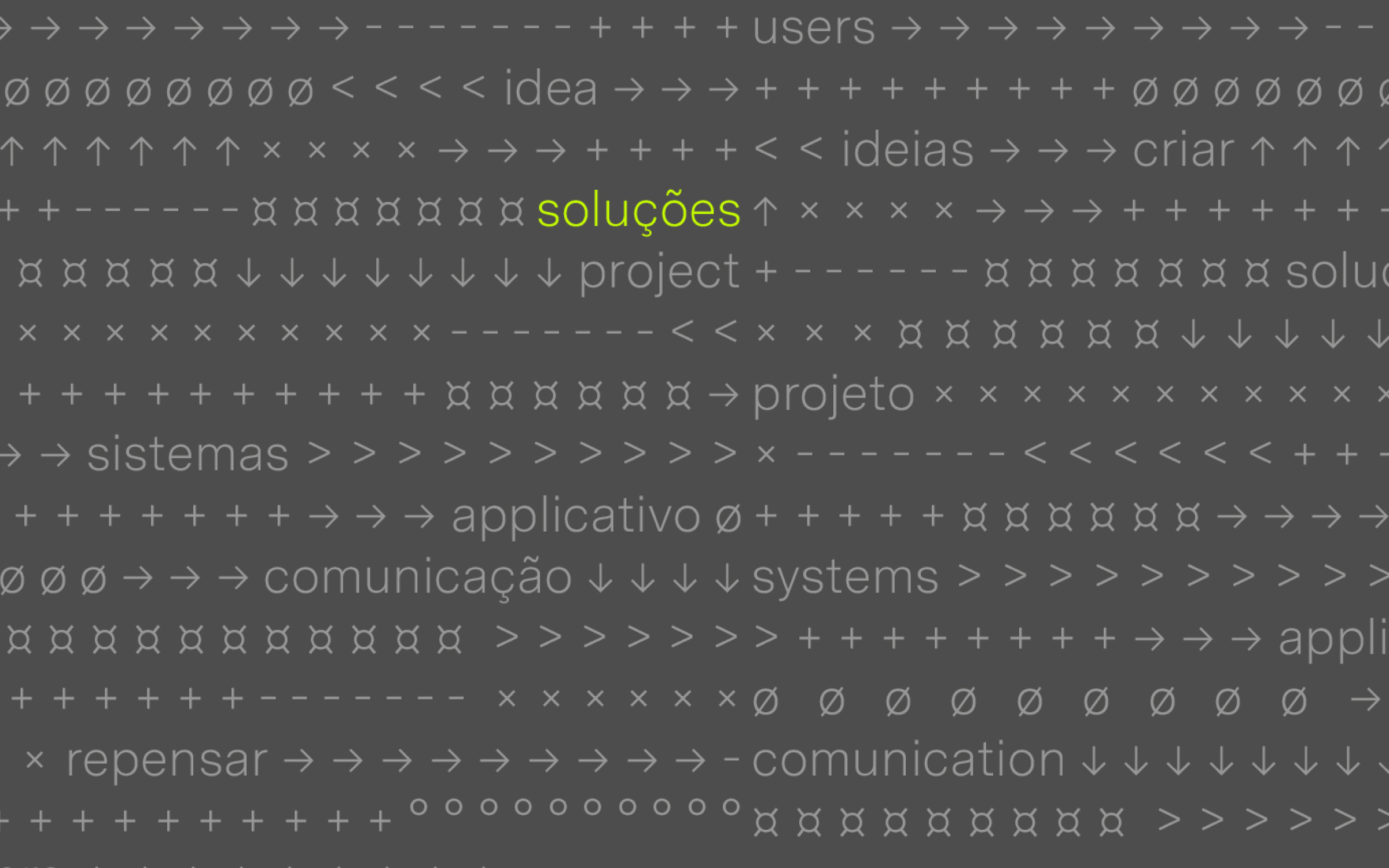
Brand identity for Rethink, a technology company that creates digital products. The new identity brings a more contemporary and fluid language that refers to the digital environment’s symbols and icons—reinforcing the idea of continuous transformation and evolution.
Hardy Design
Creative direction: Mariana Hardy
Executive direction: Cynthia Massote
Design Lead: Pedro de Albergaria
Design: Felipe Barbosa
Project Management: Marcelo Pantuzza
Hardy Design
Creative direction: Mariana Hardy
Executive direction: Cynthia Massote
Design Lead: Pedro de Albergaria
Design: Felipe Barbosa
Project Management: Marcelo Pantuzza
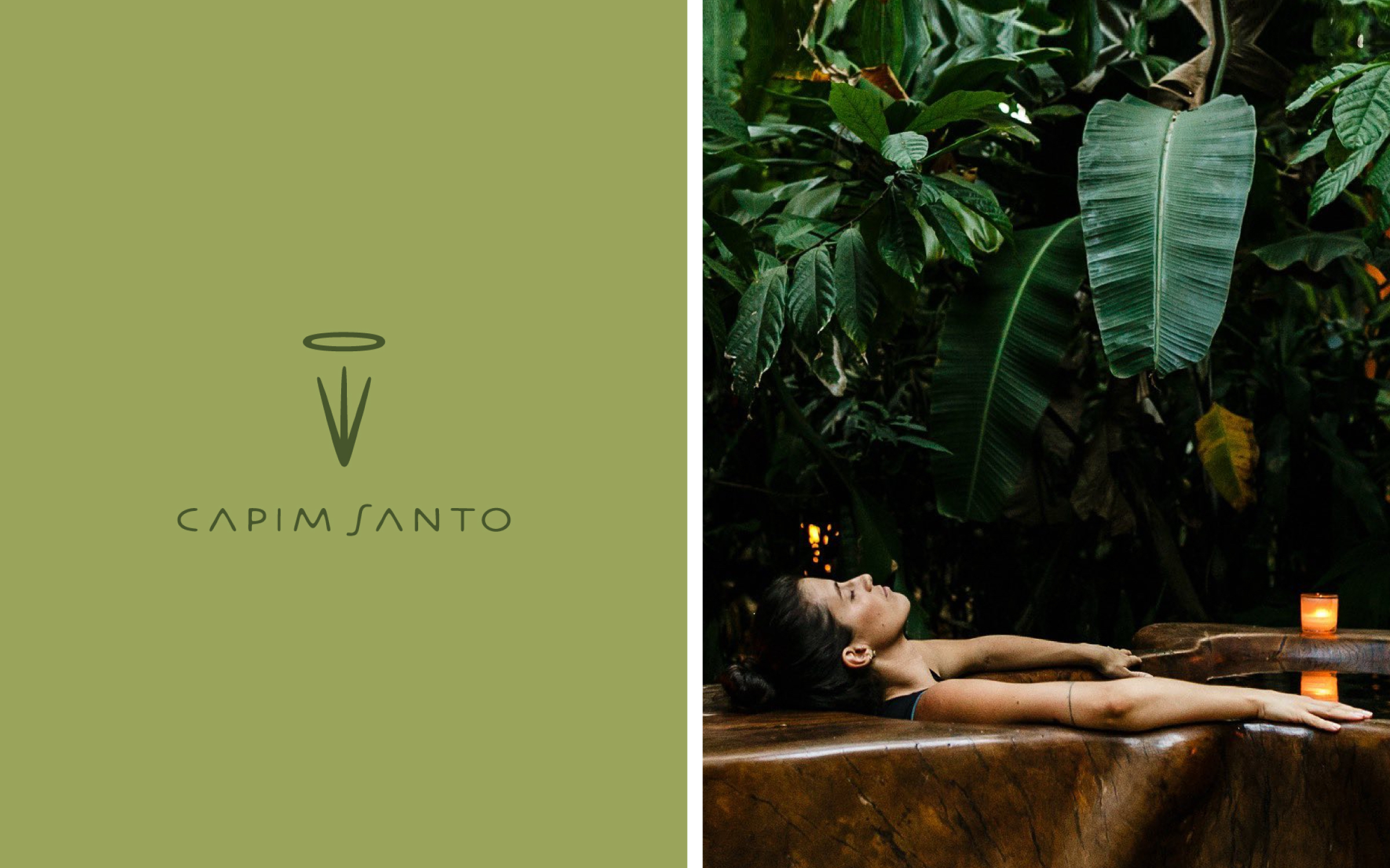
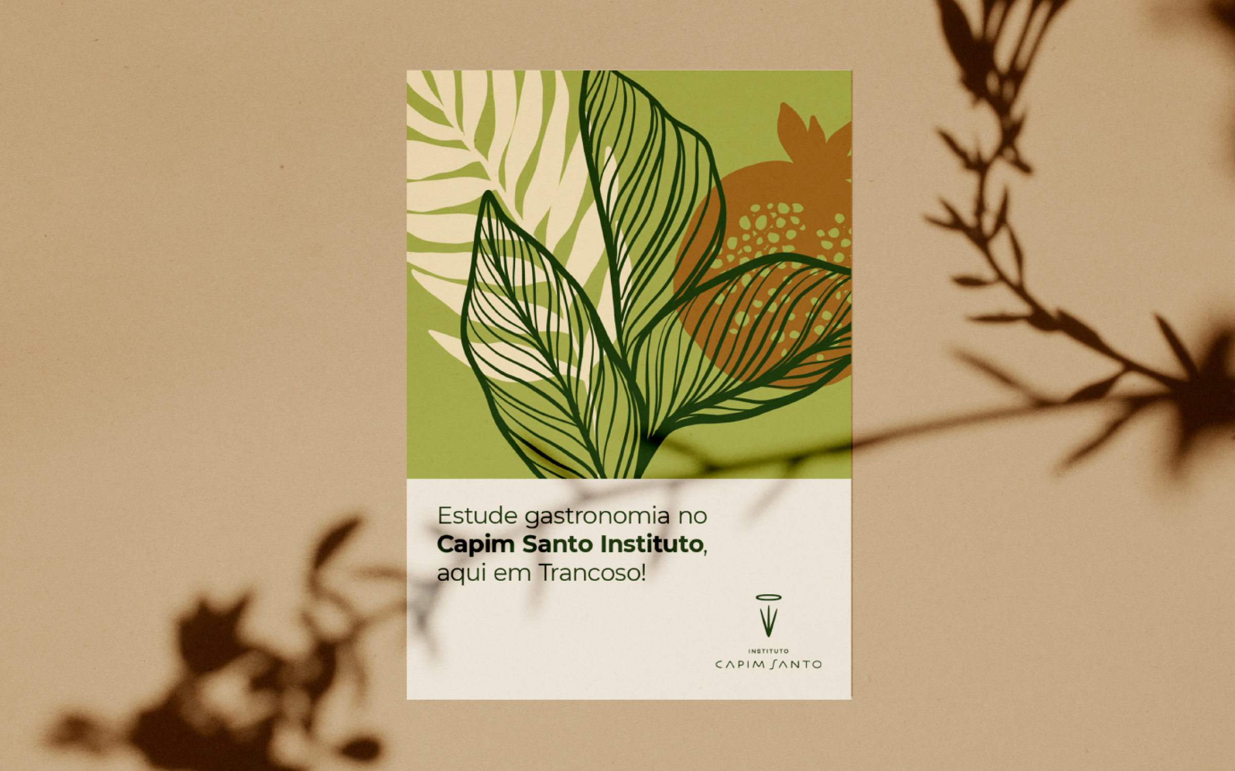

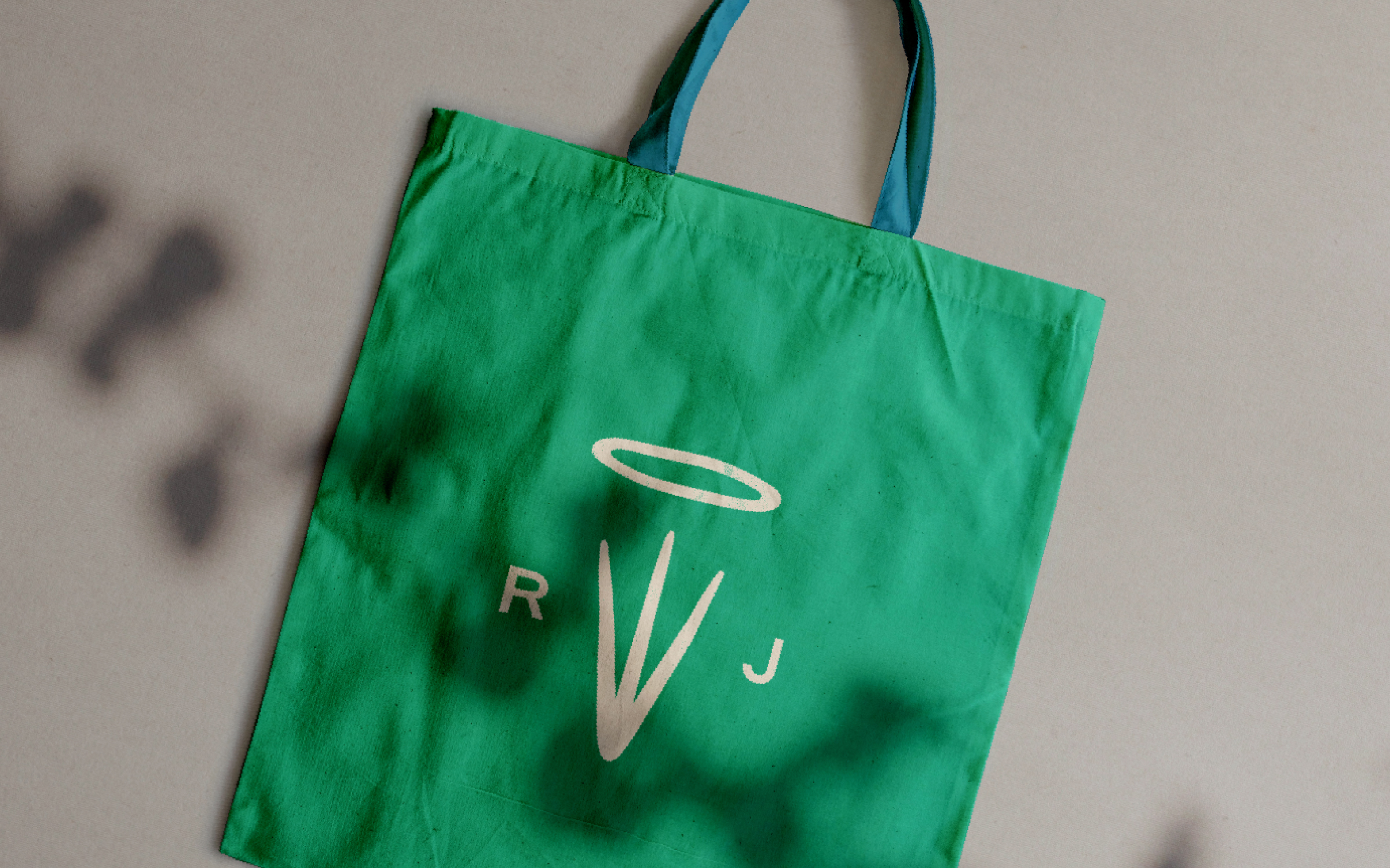
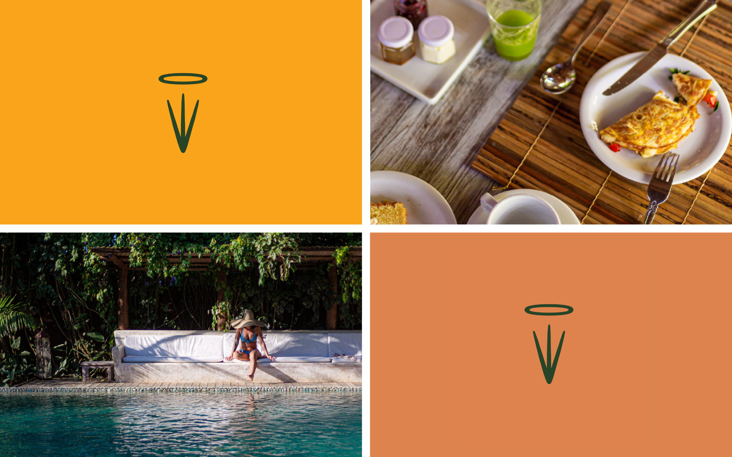
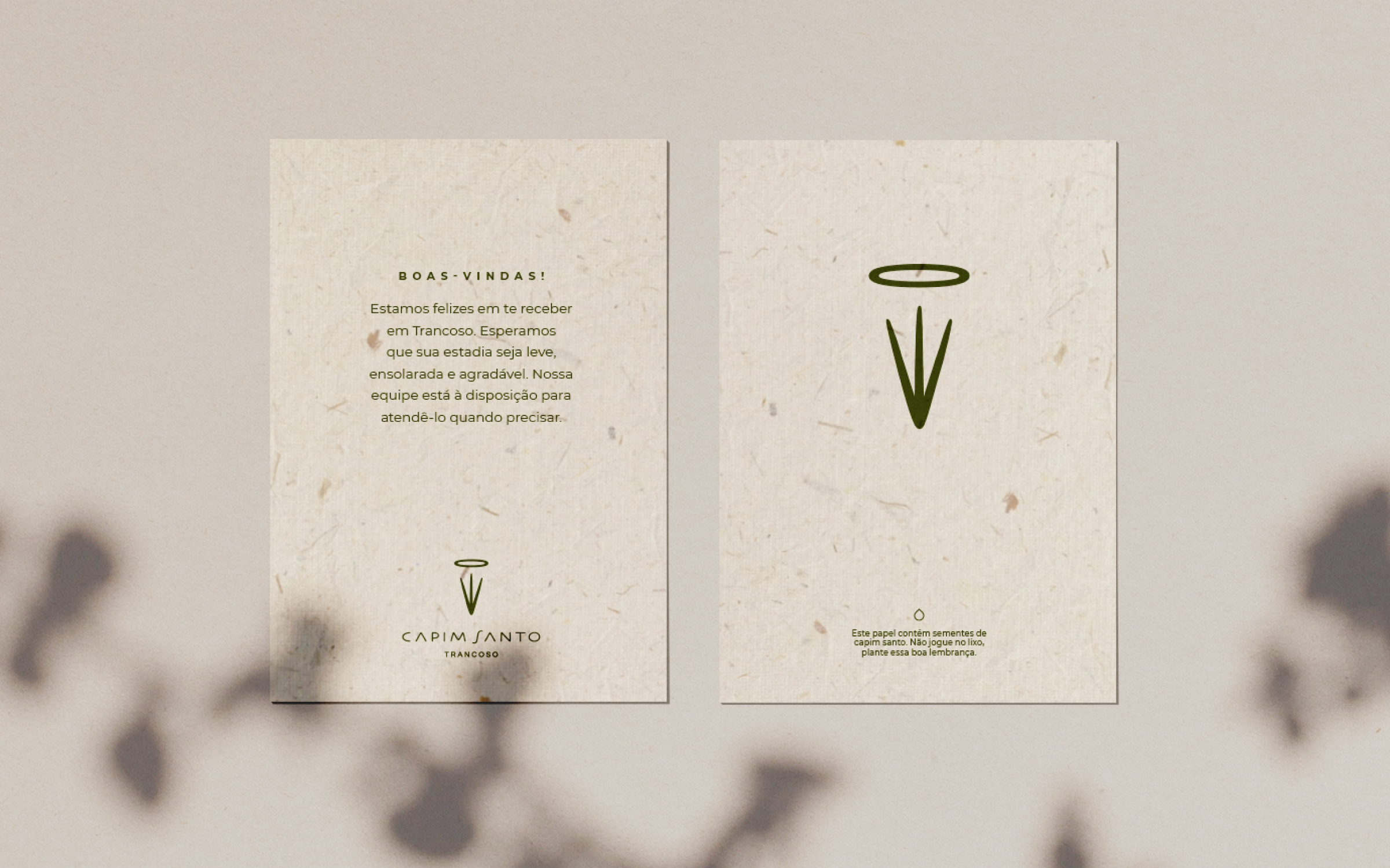
Brand and visual identity redesign for Capim Santo, an eco-friendly pousada and restaurant situated in the charming historical center of Trancoso, a former fishing village in Brazil's coastal state of Bahia. Opened as a macrobiotic cafe in 1981, it became renowned for revisiting traditional Bahian seafood dishes. Over the years, Capim Santo has expanded, with restaurant units in São Paulo and Rio de Janeiro, a Social Institute, and a Gastronomy School. The new visual system brings a cohesive language throughout all business fronts reinforcing fundamental themes to the brand's universe, such as hospitality, sustainability, tradition, and respect for the local culture.
Hardy Design
Creative direction: Mariana Hardy
Executive direction: Cynthia Massote
Design Lead: Pedro de Albergaria and Fernando Dias
Design: Hermano Lamas
Project Management: Joana Rocha
Print Production: Daniele Pires
Hardy Design
Creative direction: Mariana Hardy
Executive direction: Cynthia Massote
Design Lead: Pedro de Albergaria and Fernando Dias
Design: Hermano Lamas
Project Management: Joana Rocha
Print Production: Daniele Pires
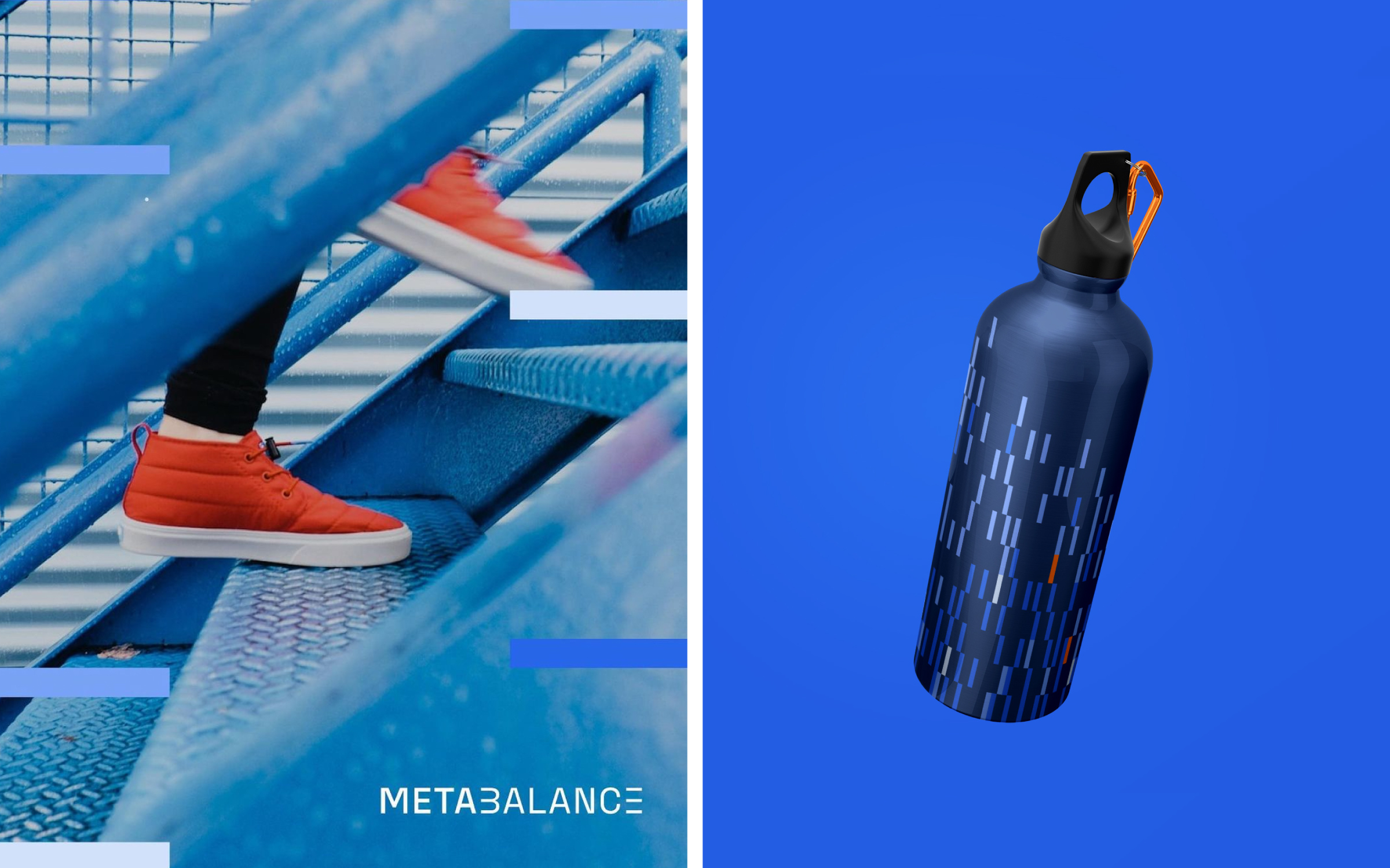
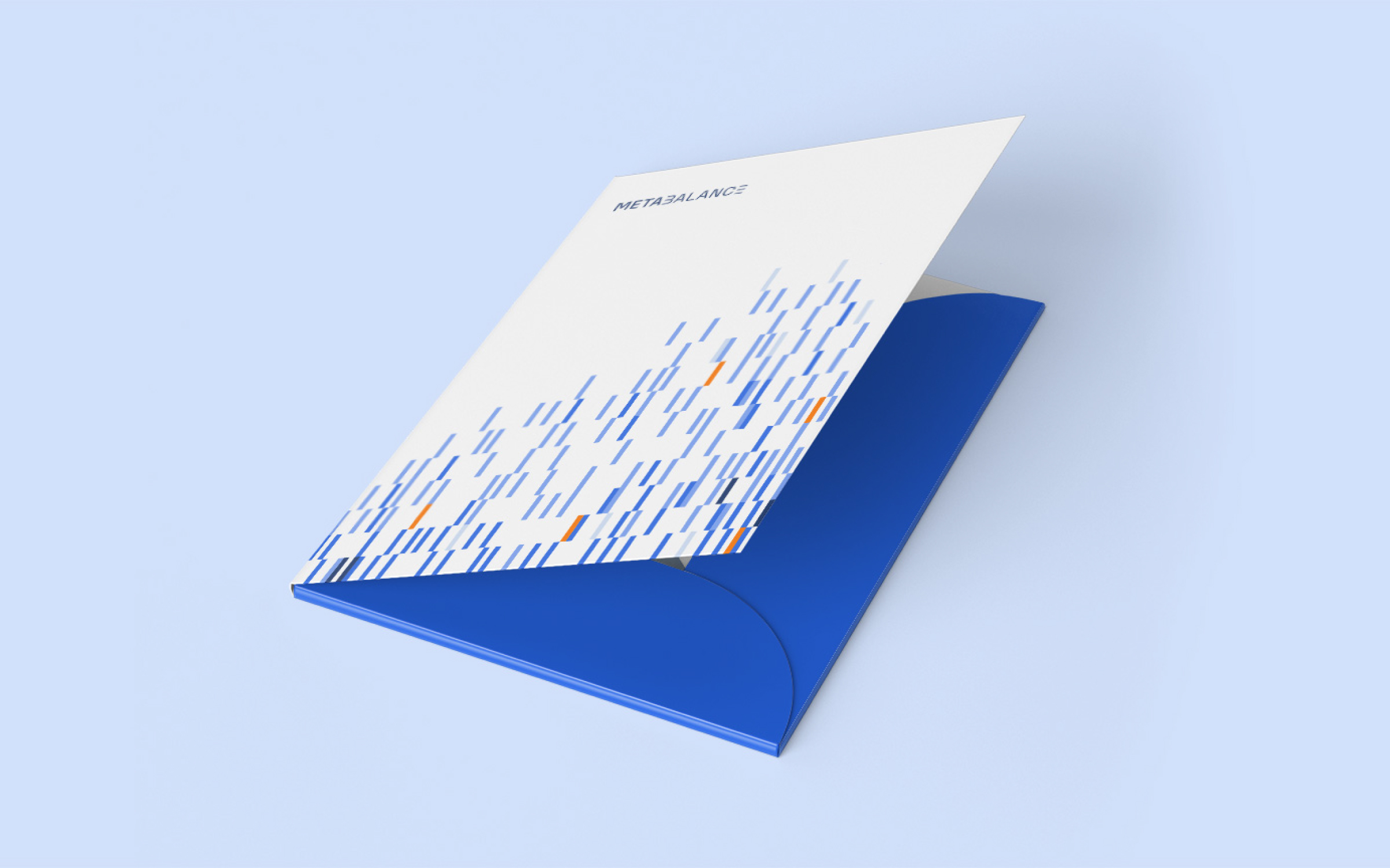
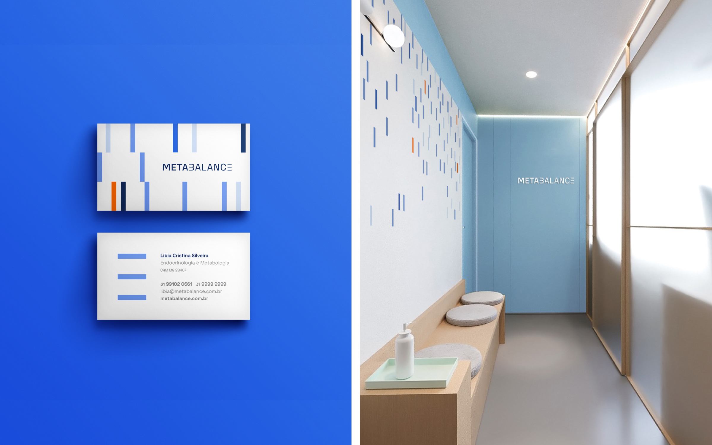
Brand identity for Metabalance, a diagnostic
clinic that uses
innovative technology and tools
to provide accurate data on the
metabolic performance of each
patient’s body. Concepts such as
movement, precision, energy, and
technology guided the visuality of
the logo.
Hardy Design
Creative direction: Mariana Hardy
Executive direction: Cynthia Massote
Design Lead: Pedro de Albergaria
Design: Matheus de Souza Viana
Project Management: Beatriz Fonseca
Hardy Design
Creative direction: Mariana Hardy
Executive direction: Cynthia Massote
Design Lead: Pedro de Albergaria
Design: Matheus de Souza Viana
Project Management: Beatriz Fonseca
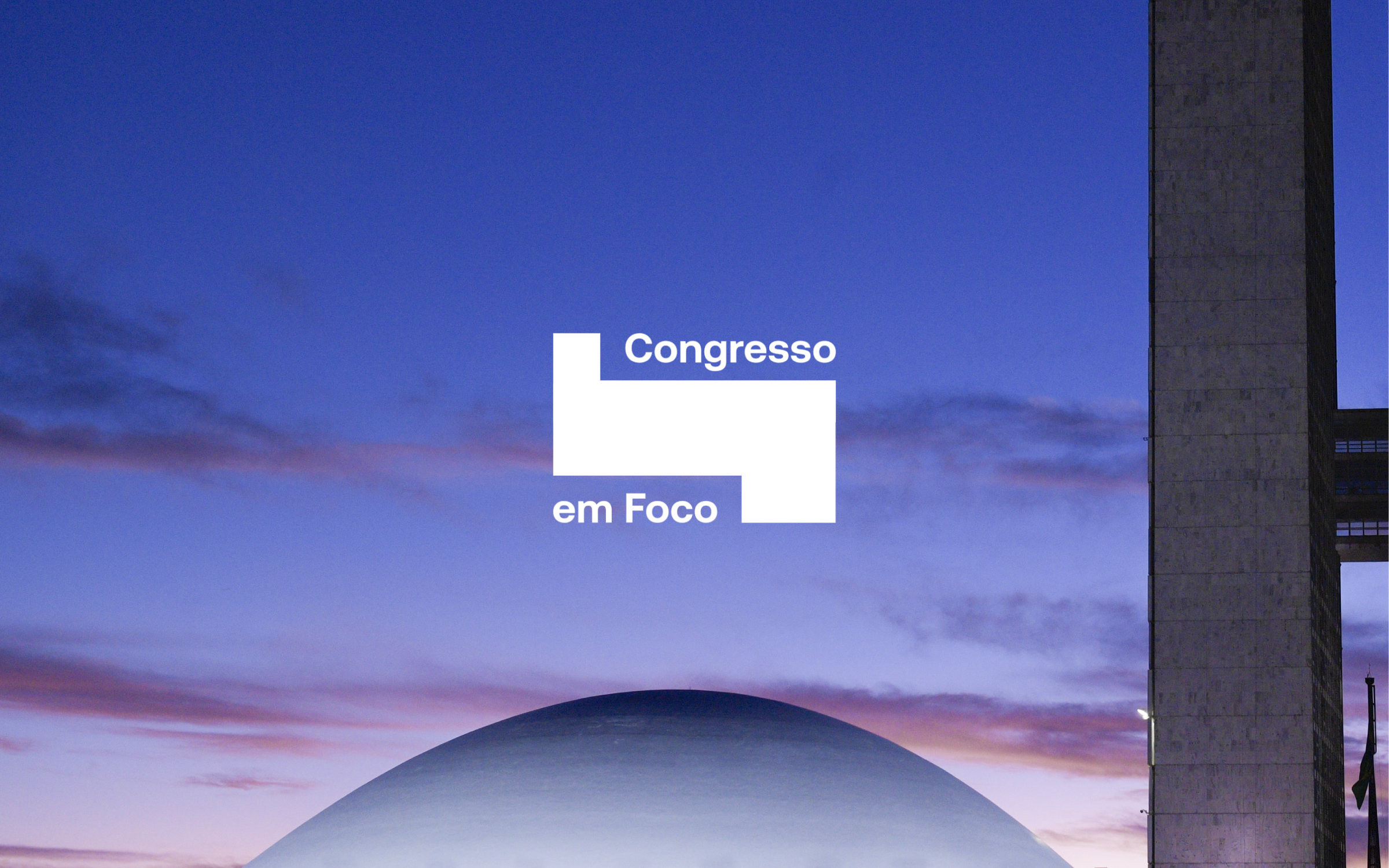

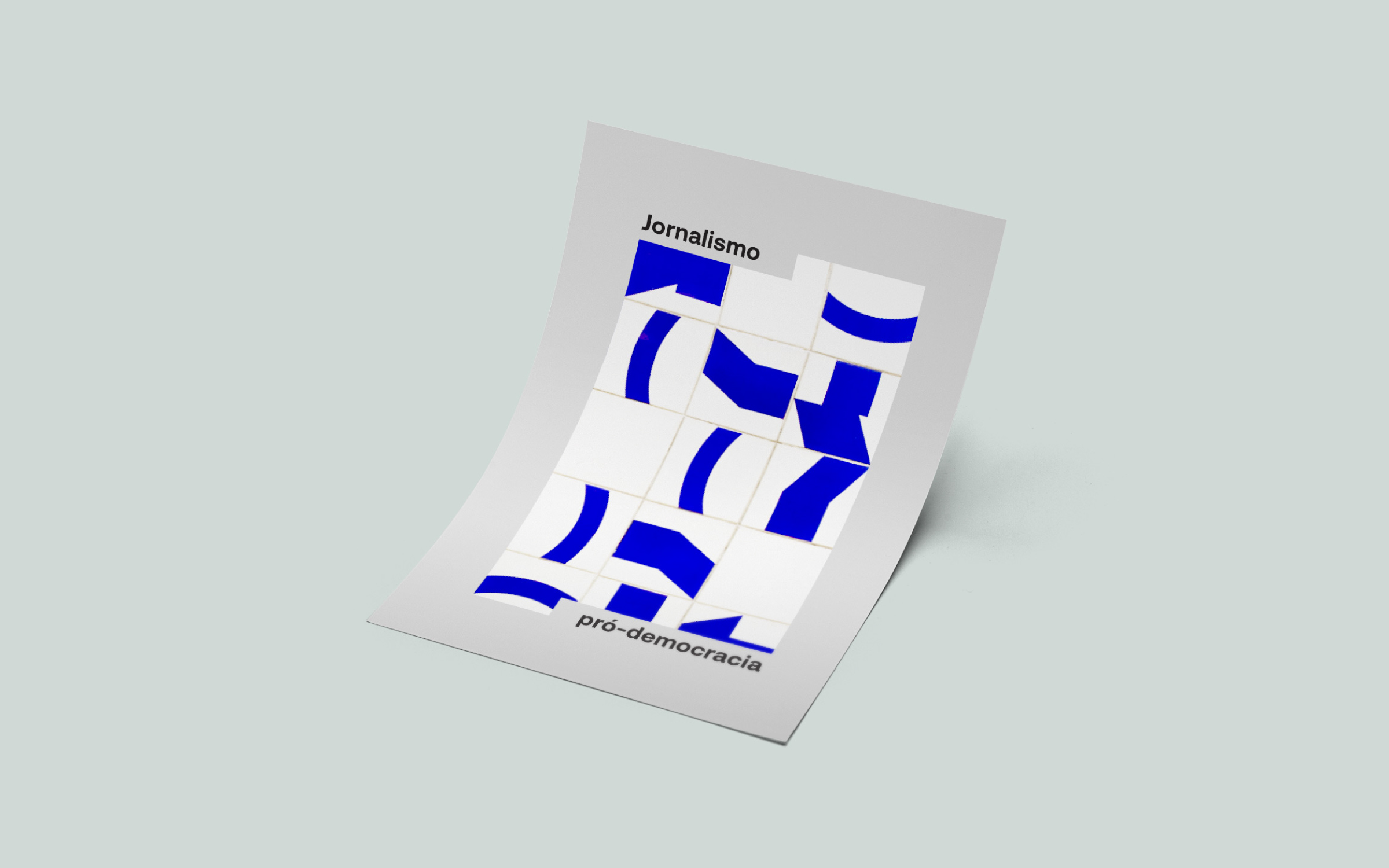
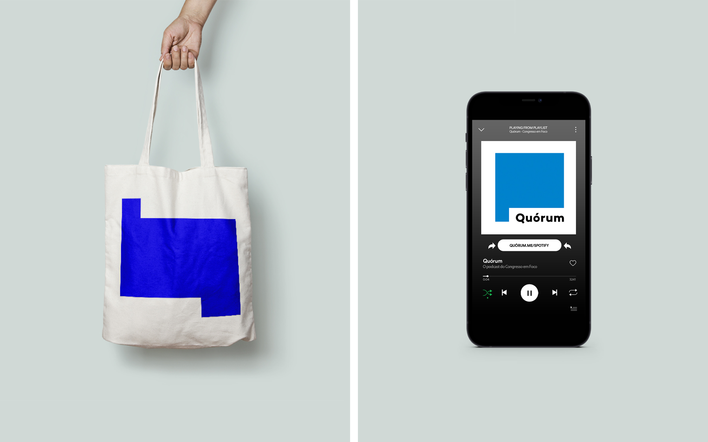
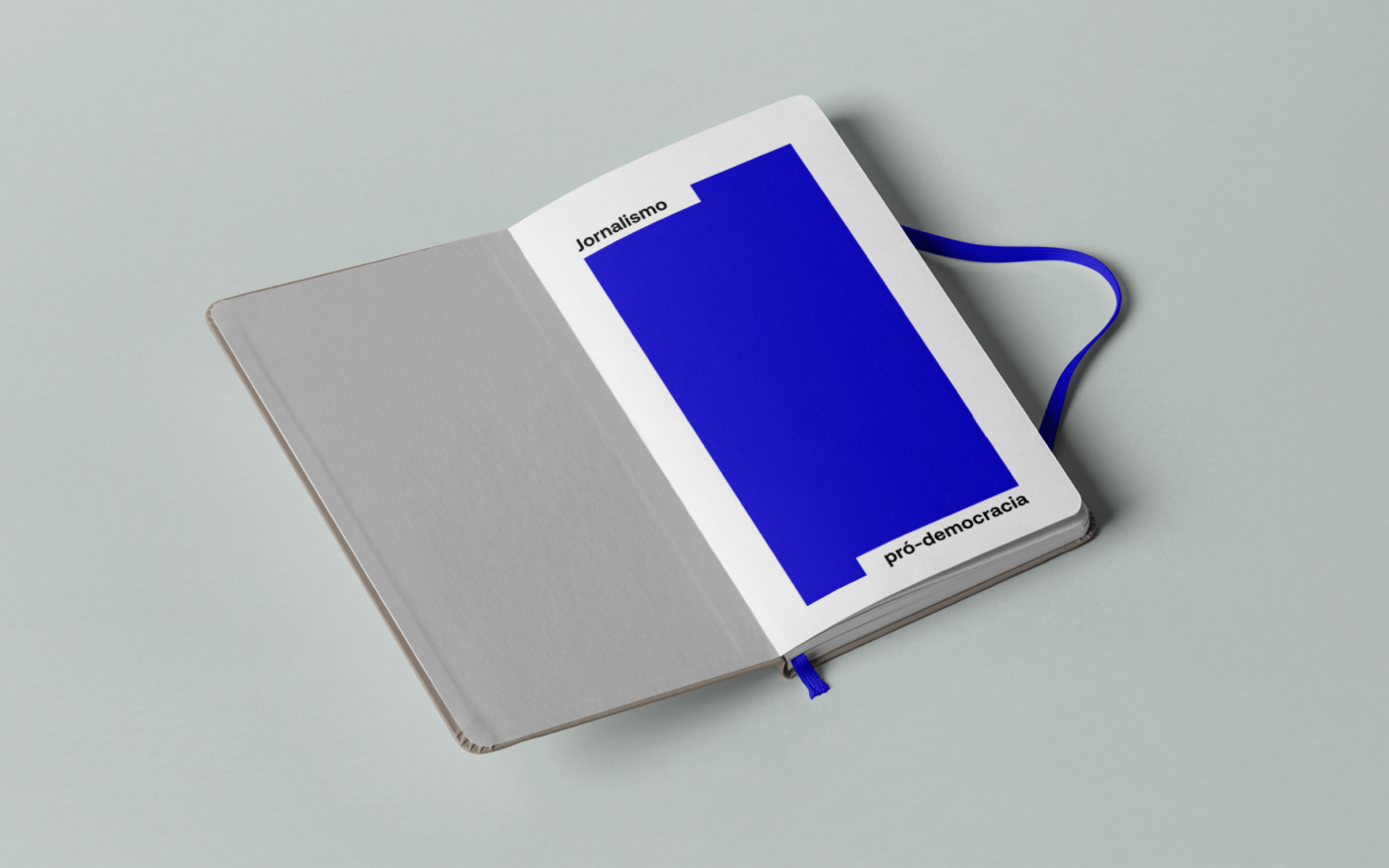
Brand
identity for Congresso em Foco, one of the leading political digital newspapers
in Brazil. It has been covering the federal legislature’s activities intensively
for 16 years. The intention was to translate its already consolidated
journalistic performance into a more contemporary and palatable language for
the digital environment. The new visual identity seeks to combine seriousness
and credibility with a fresh and versatile visual repertoire. The branding
introduces modular windows as visual resources that make up an identity system
in constant motion. With the expansion of the graphic repertoire, the
possibilities of communication on the website and social networks expand,
consolidating a recognizable language.
Congresso em Foco︎︎︎
Hardy Design
Creative Direction: Mariana Hardy
Executive Direction: Cynthia Massote
Design Lead: Pedro de Albergaria
Design: Hudson Girundi and Tobia Hallak
Project Management: Marcelo Pantuzza
Congresso em Foco︎︎︎
Hardy Design
Creative Direction: Mariana Hardy
Executive Direction: Cynthia Massote
Design Lead: Pedro de Albergaria
Design: Hudson Girundi and Tobia Hallak
Project Management: Marcelo Pantuzza

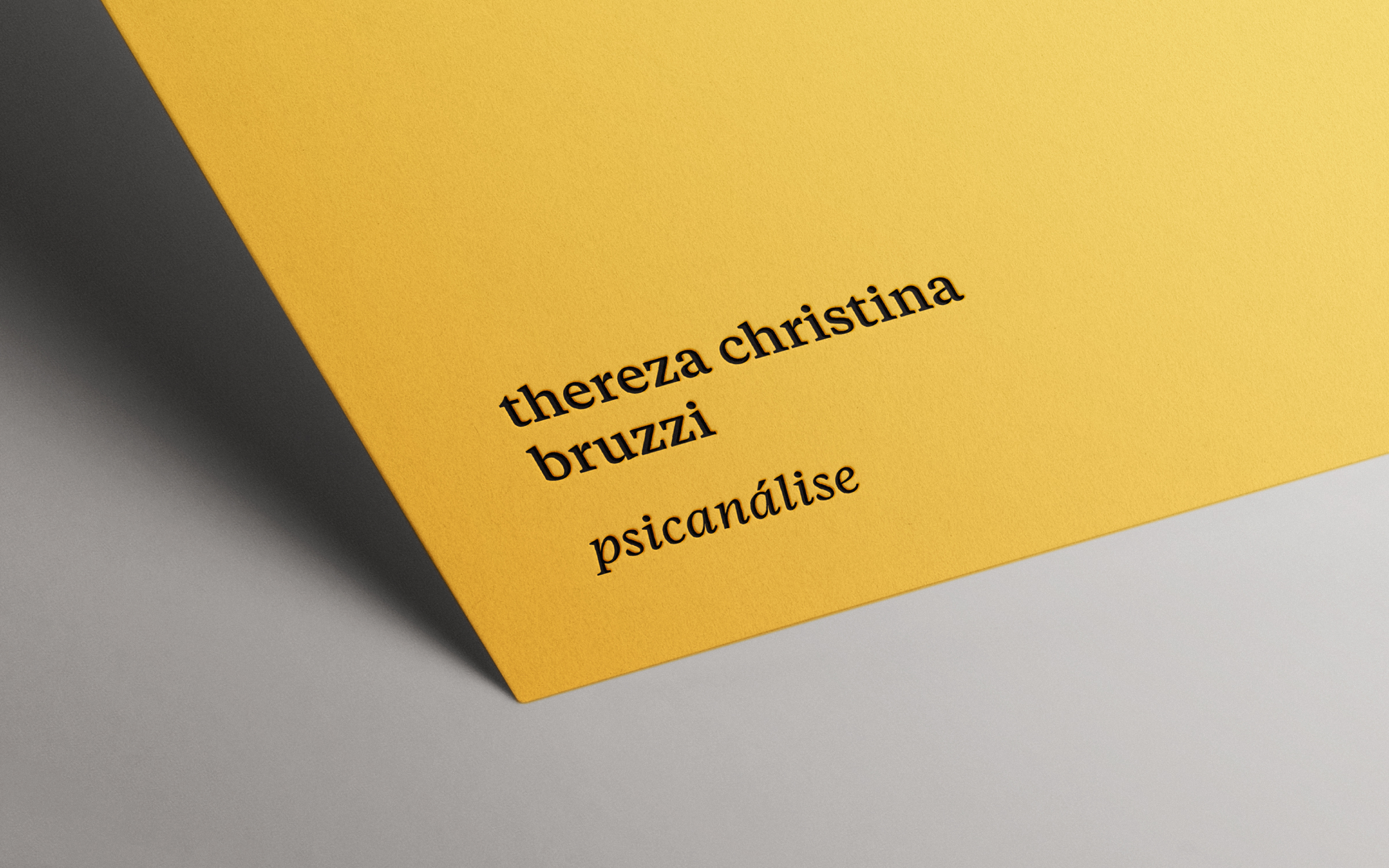
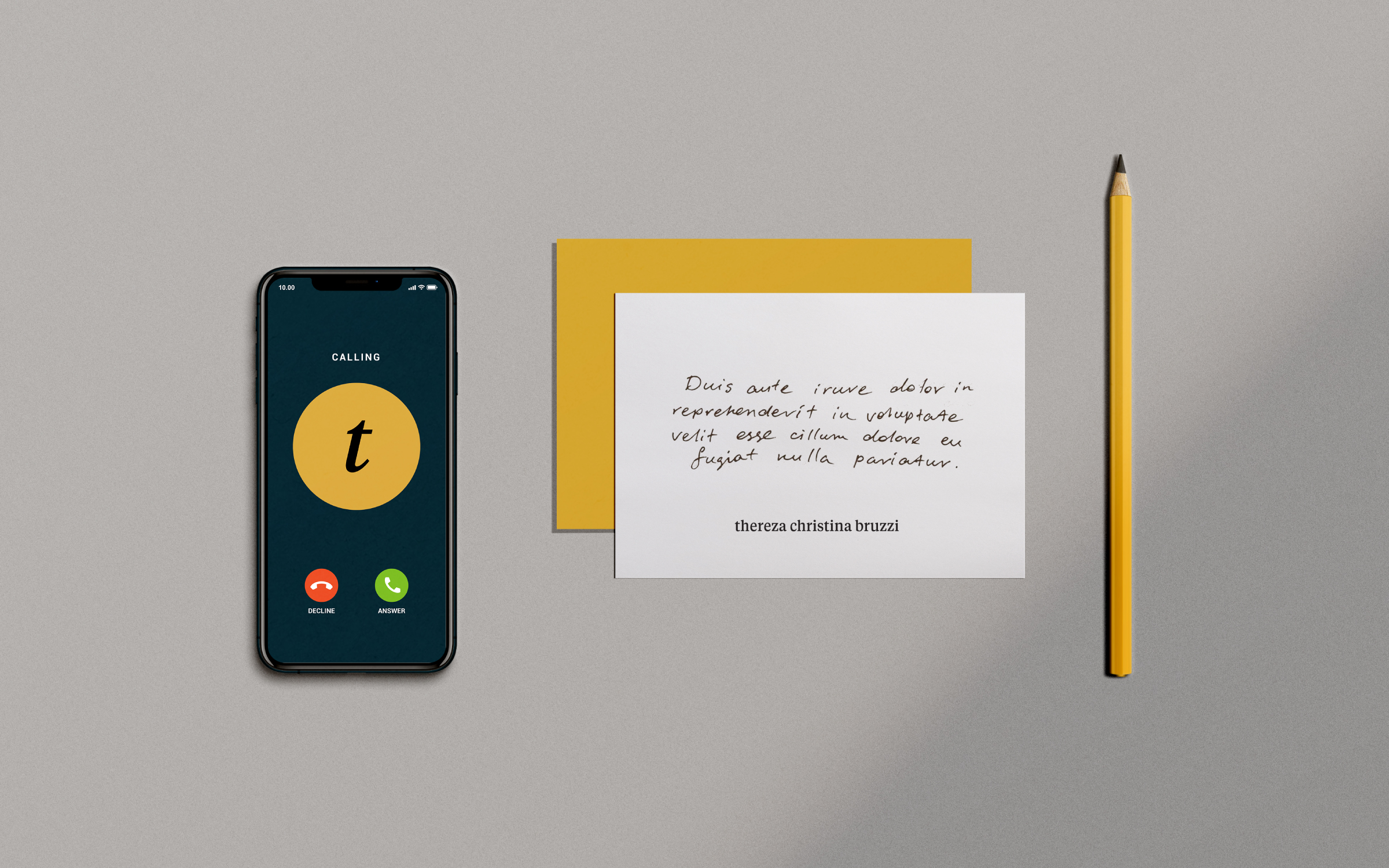
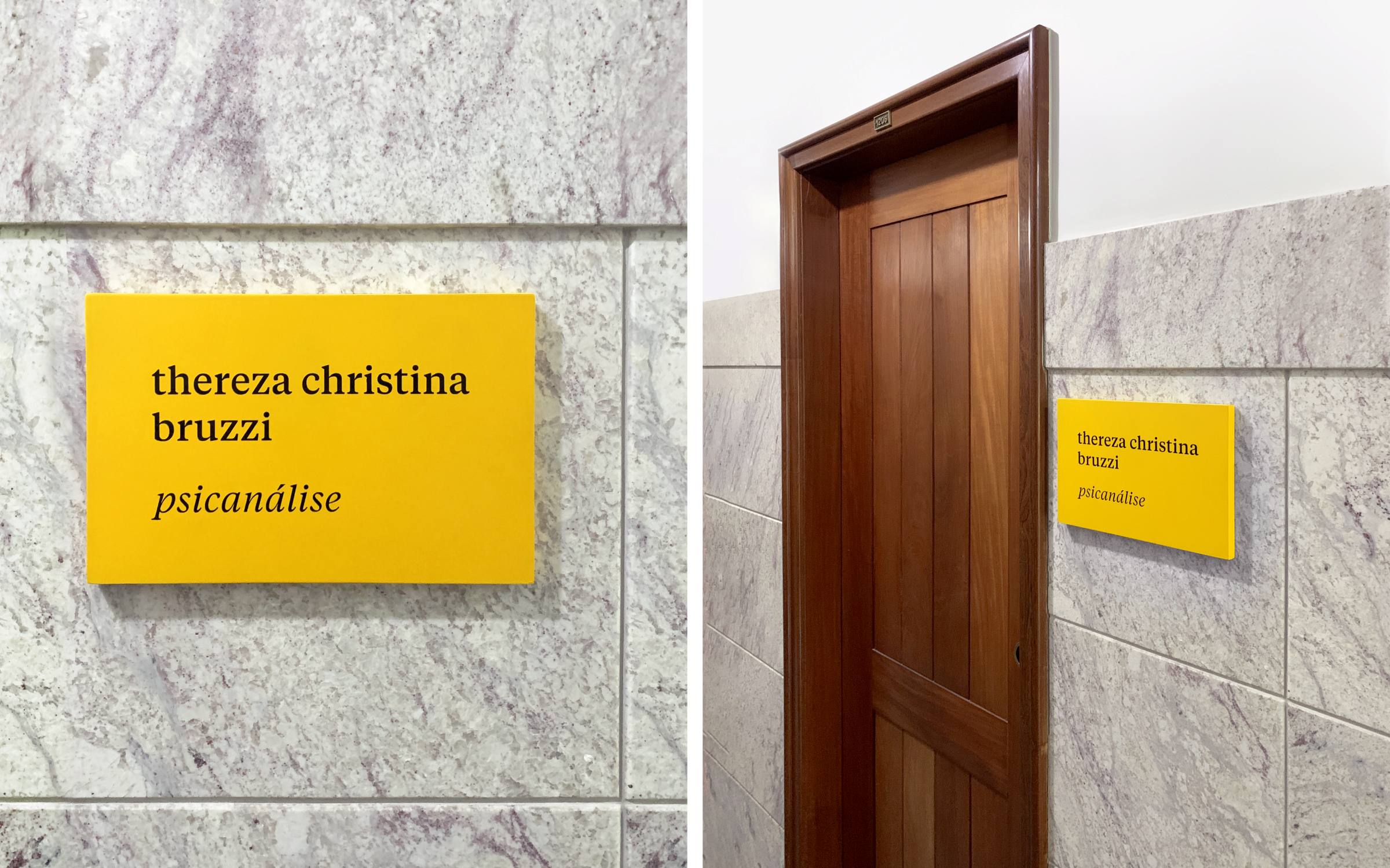
Visual identity, stationery, and signage for psychoanalyst Thereza Christina Bruzzi's office. The goal was to create a simple and minimalist graphic system to reflect a wise, welcoming, and professional personality. The typographic composition between serif and sans-serif fonts is the main asset of the visual language, communicating a sense of trust and security. Combined with a contemporary and vibrant yellow, it evokes optimism and warmth.