Graphic & Type Designer
Belo Horizonte, Brazil
Belo Horizonte, Brazil
info@pedrodealbergaria.com
linked.in/pedrodealbergaria ︎︎︎
linked.in/pedrodealbergaria ︎︎︎


Exhibition
In Plantin's footsteps ︎︎︎, Aug-Sep 2022
Museum Plantin-Moretus, Antwerp, Belgium
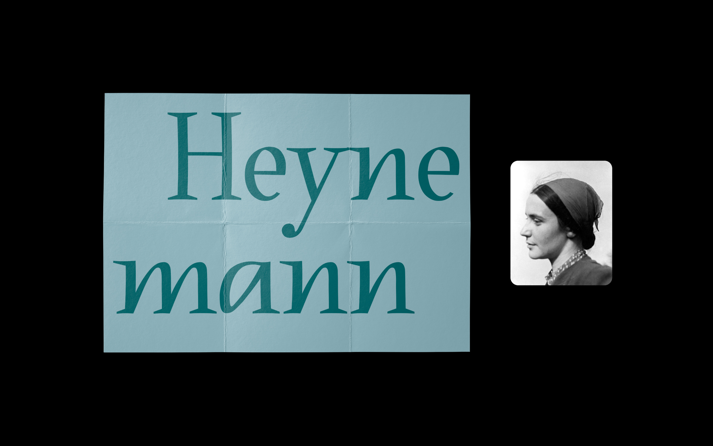
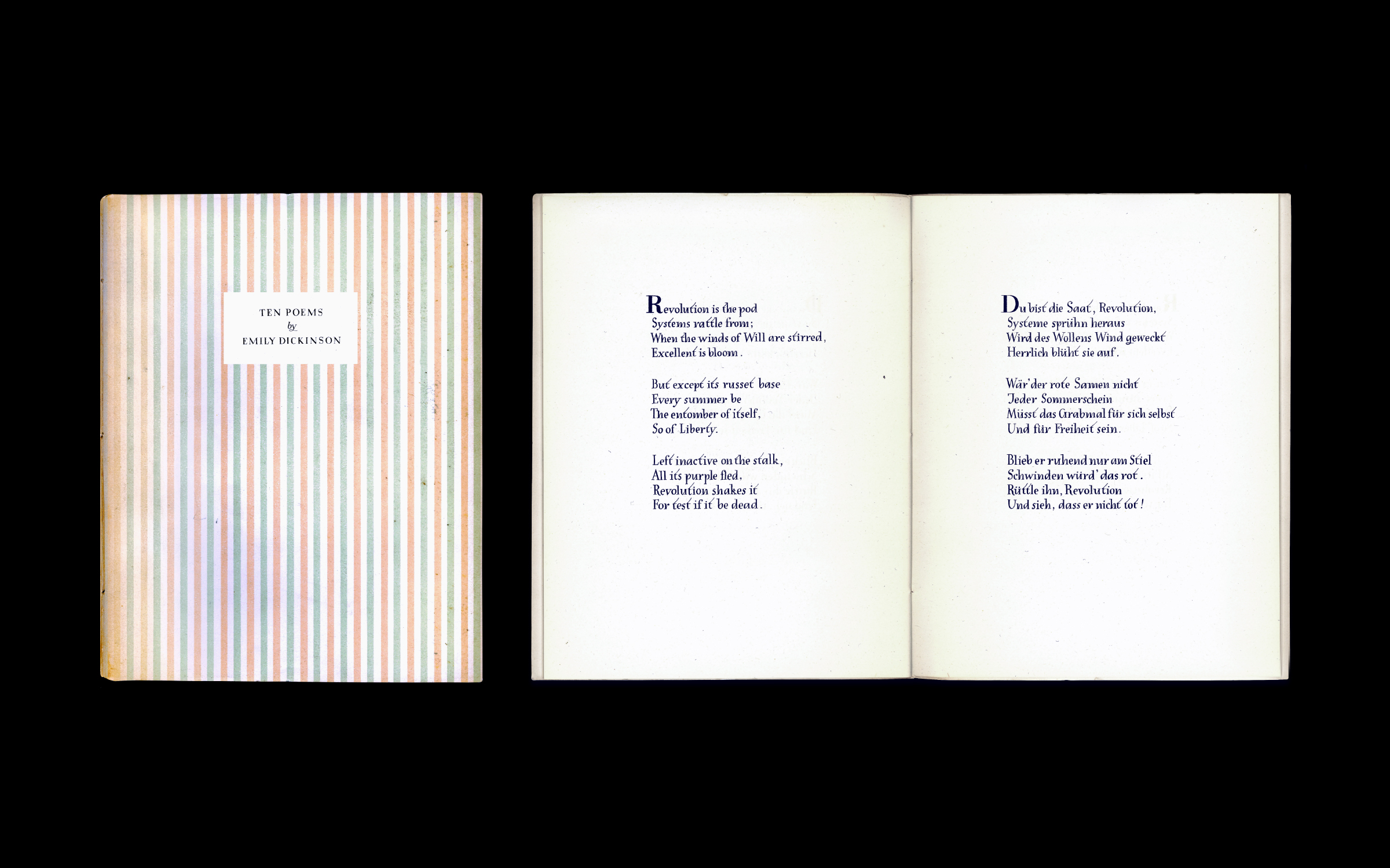
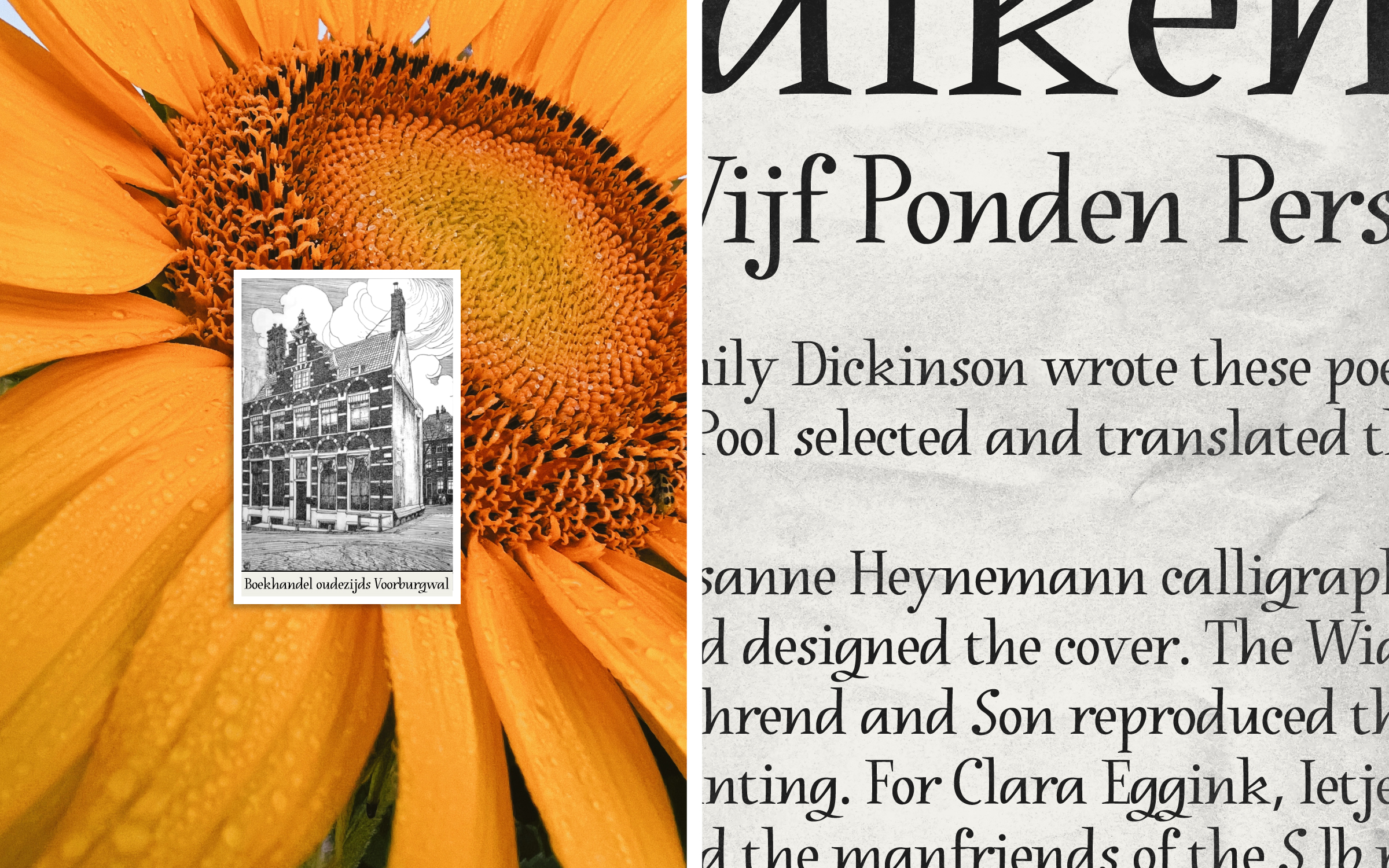
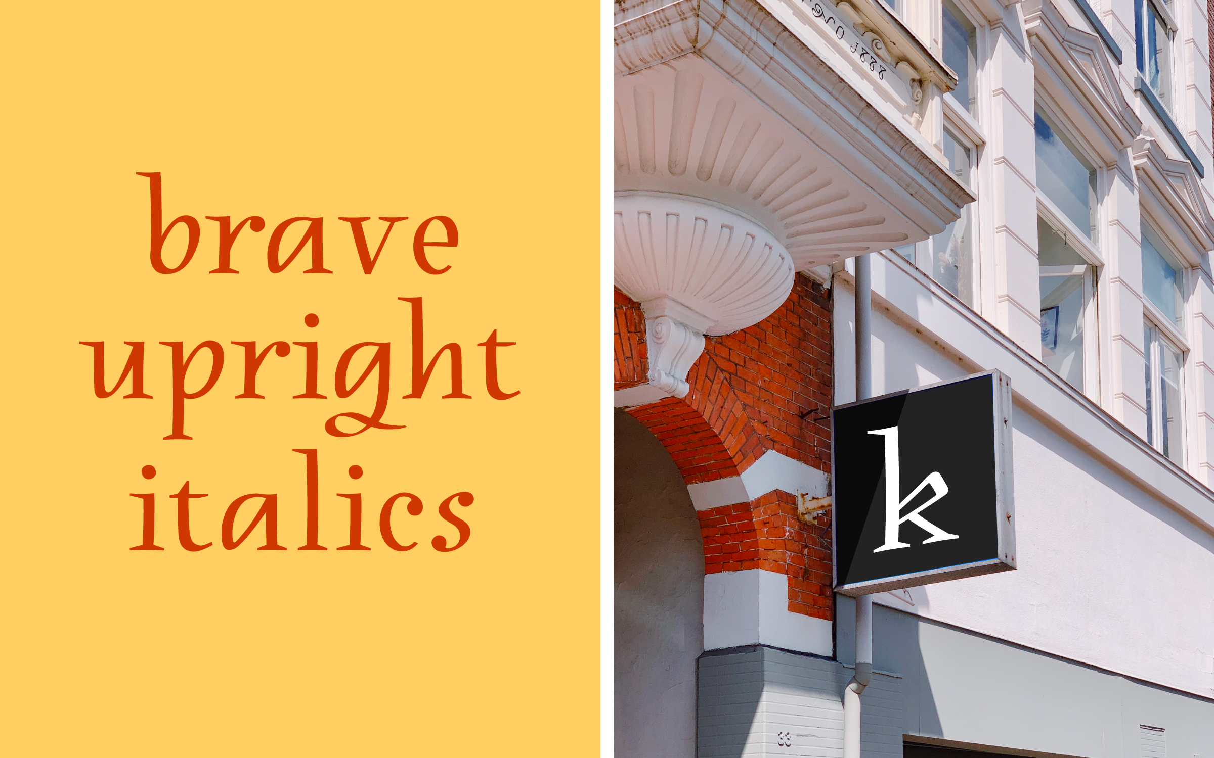
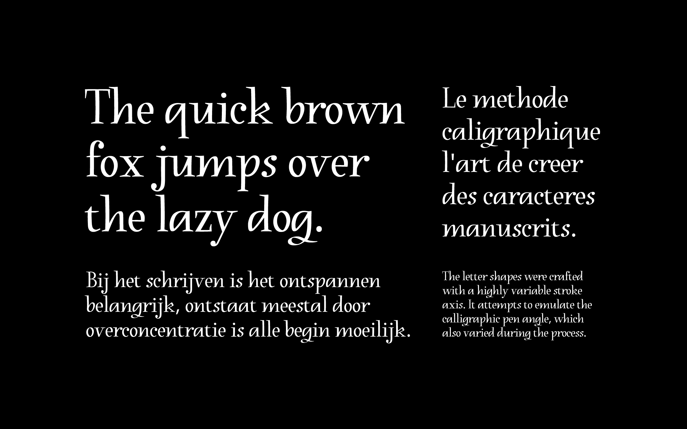
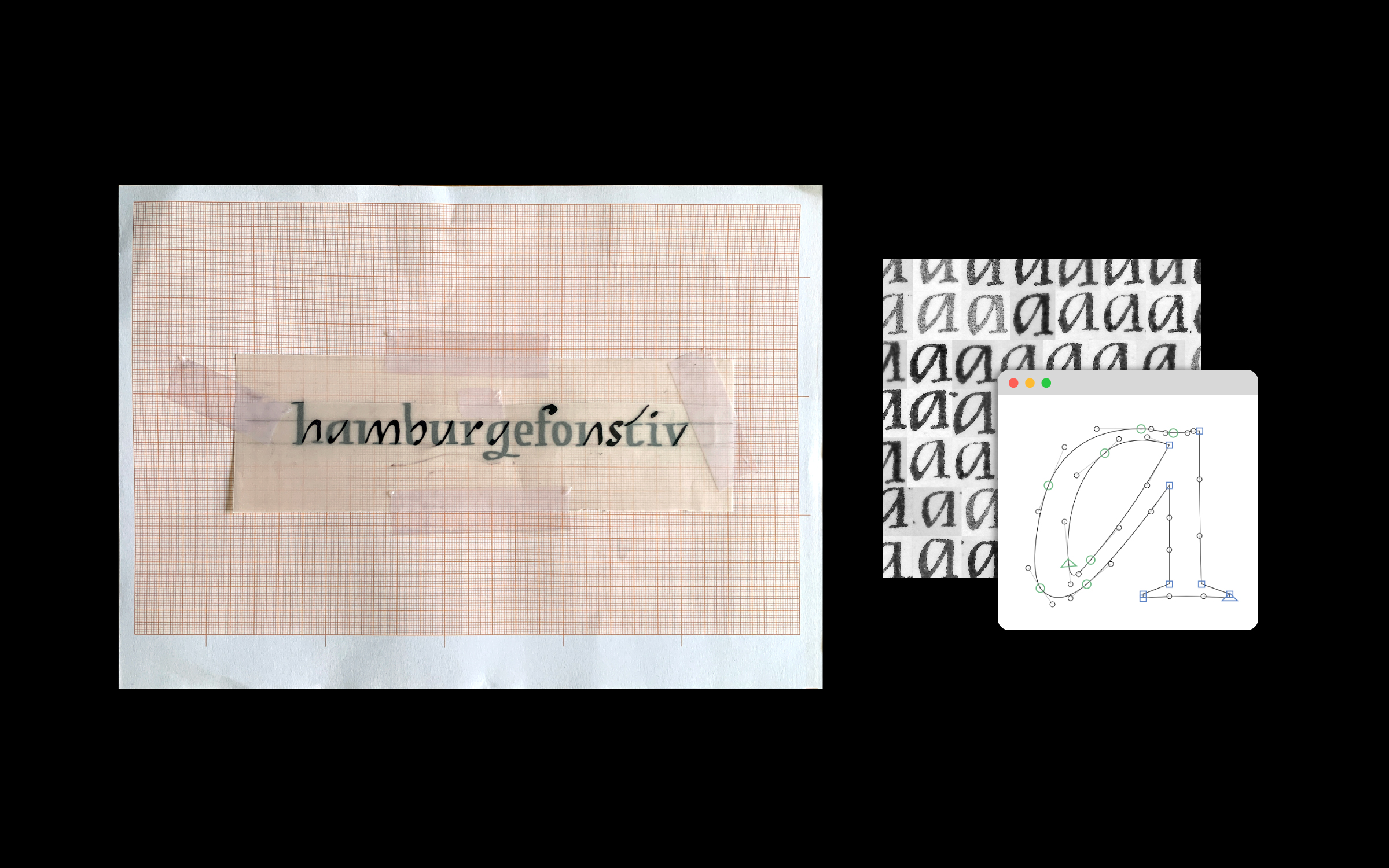
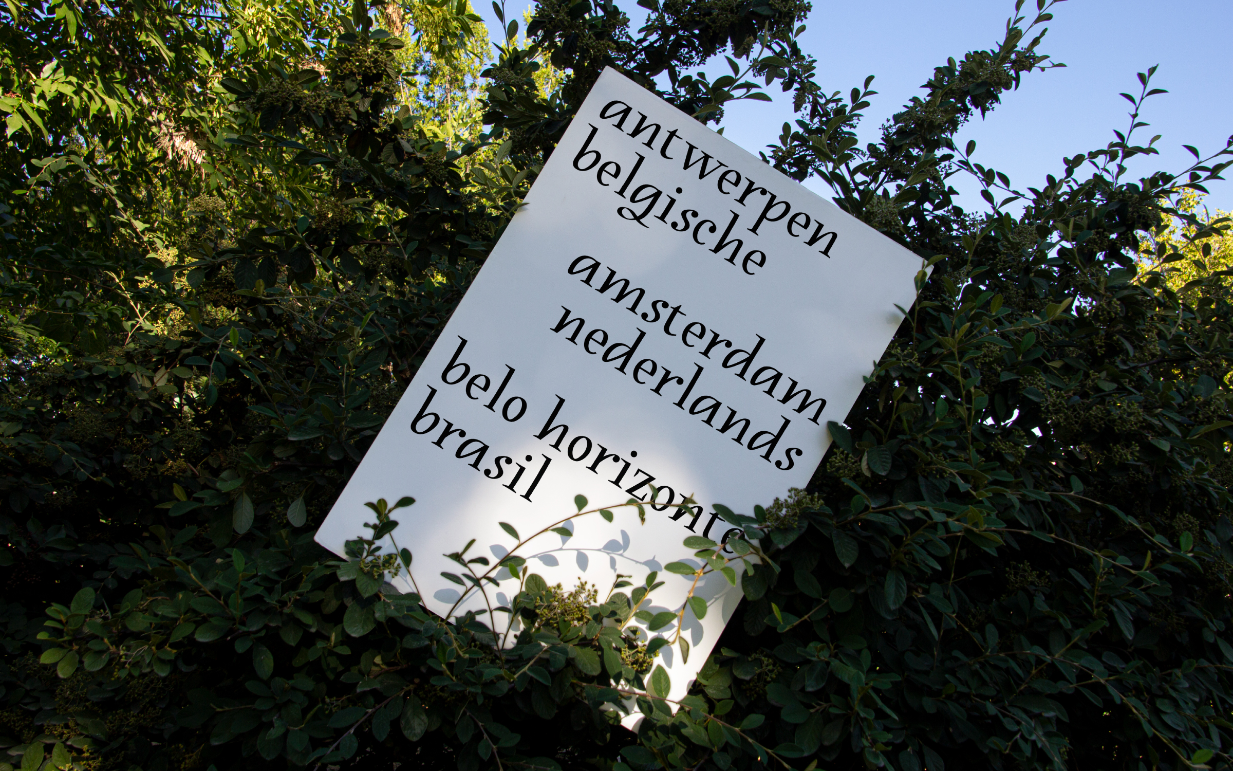
Heynemann is a typographic revival of Susanne Heynemann's (1913-2019) calligraphy for the publication "Ten Poems by Emily Dickinson". Published in 1944, the booklet was illegally printed by the Vijf Ponden Pers in nazi occupied Amsterdam. What stands out are the unique upright italics created to typeset the poems. The digital interpretation was fully standardized and crafted with a variable stroke axis emulating the broad nib angle, which varied significantly during Heynemann's handwriting process. By reproducing some of the charming anatomical features of the original, the contemporary version preserves a fresh calligraphic feel and pays homage to Susanne Heynemann's natural talent.
The result of a year-long research project, this typeface was conceived in the Expert class Type design 2021–22 at the Plantin Institute of Typography, under the supervision of Frank E. Blokland. The institute is hosted inside the Museum Plantin-Moretus, the foremost printing-publishing house of the 16th century, and a UNESCO World Heritage site.
In Plantin's footsteps ︎︎︎, Aug-Sep 2022
Museum Plantin-Moretus, Antwerp, Belgium
Heynemann is a typographic revival of Susanne Heynemann's (1913-2019) calligraphy for the publication "Ten Poems by Emily Dickinson". Published in 1944, the booklet was illegally printed by the Vijf Ponden Pers in nazi occupied Amsterdam. What stands out are the unique upright italics created to typeset the poems. The digital interpretation was fully standardized and crafted with a variable stroke axis emulating the broad nib angle, which varied significantly during Heynemann's handwriting process. By reproducing some of the charming anatomical features of the original, the contemporary version preserves a fresh calligraphic feel and pays homage to Susanne Heynemann's natural talent.
The result of a year-long research project, this typeface was conceived in the Expert class Type design 2021–22 at the Plantin Institute of Typography, under the supervision of Frank E. Blokland. The institute is hosted inside the Museum Plantin-Moretus, the foremost printing-publishing house of the 16th century, and a UNESCO World Heritage site.
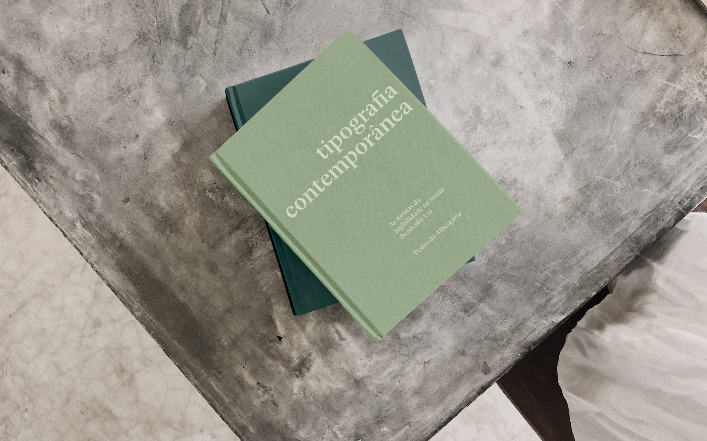
“Tipografia Contemporânea: As formas da legibilidade no ínicio do século
XXI”
is the bachelor
dissertation presented at the Federal University of Minas Gerais for my degree
in Social Communication. It was an investigation into the history and
contemporary aspects of typography. I used this opportunity to deepen my
knowledge of the history, principles, and discussions on type design. The
editorial project for this dissertation was my first attempt at designing a
book.
16 × 25 cm
80 pages
16 × 25 cm
80 pages
“Une
Expérimentation Typographique” is a video made as a creative experiment for the
Animation et Créativité course at Université du Québec à Montréal (UQAM). The
idea behind this project is to find the tracing of letters in Montreal’s public
spaces.
Music: The Suburbs (Arcade Fire Cover) by Mr. Little Jeans
Music: The Suburbs (Arcade Fire Cover) by Mr. Little Jeans
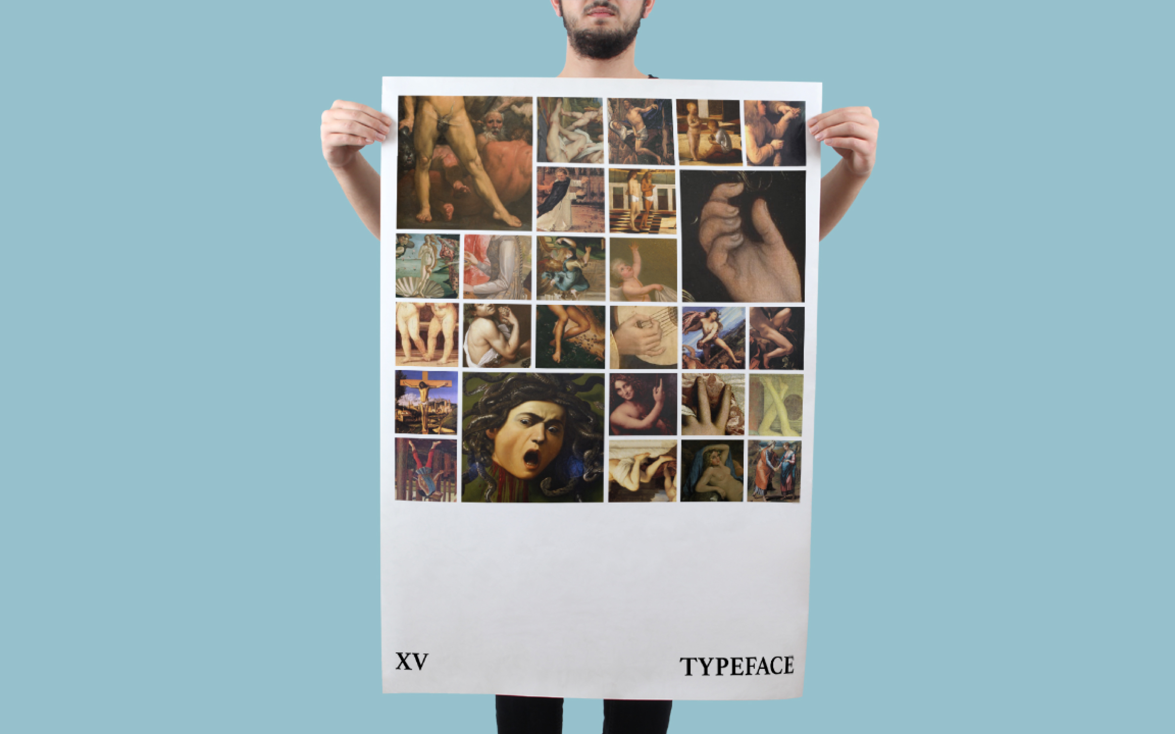
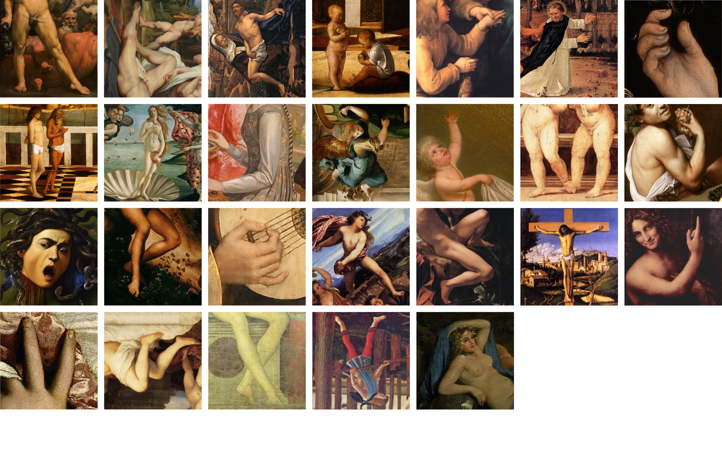
XV Typeface
was created as a practical exercise for the Elements of Visual Communication
Laboratory at the University of Minas Gerais (UFMG), Brazil. Testing the limits
of legibility, this set of letters was designed with cutouts of renaissance
paintings, where the shape of the letters was found in the movement of the
bodies portrayed.
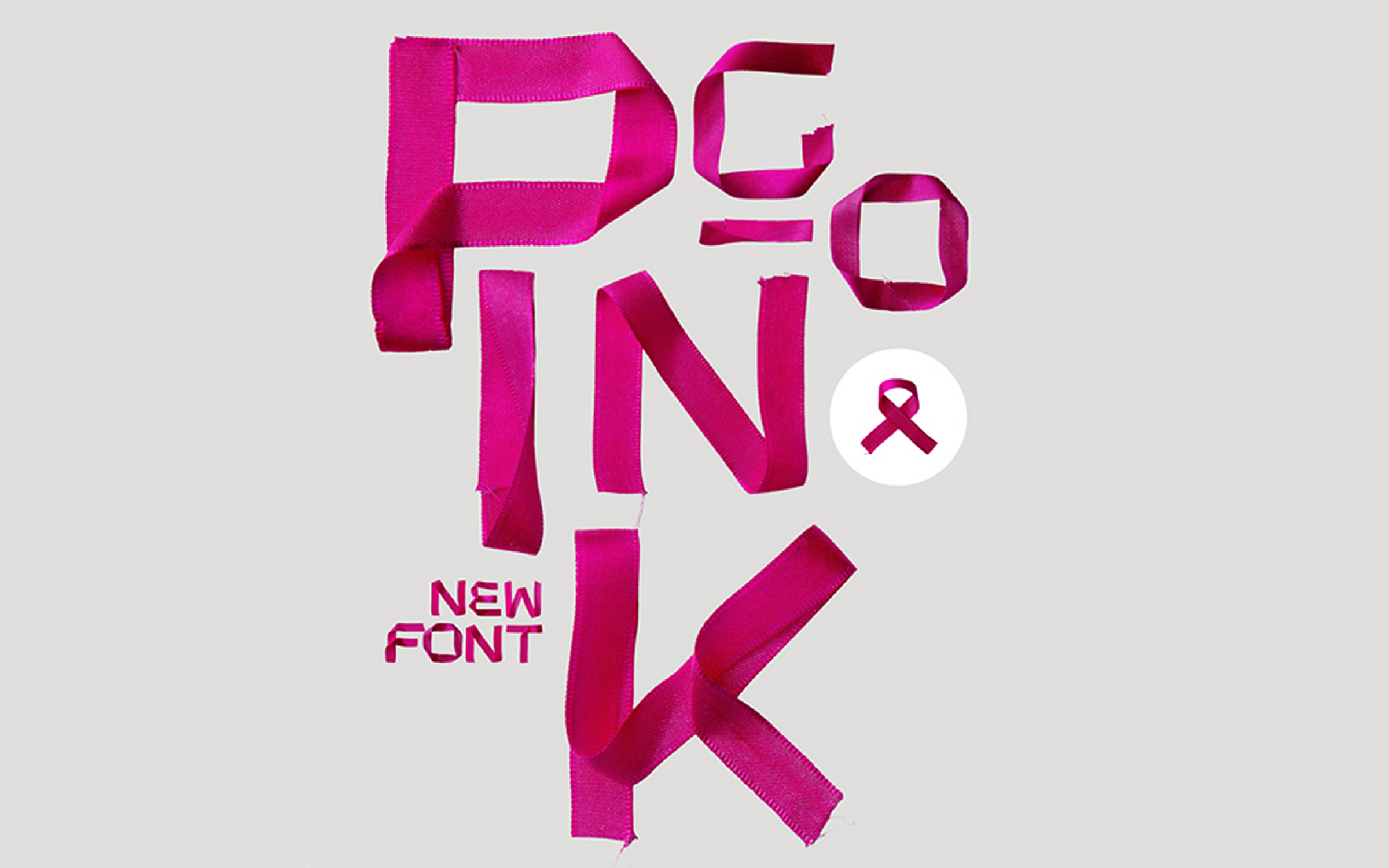
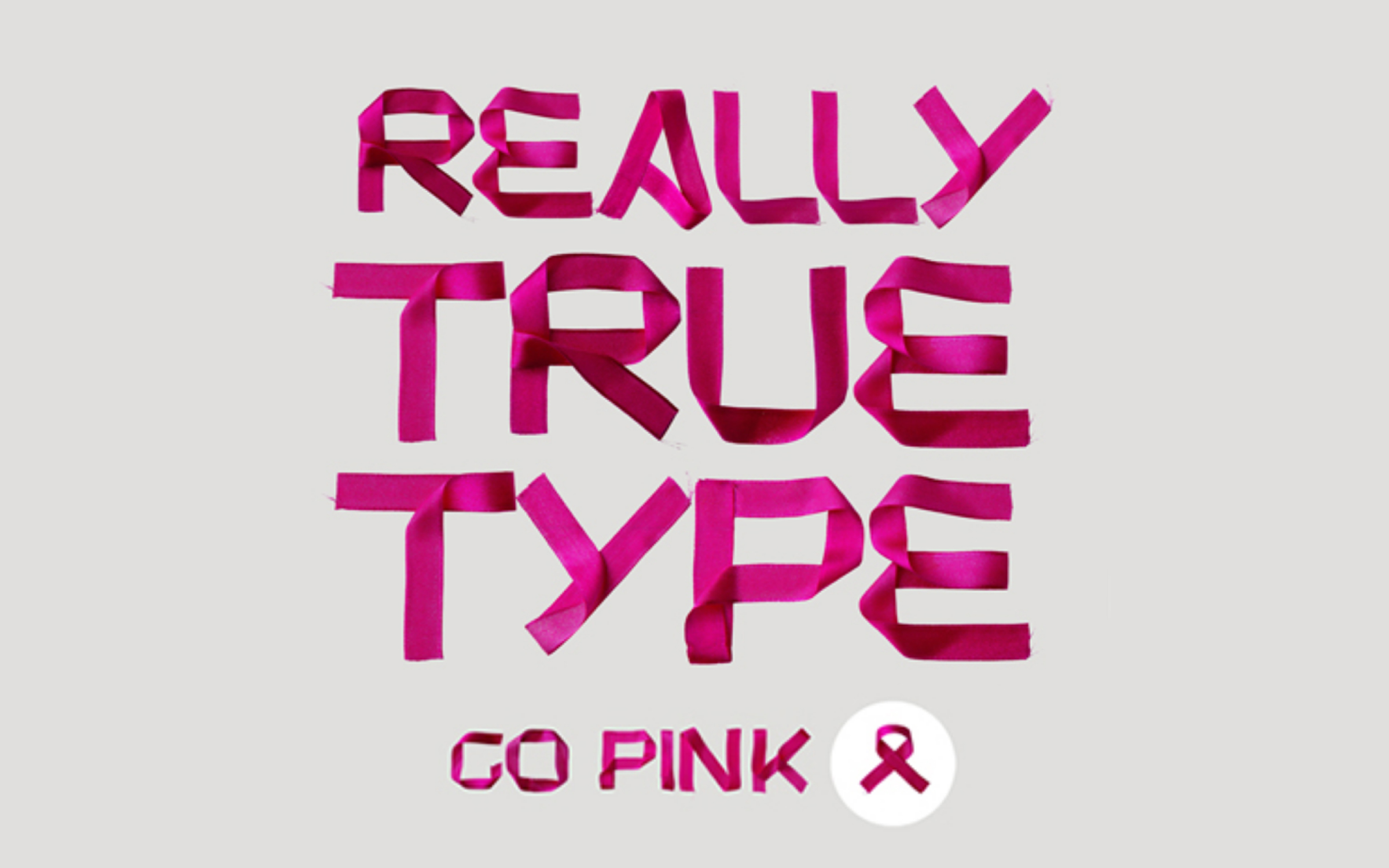
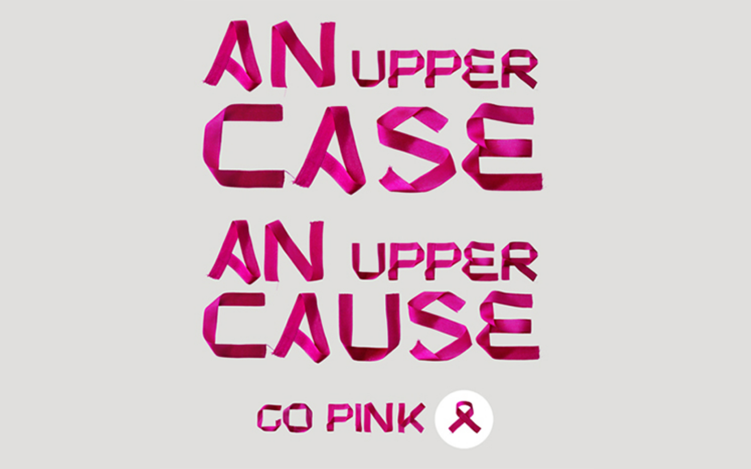
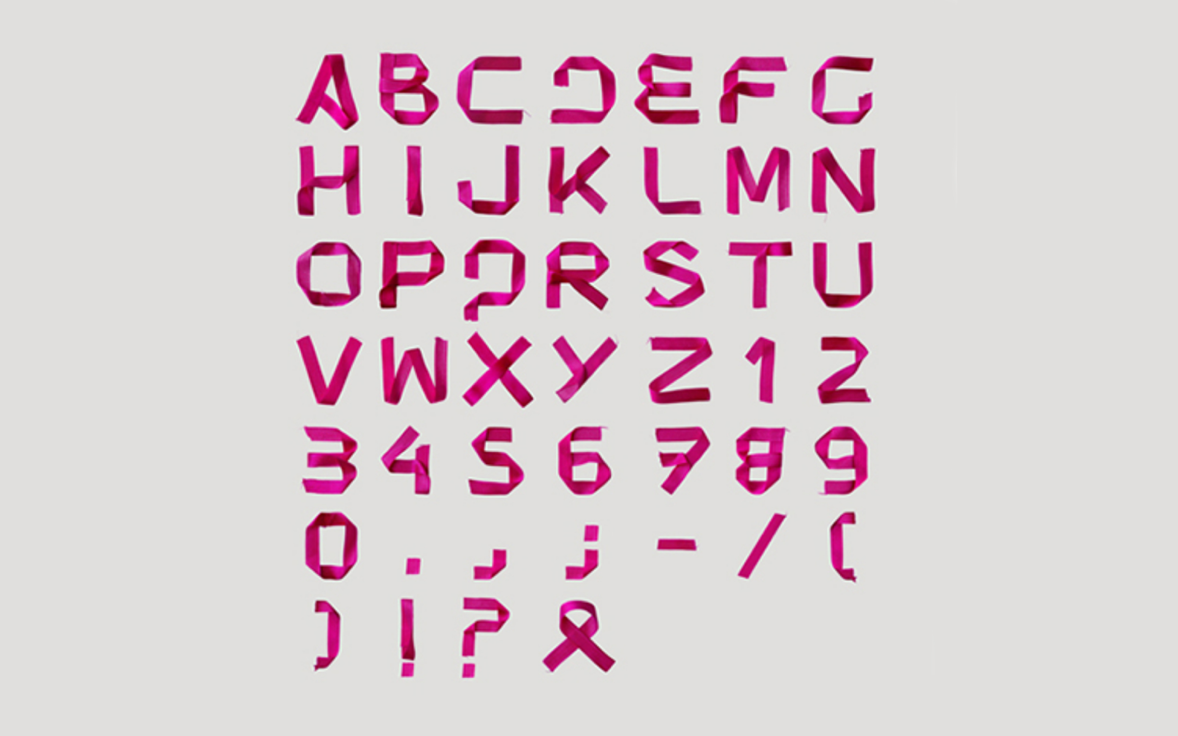
Go Pink is
a handmade layered PSD font in honor of Breast Cancer Awareness Month (BCAM) in
October 2012. The inspiration is the pink ribbon, the symbol of the movement.
RC Comunicação
Creative direction: Guilherme Araújo
Design Lead: Eduardo Araújo
Design: Pedro de Albergaria and Pedro Pinho
RC Comunicação
Creative direction: Guilherme Araújo
Design Lead: Eduardo Araújo
Design: Pedro de Albergaria and Pedro Pinho