Graphic & Type Designer
Belo Horizonte, Brazil
Belo Horizonte, Brazil
info@pedrodealbergaria.com
linked.in/pedrodealbergaria ︎︎︎
linked.in/pedrodealbergaria ︎︎︎


Exhibition
In Plantin's footsteps ︎︎︎, Aug-Sep 2022
Museum Plantin-Moretus, Antwerp, Belgium
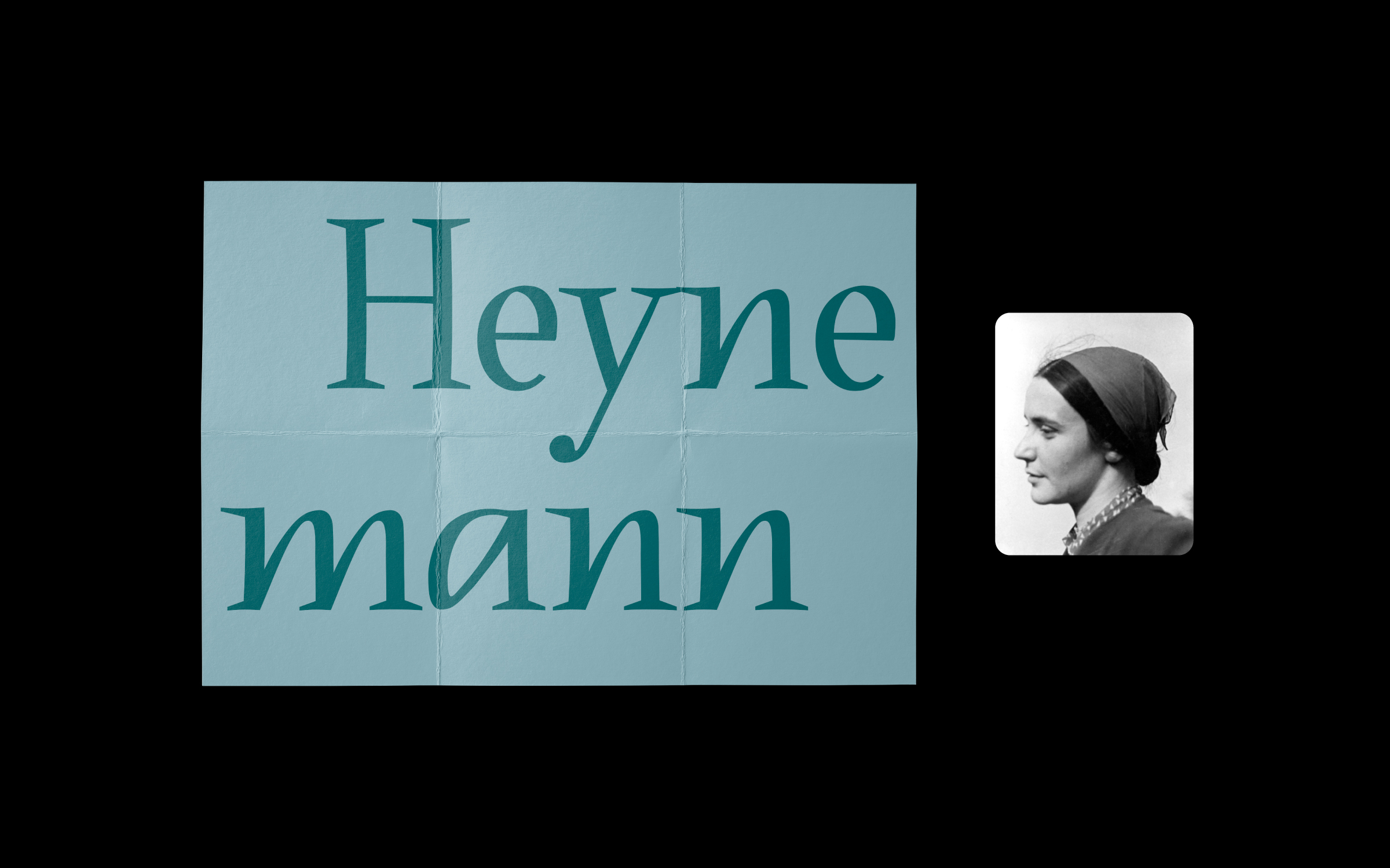
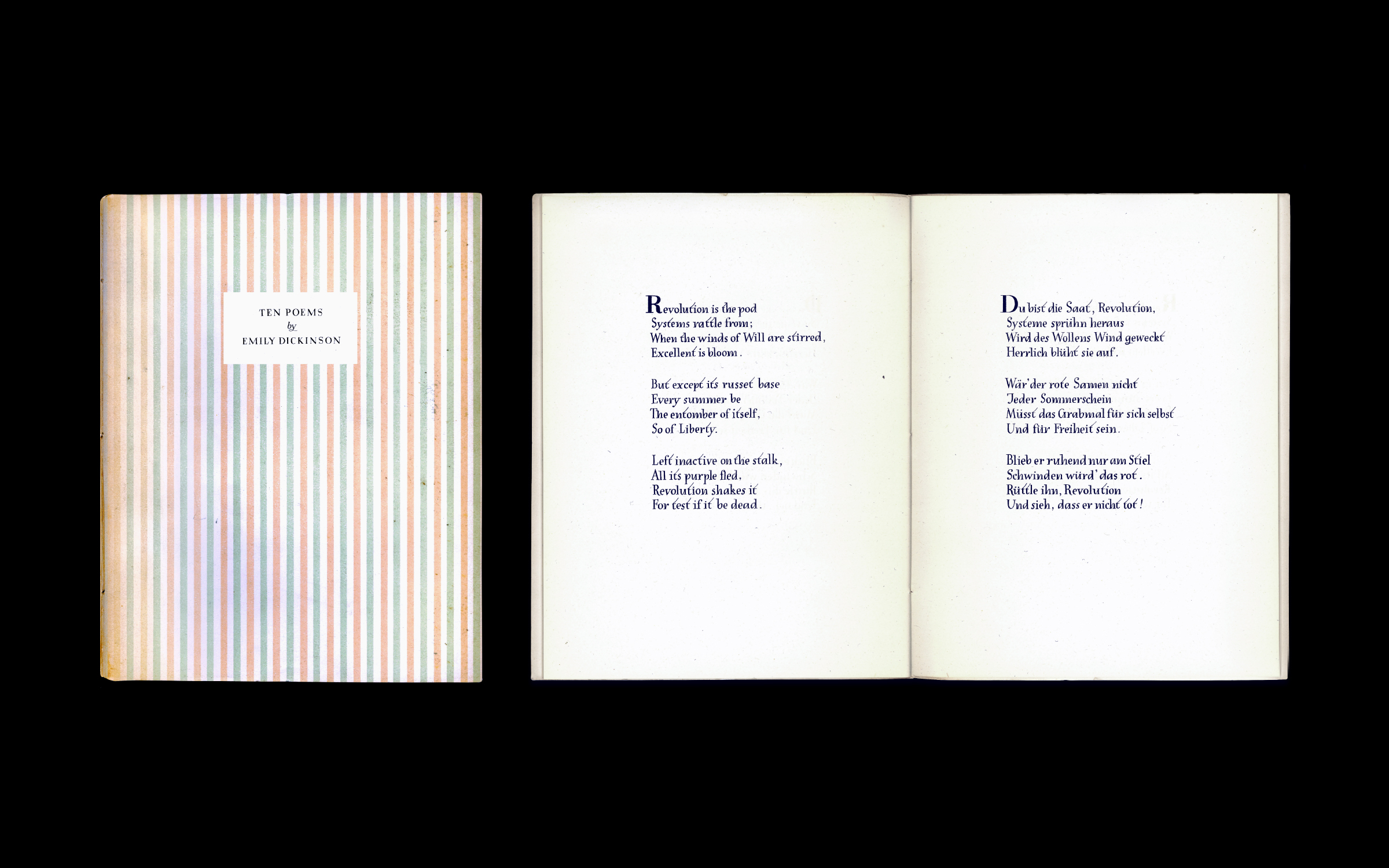
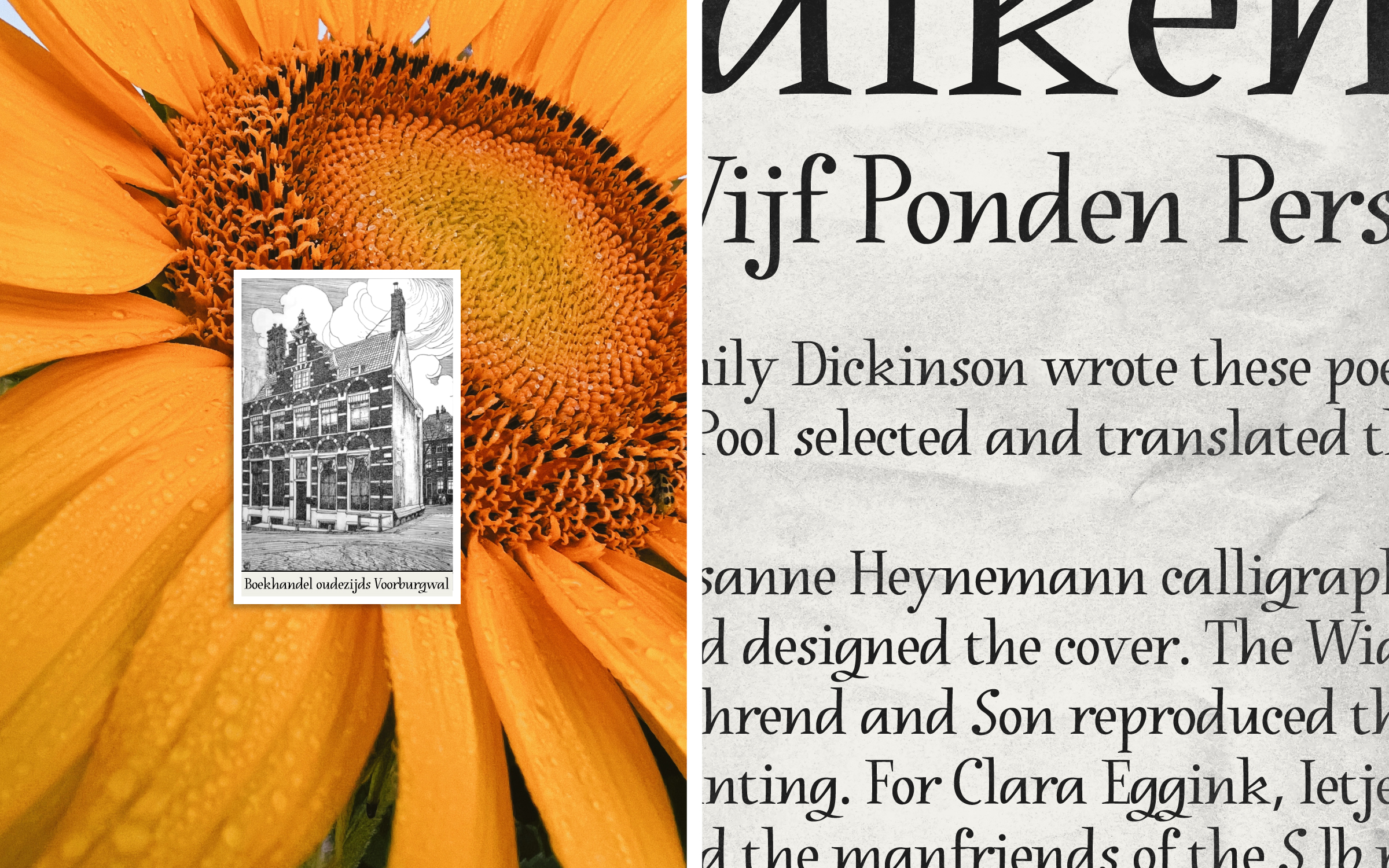
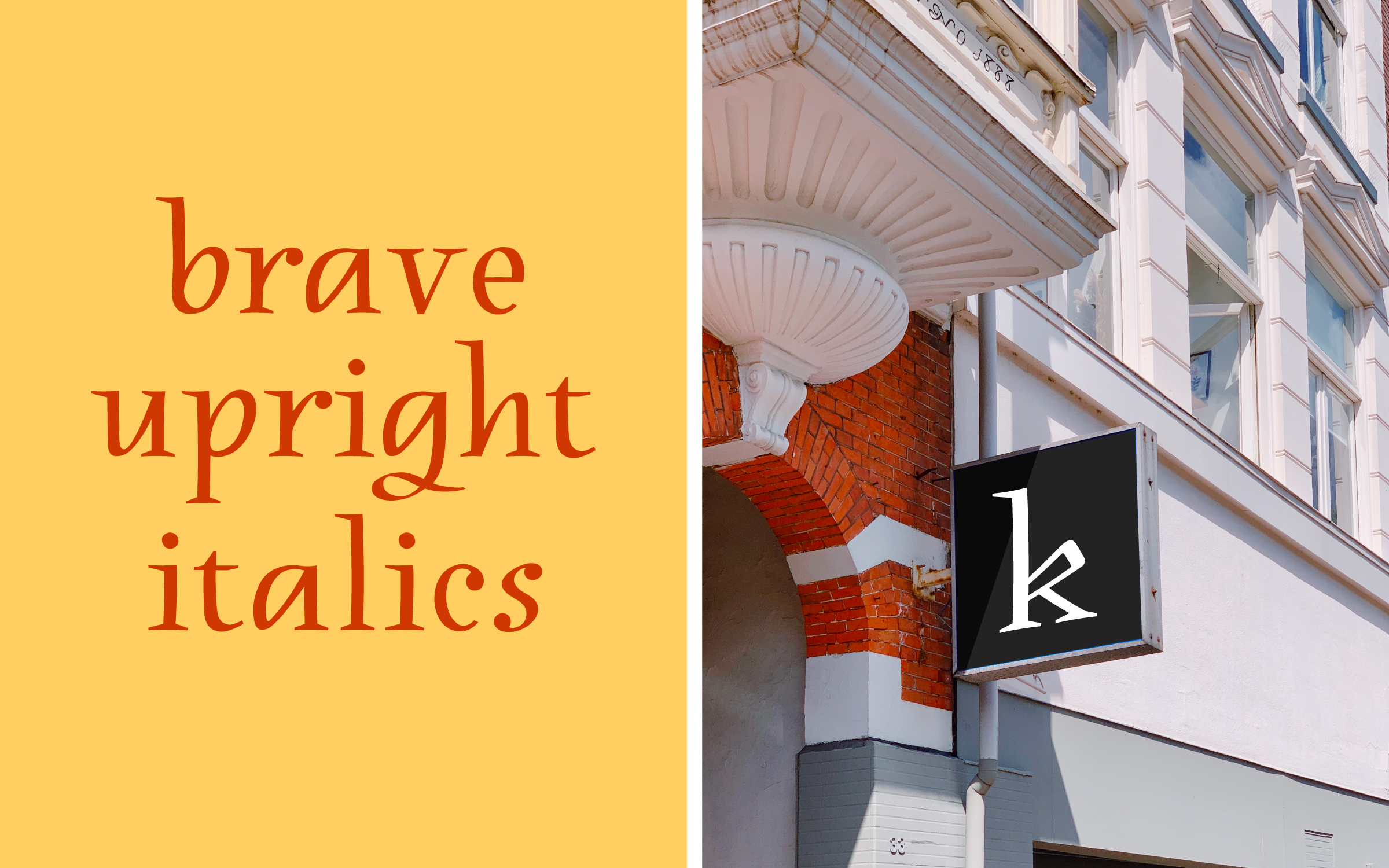
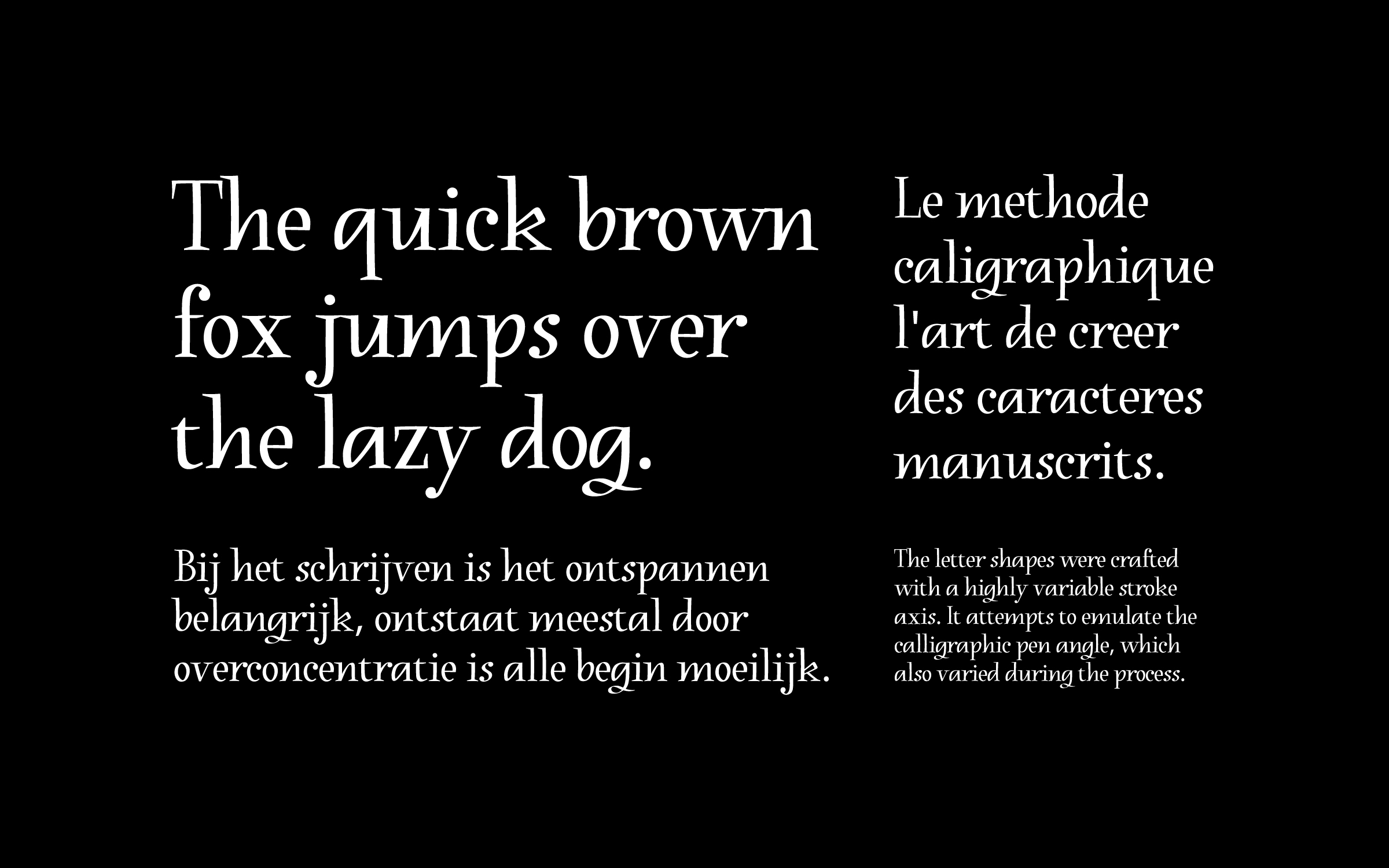
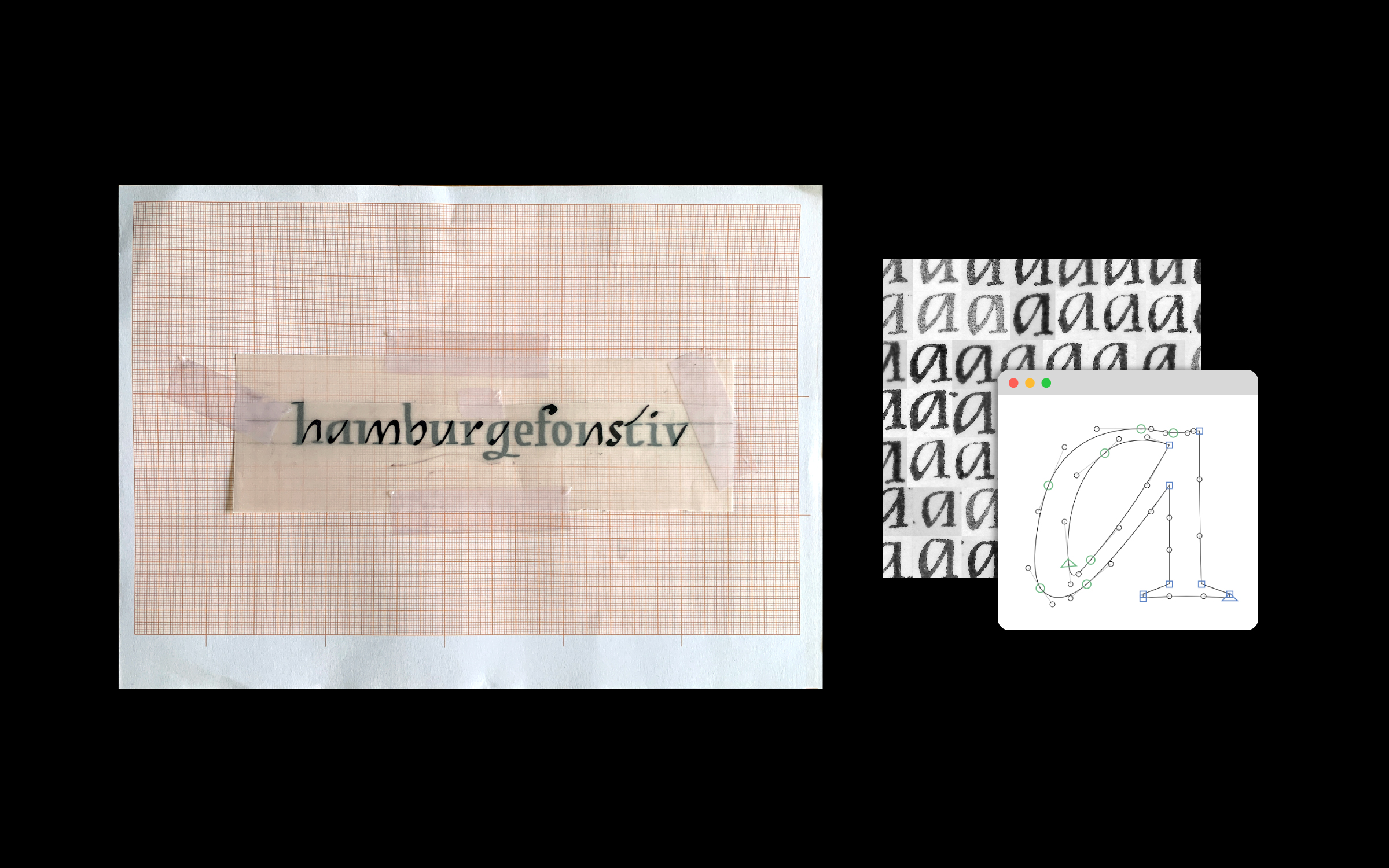
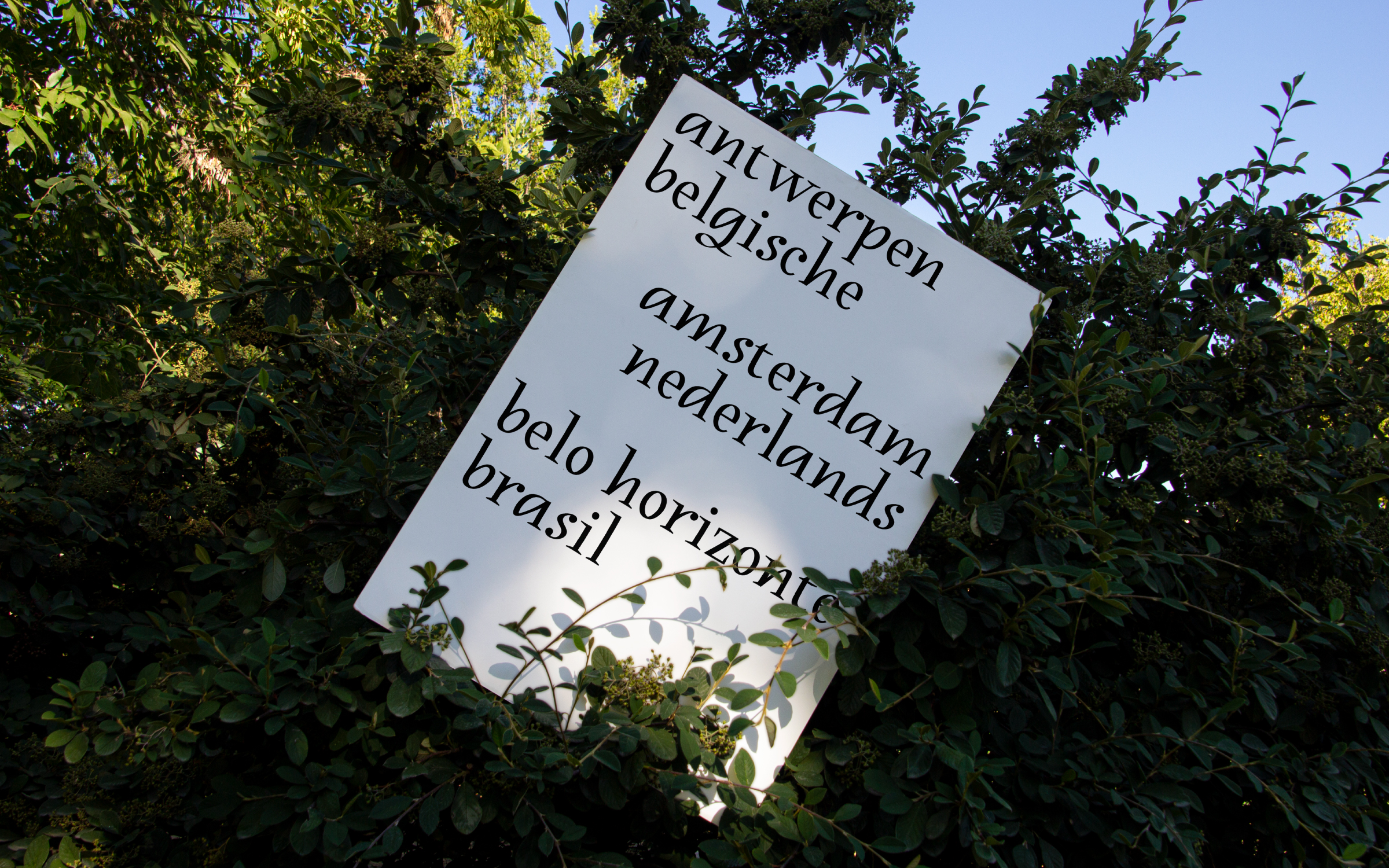
Heynemann is a typographic revival of Susanne Heynemann's (1913-2019) calligraphy for the publication "Ten Poems by Emily Dickinson". Published in 1944, the booklet was illegally printed by the Vijf Ponden Pers in nazi occupied Amsterdam. What stands out are the unique upright italics created to typeset the poems. The digital interpretation was fully standardized and crafted with a variable stroke axis emulating the broad nib angle, which varied significantly during Heynemann's handwriting process. By reproducing some of the charming anatomical features of the original, the contemporary version preserves a fresh calligraphic feel and pays homage to Susanne Heynemann's natural talent.
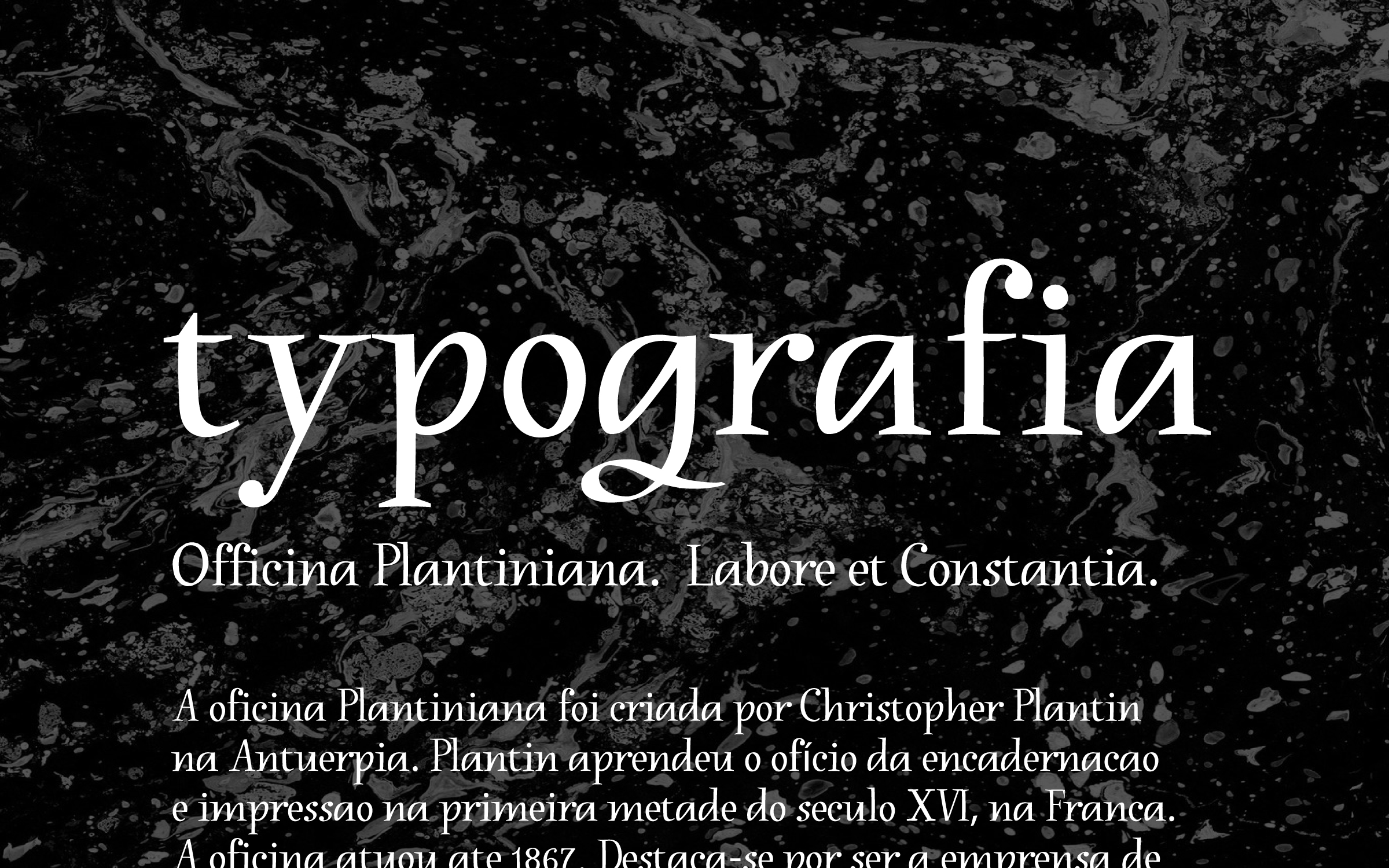
The result of a year-long research project, this typeface was conceived in the Expert class Type design 2021–22 at the Plantin Institute of Typography, under the supervision of Frank E. Blokland. The institute is hosted inside the Museum Plantin-Moretus, the foremost printing-publishing house of the 16th century, and a UNESCO World Heritage site.