Graphic & Type Designer
Belo Horizonte, Brazil
Belo Horizonte, Brazil
info@pedrodealbergaria.com
linked.in/pedrodealbergaria ︎︎︎
linked.in/pedrodealbergaria ︎︎︎
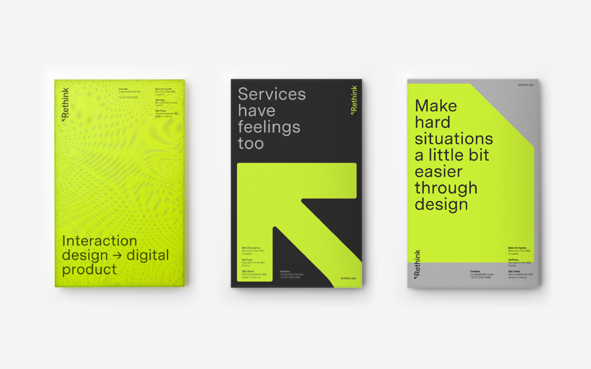
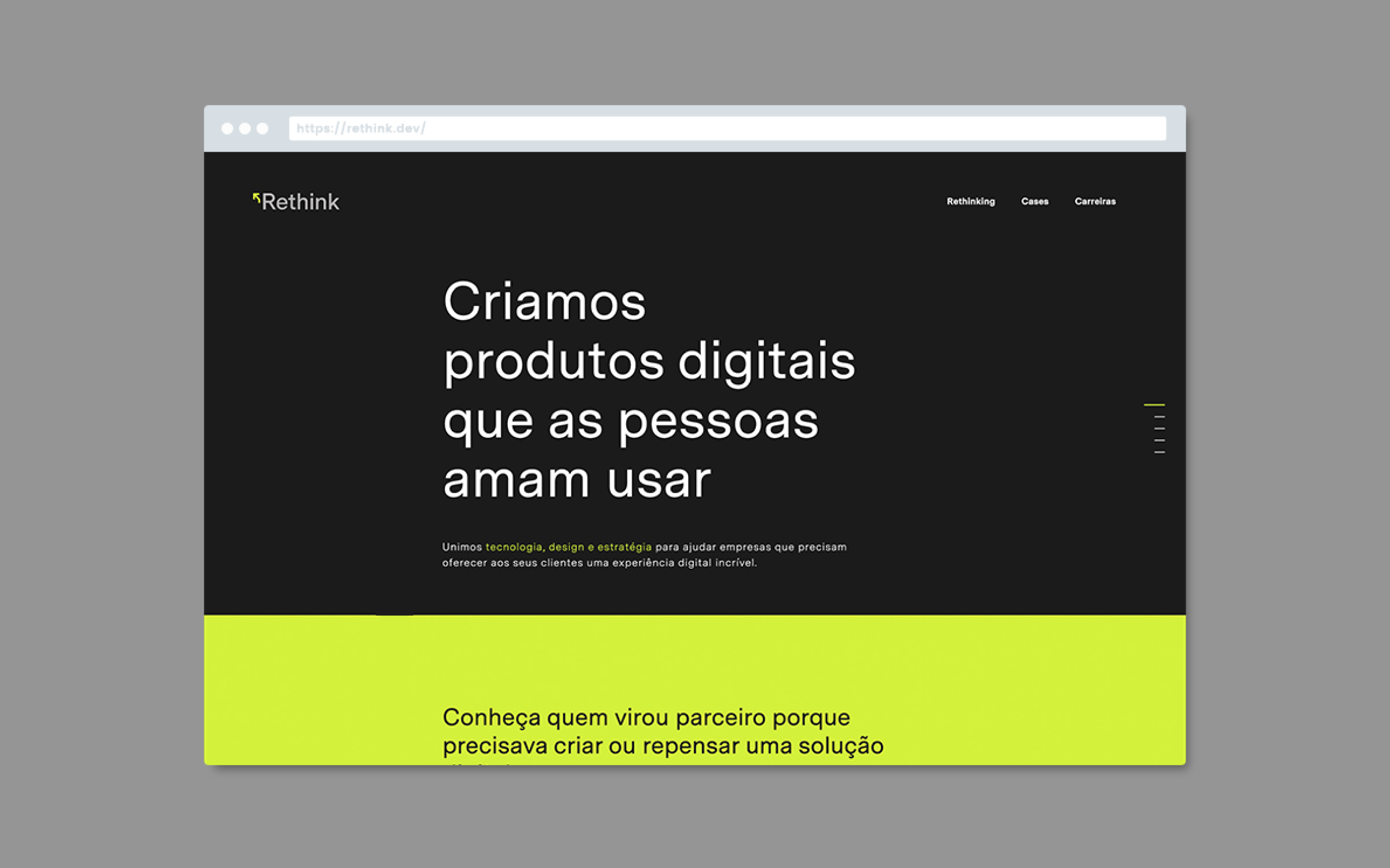
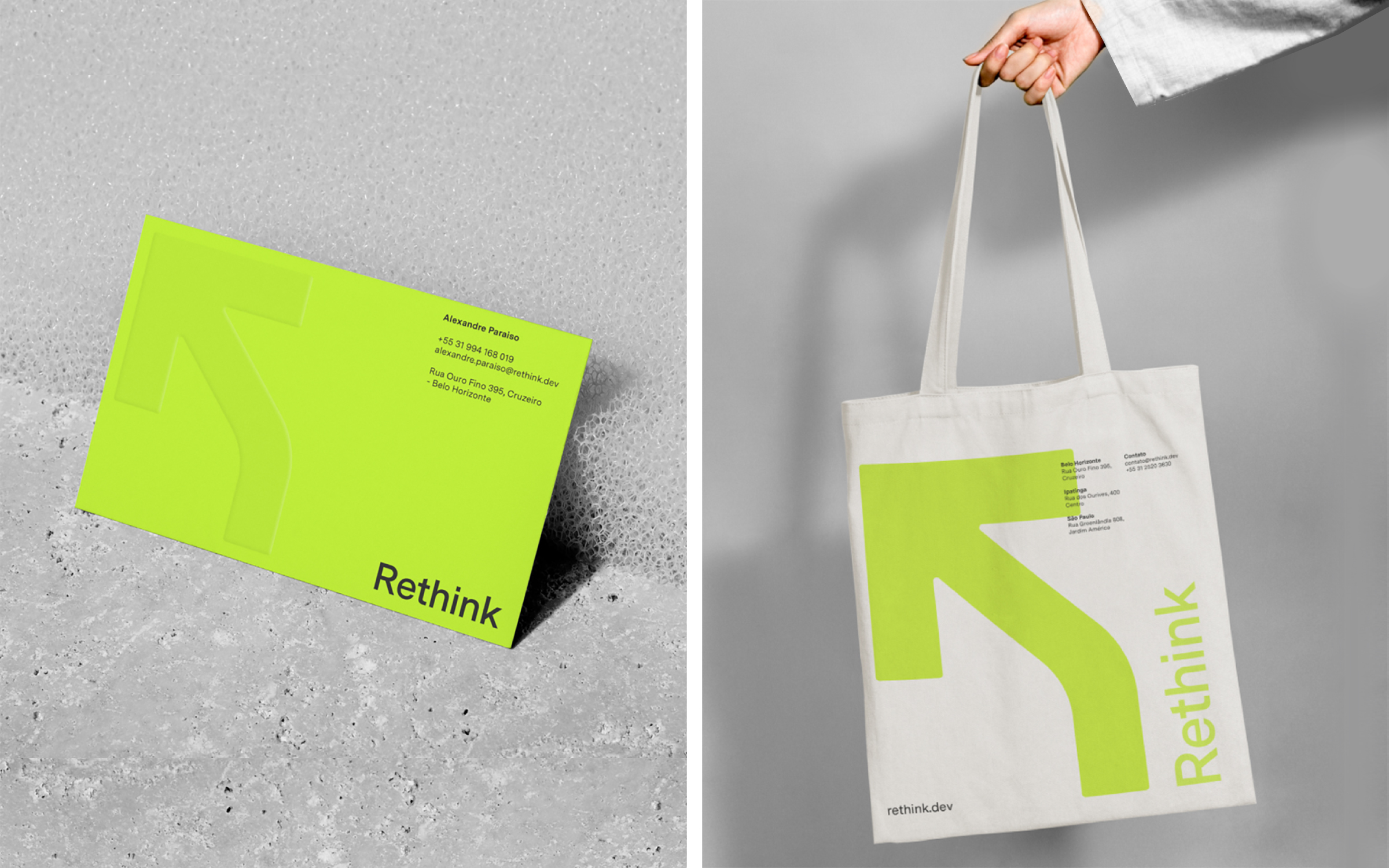
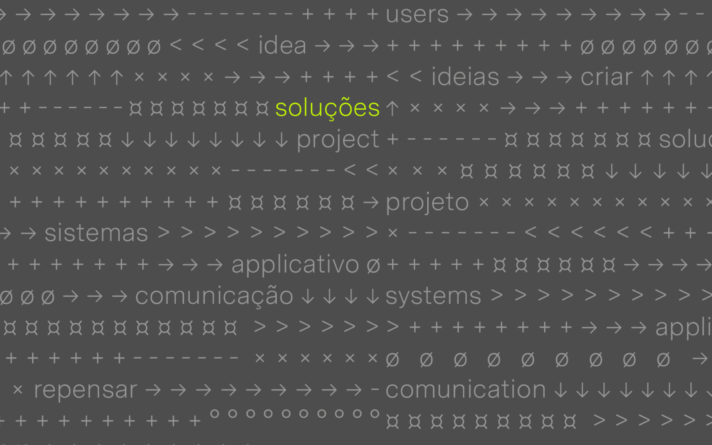
Brand identity for Rethink, a technology company that creates digital products. The new identity brings a more contemporary and fluid language that refers to the digital environment’s symbols and icons—reinforcing the idea of continuous transformation and evolution.
Hardy Design
Creative direction: Mariana Hardy
Executive direction: Cynthia Massote
Design Lead: Pedro de Albergaria
Design: Felipe Barbosa
Project Management: Marcelo Pantuzza
Hardy Design
Creative direction: Mariana Hardy
Executive direction: Cynthia Massote
Design Lead: Pedro de Albergaria
Design: Felipe Barbosa
Project Management: Marcelo Pantuzza
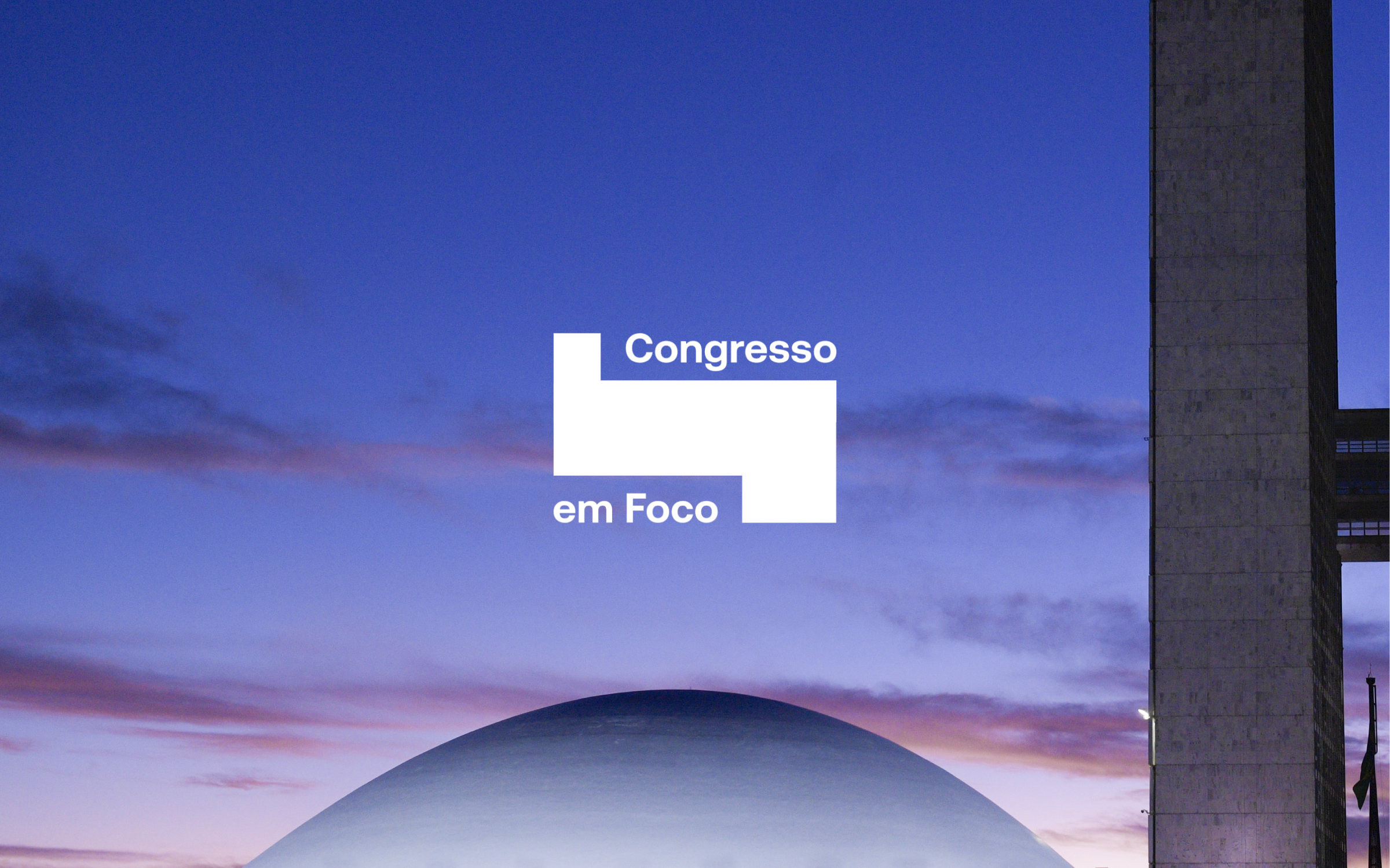

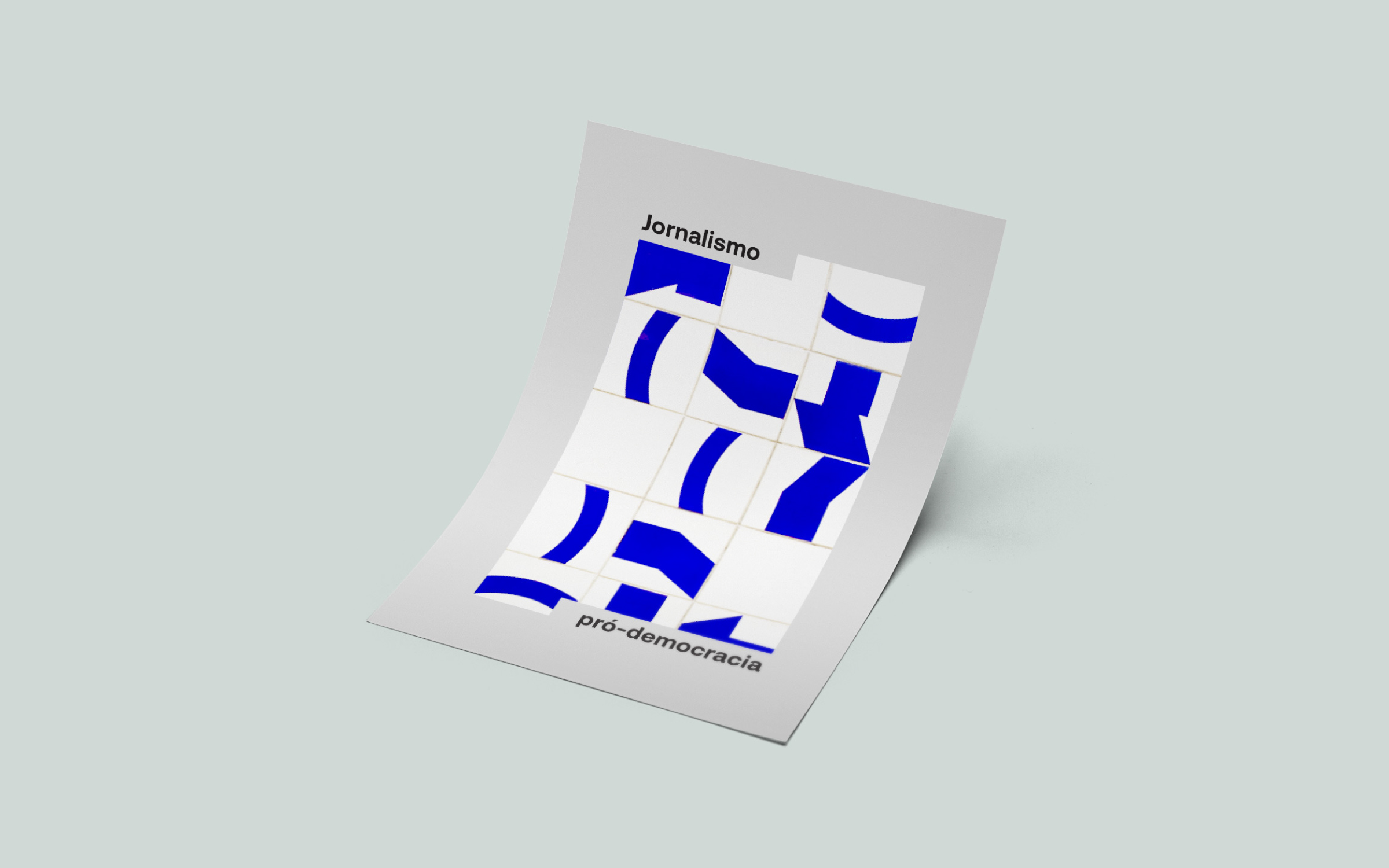
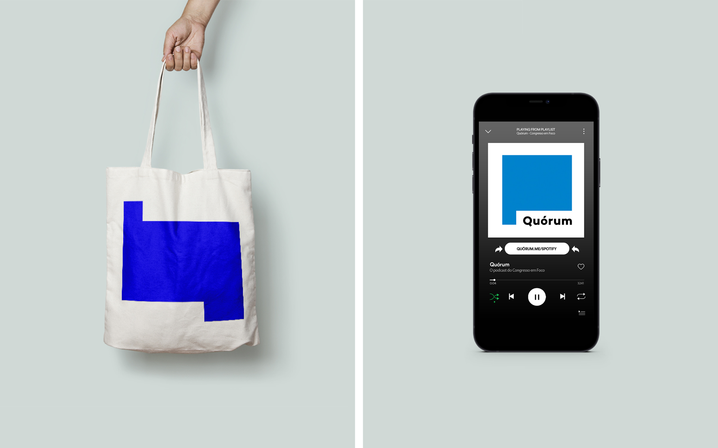
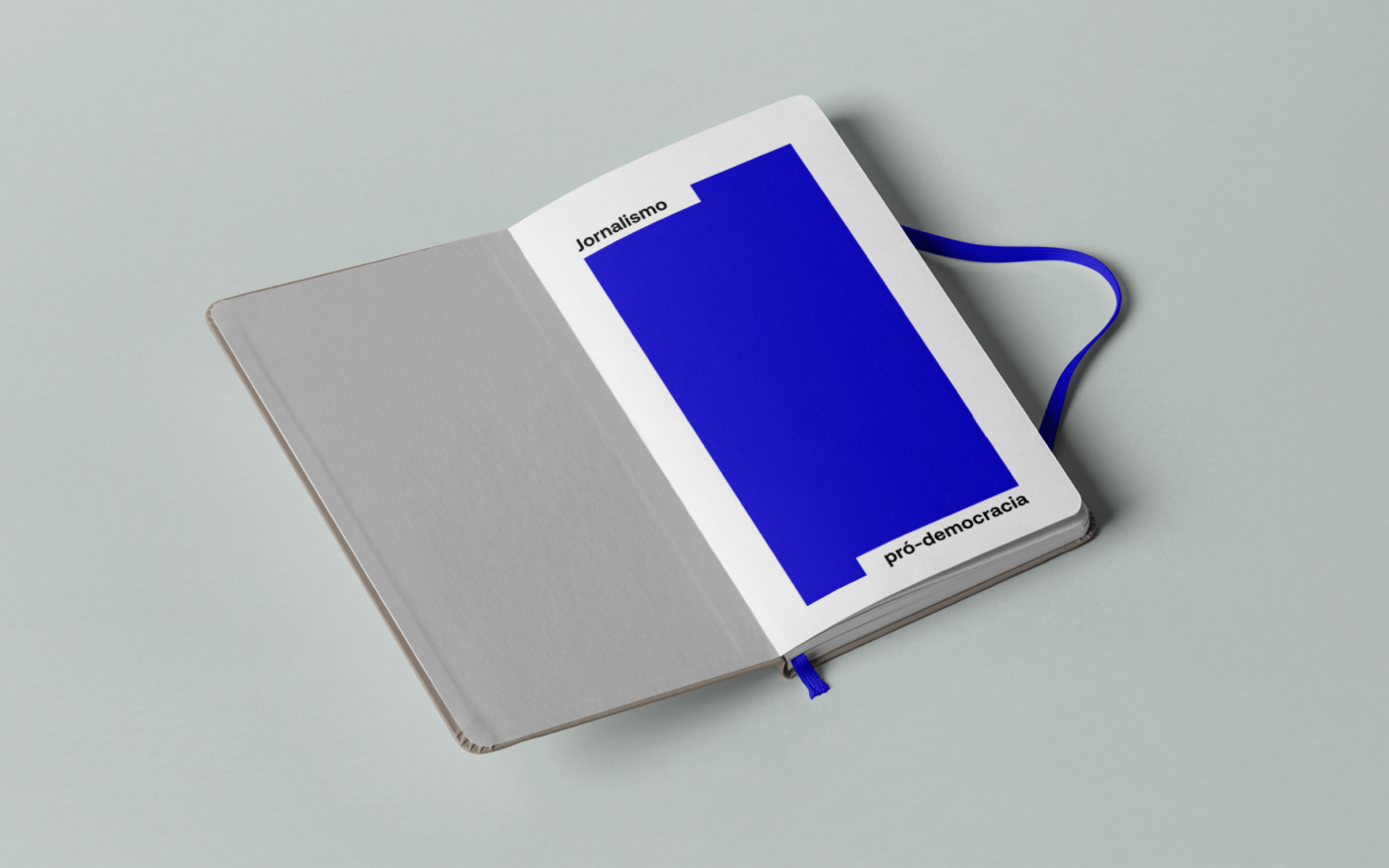
Brand
identity for Congresso em Foco, one of the leading political digital newspapers
in Brazil. It has been covering the federal legislature’s activities intensively
for 16 years. The intention was to translate its already consolidated
journalistic performance into a more contemporary and palatable language for
the digital environment. The new visual identity seeks to combine seriousness
and credibility with a fresh and versatile visual repertoire. The branding
introduces modular windows as visual resources that make up an identity system
in constant motion. With the expansion of the graphic repertoire, the
possibilities of communication on the website and social networks expand,
consolidating a recognizable language.
Congresso em Foco︎︎︎
Hardy Design
Creative Direction: Mariana Hardy
Executive Direction: Cynthia Massote
Design Lead: Pedro de Albergaria
Design: Hudson Girundi and Tobia Hallak
Project Management: Marcelo Pantuzza
Congresso em Foco︎︎︎
Hardy Design
Creative Direction: Mariana Hardy
Executive Direction: Cynthia Massote
Design Lead: Pedro de Albergaria
Design: Hudson Girundi and Tobia Hallak
Project Management: Marcelo Pantuzza


Visual
identity for Inhotim’s new online series. The solution was to find different
interpretations for the “box”, an essential element of Inhotim’s graphic
language. The motion design reflects the dynamic character creating frames,
masks, open windows for textures, movements, and images. The Retrato series was recorded
between 2011 and 2014, digitized and subtitled in 2020, and explores the
universe of artists from the museum’s collection. The Bastidores series shows
the backstage works of a museum institution and a closer look at the processes
behind contemporary art. The Diálogos series
holds discussions on art, culture, and the environment through interviews with
artists, curators, and botany specialists.
Retrato︎︎︎ Bastidores︎︎︎ Diálogos︎︎︎
Hardy Design
Creative Direction: Mariana Hardy
Executive Direction: Cynthia Massote
Design Lead: Pedro de Albergaria
Design: Hudson Girundi
Project Management: Izabela Rodrigues
Retrato︎︎︎ Bastidores︎︎︎ Diálogos︎︎︎
Hardy Design
Creative Direction: Mariana Hardy
Executive Direction: Cynthia Massote
Design Lead: Pedro de Albergaria
Design: Hudson Girundi
Project Management: Izabela Rodrigues
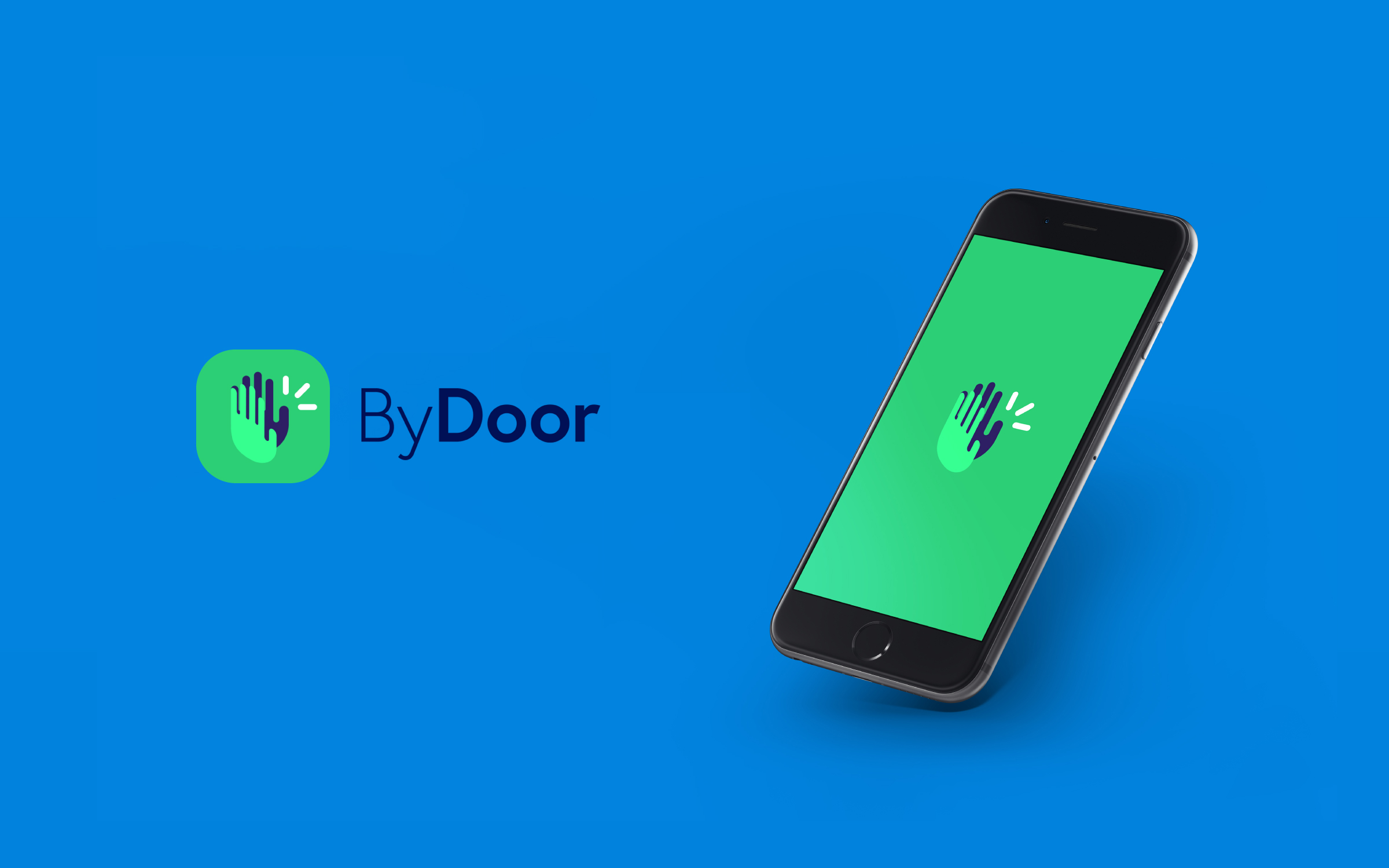

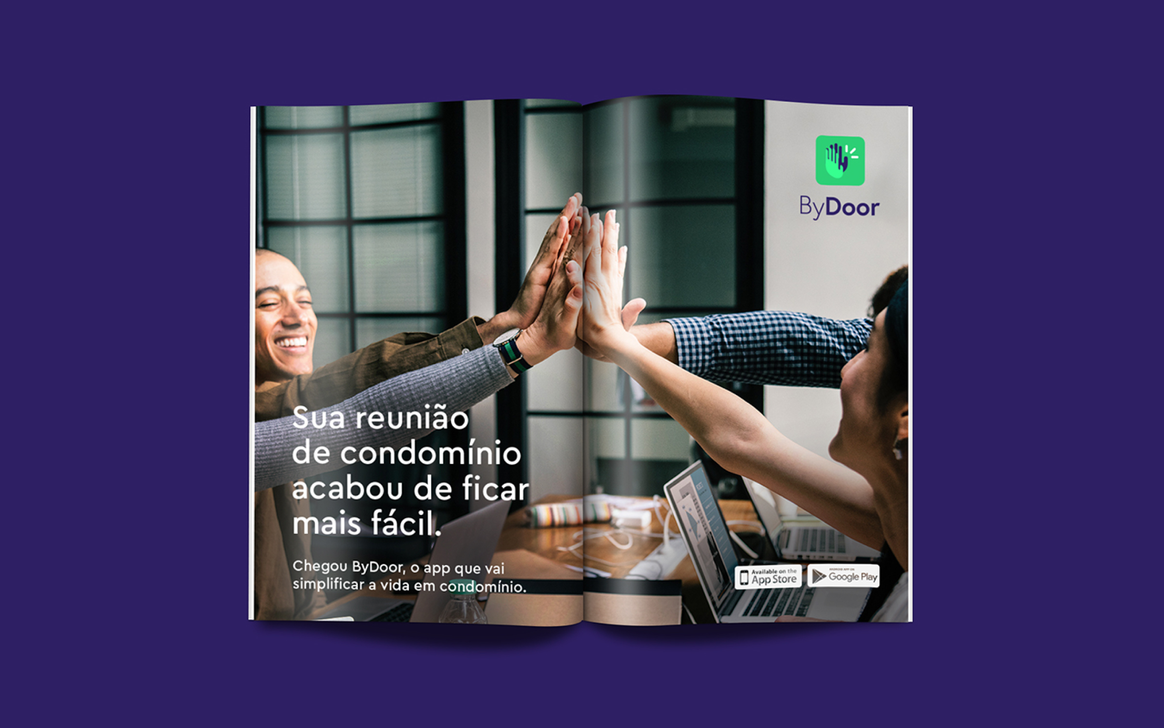
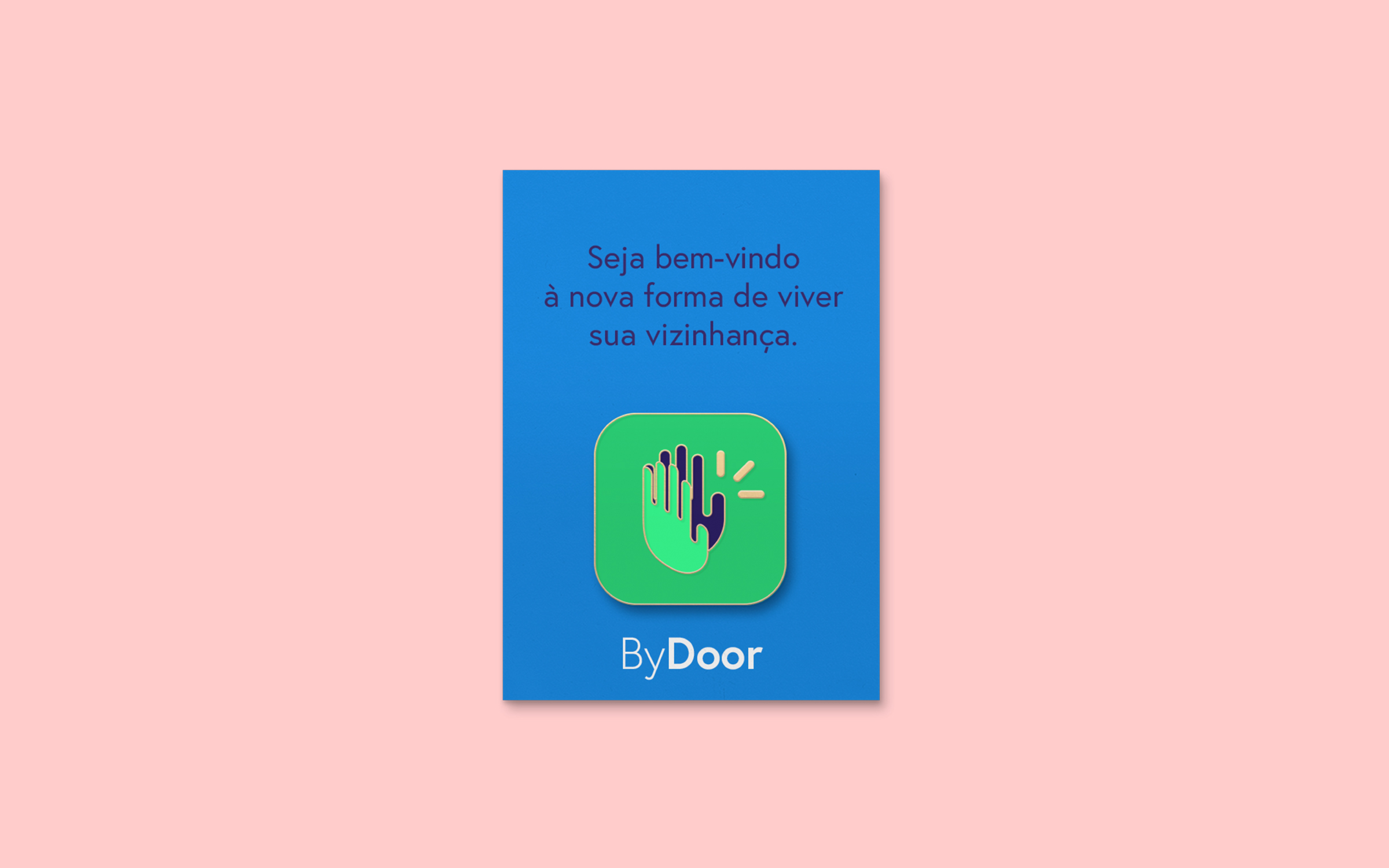
Brand
identity for By Door, an online community management app. The logo conveys the
connection between people through the touch of hands, symbolizing contemporary
social interaction, using technology to empower citizens, and creating a more
united and uncomplicated community. In addition to touching, the hands are
open, projecting and reinforcing By Door as a tool that provides access and
generates movement. The technological aspect is evident in the illustration’s
contemporary stroke, the icon’s vibrant color, and the minimalist and
accessible typographic choice.
Hardy Design
Creative Direction: Mariana Hardy
Executive Direction and Naming: Cynthia Massote
Design Lead: Délio Faleiro
Design: Pedro de Albergaria
Project Management: Marcelo Pantuzza
Hardy Design
Creative Direction: Mariana Hardy
Executive Direction and Naming: Cynthia Massote
Design Lead: Délio Faleiro
Design: Pedro de Albergaria
Project Management: Marcelo Pantuzza
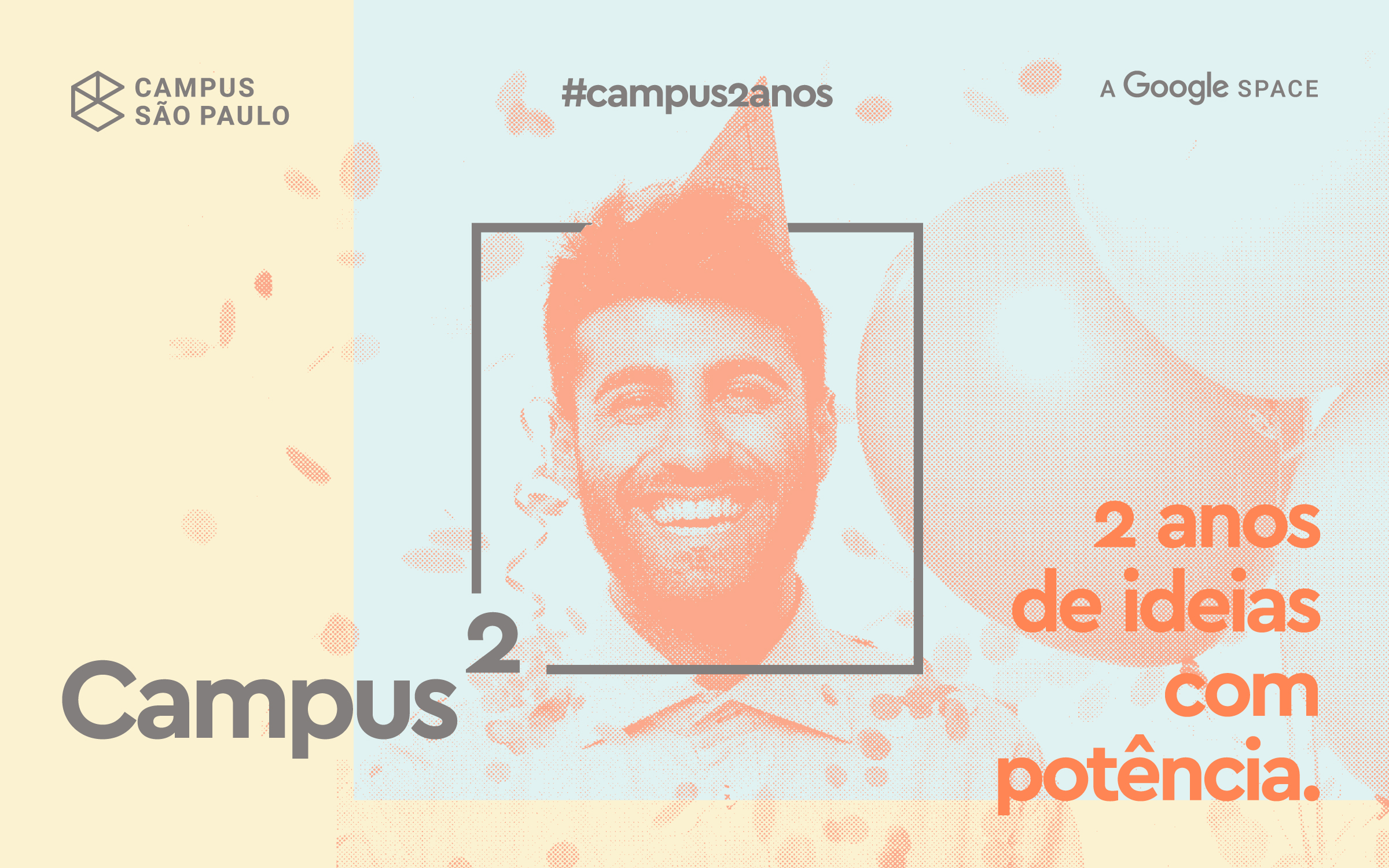
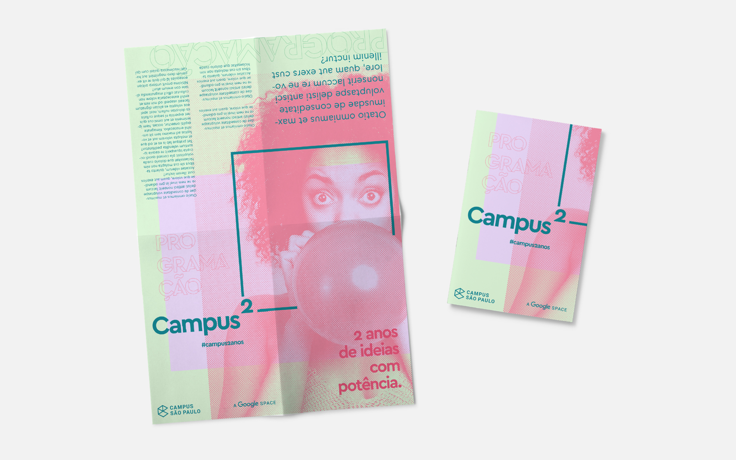
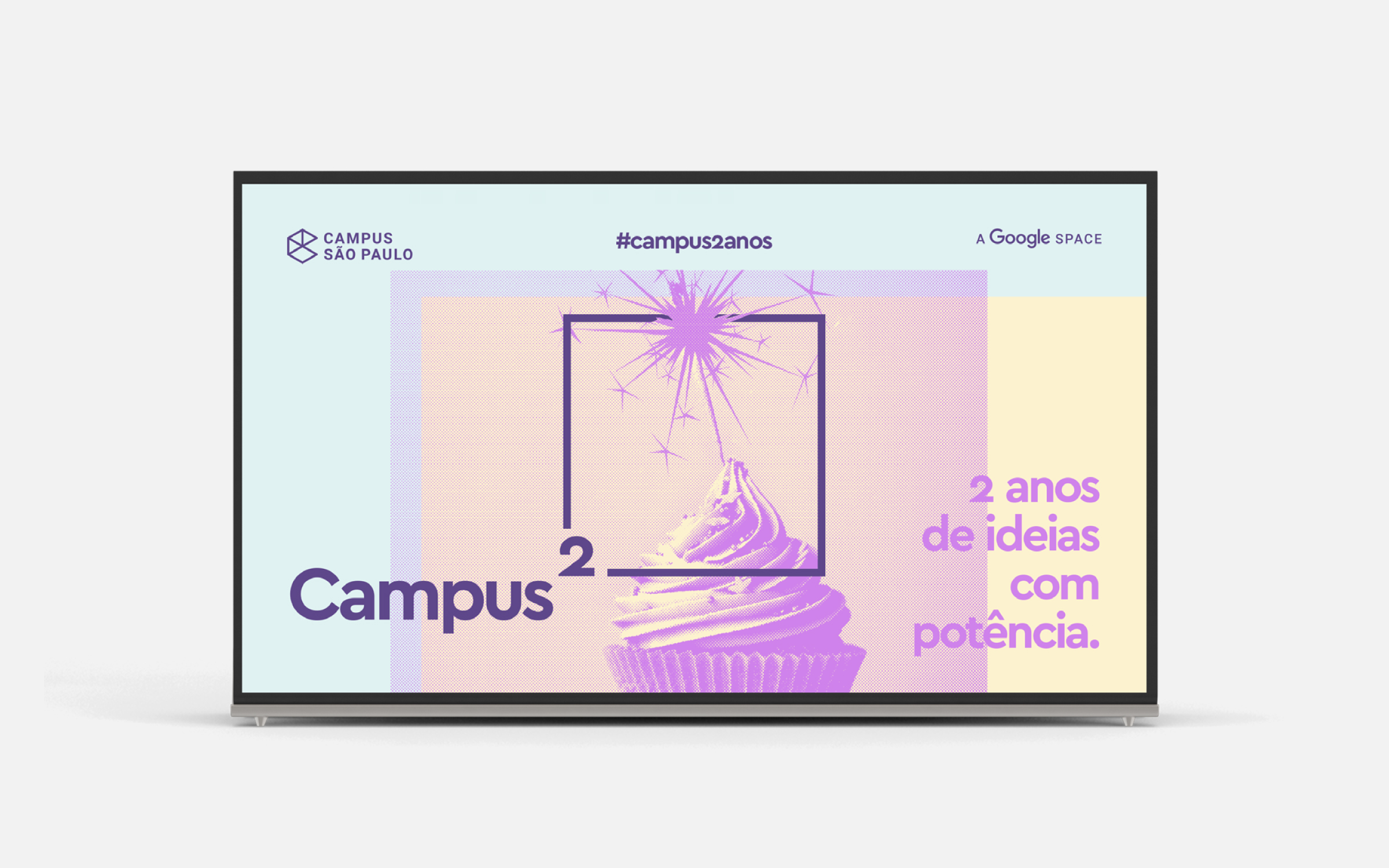

Commemorative campaign to celebrate the 2nd anniversary of the Campus São Paulo. Nowadays known as Google for Startups, it is a startup accelerator program by Google that currently has many campuses worldwide. To emphasize the theme, we introduced the math concept of squaring - the number multiplied by itself. Celebrating all the experience from the initial years to strengthen, boost and potentialize startups. And most importantly, to position the campus as a place driven by powerful ideas.
Hardy Design
Creative Direction: Mariana Hardy
Executive Direction: Cynthia Massote
Design: Pedro de Albergaria
Project Management: Mariana Muchon
Hardy Design
Creative Direction: Mariana Hardy
Executive Direction: Cynthia Massote
Design: Pedro de Albergaria
Project Management: Mariana Muchon