Graphic & Type Designer
Belo Horizonte, Brazil
Belo Horizonte, Brazil
info@pedrodealbergaria.com
linked.in/pedrodealbergaria ︎︎︎
linked.in/pedrodealbergaria ︎︎︎
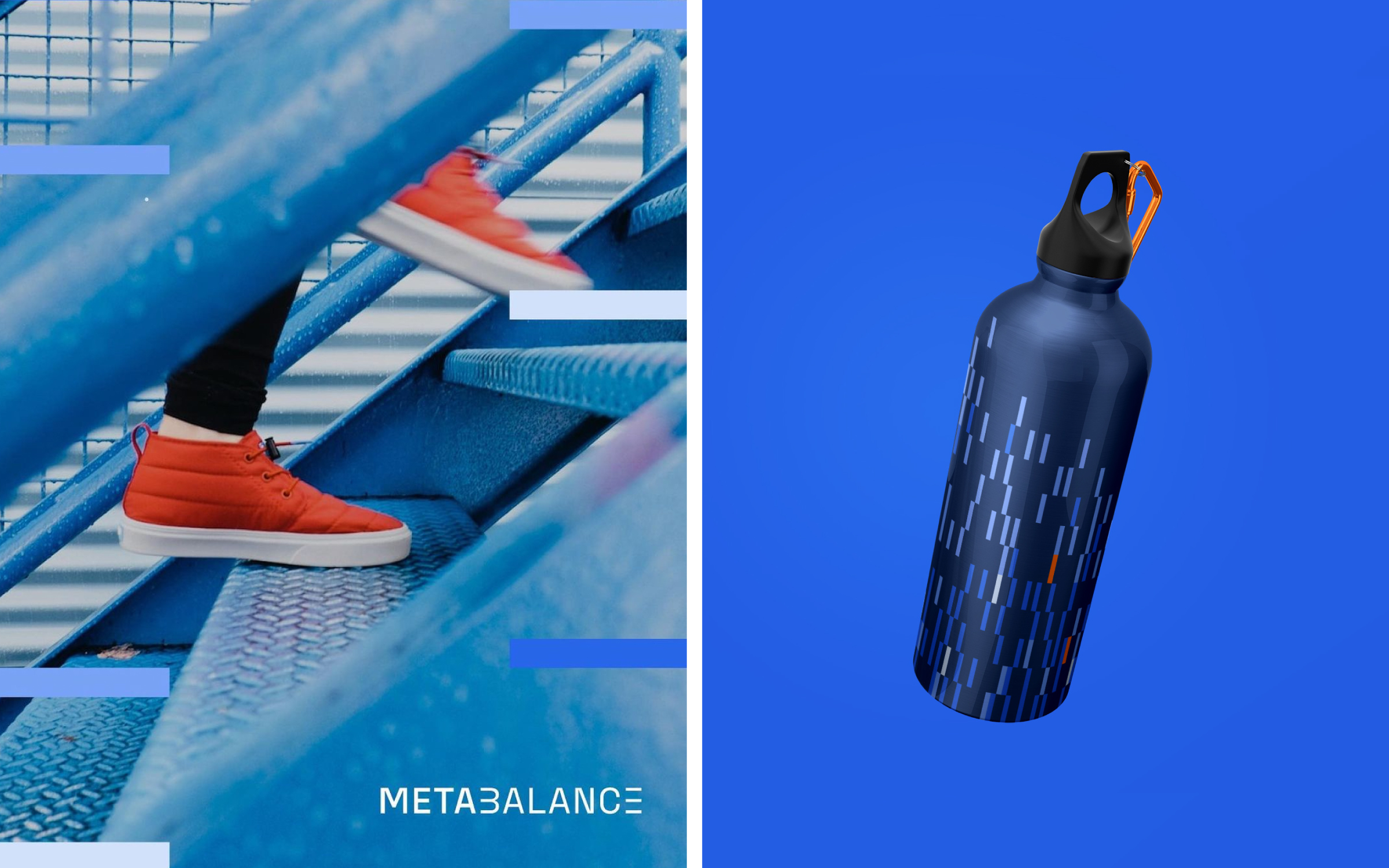
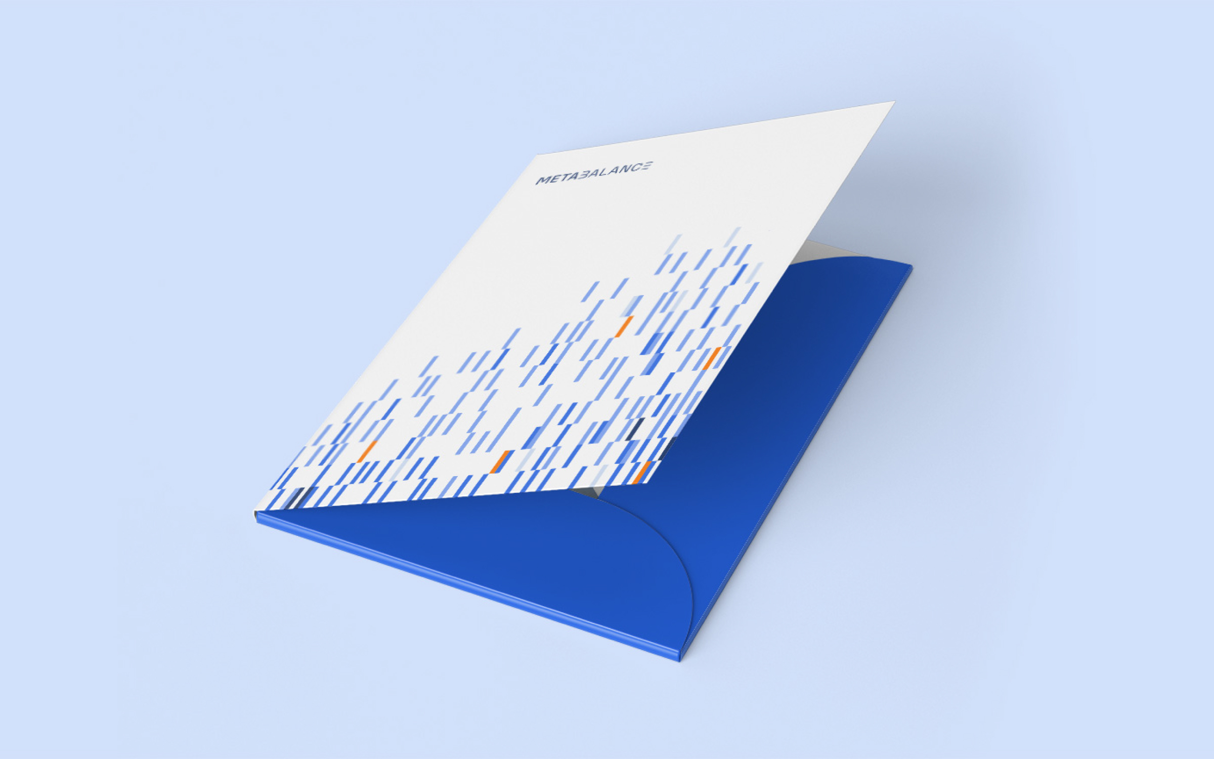
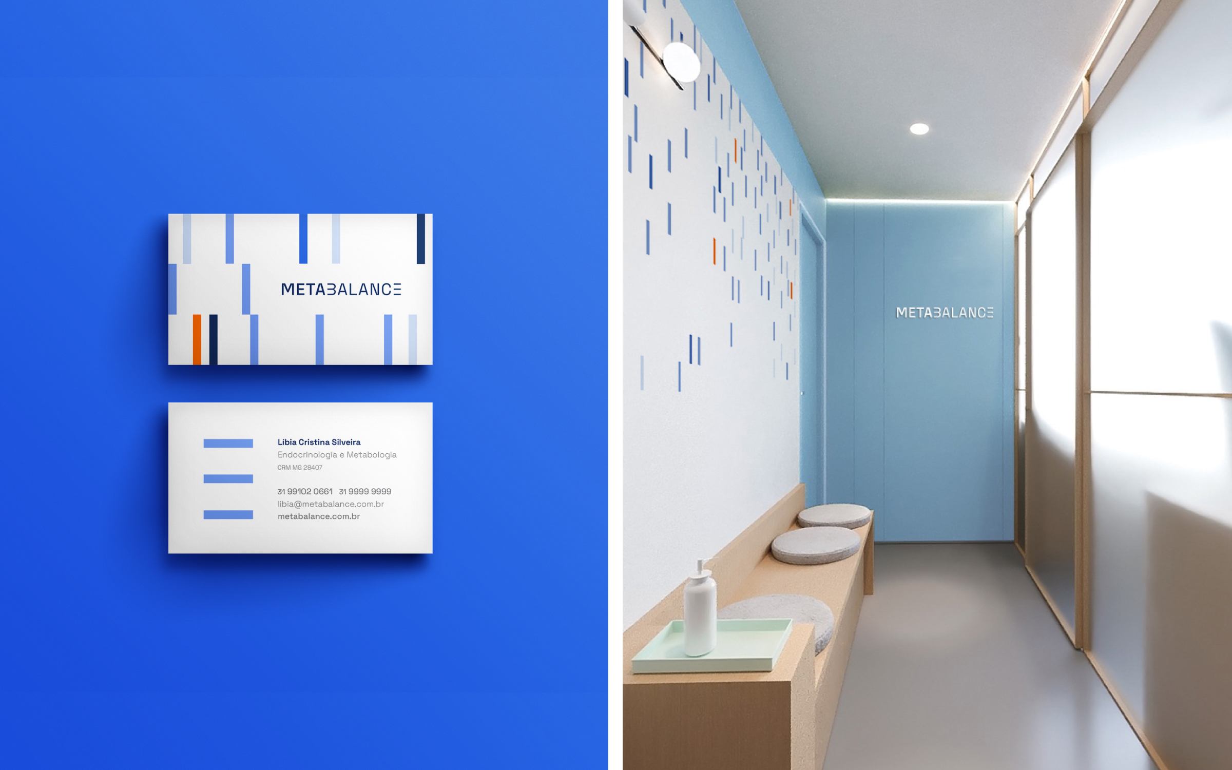
Brand identity for Metabalance, a diagnostic
clinic that uses
innovative technology and tools
to provide accurate data on the
metabolic performance of each
patient’s body. Concepts such as
movement, precision, energy, and
technology guided the visuality of
the logo.
Hardy Design
Creative direction: Mariana Hardy
Executive direction: Cynthia Massote
Design Lead: Pedro de Albergaria
Design: Matheus de Souza Viana
Project Management: Beatriz Fonseca
Hardy Design
Creative direction: Mariana Hardy
Executive direction: Cynthia Massote
Design Lead: Pedro de Albergaria
Design: Matheus de Souza Viana
Project Management: Beatriz Fonseca

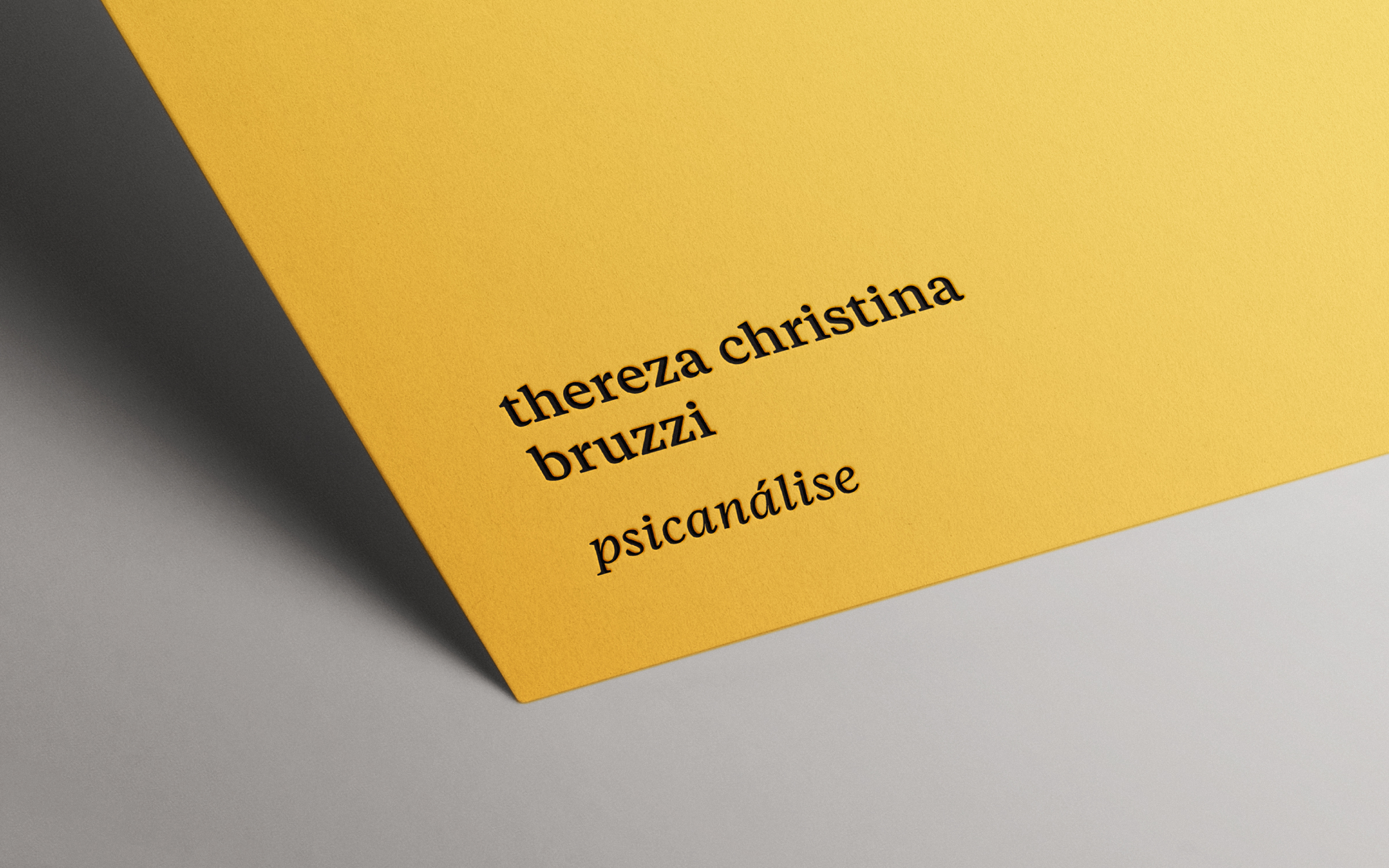
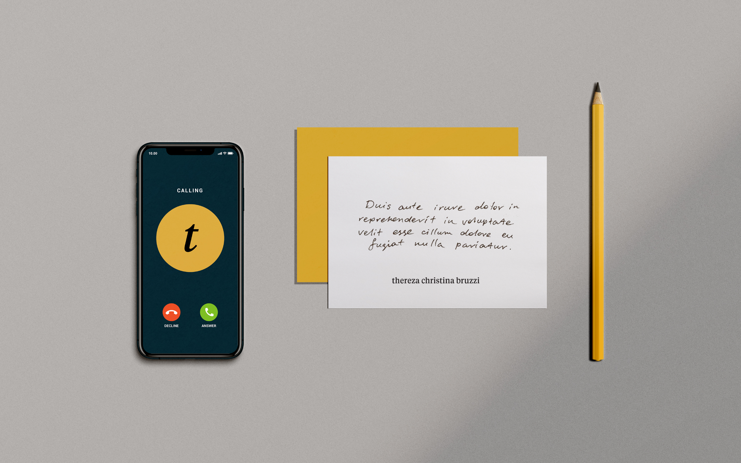
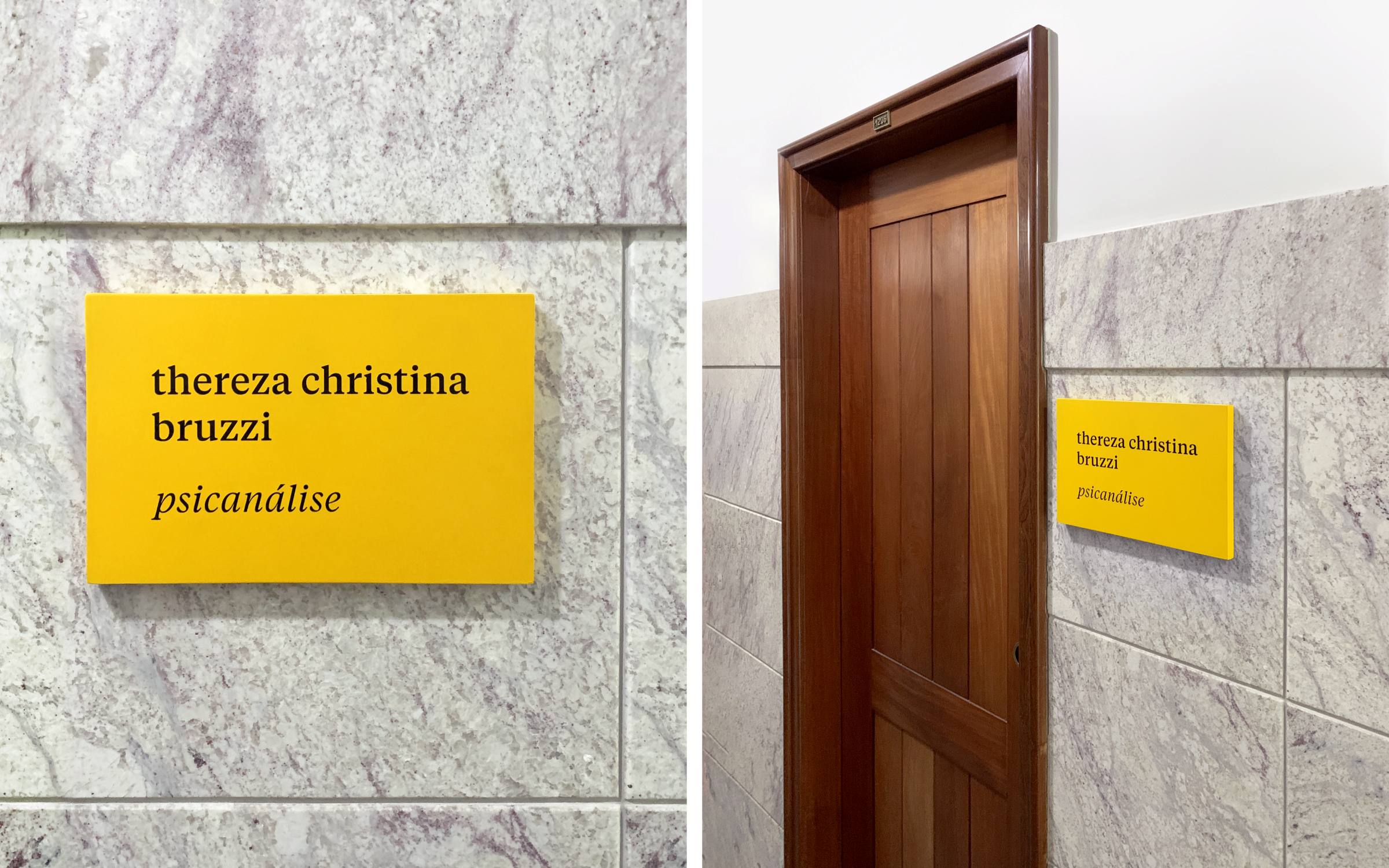
Visual identity, stationery, and signage for psychoanalyst Thereza Christina Bruzzi's office. The goal was to create a simple and minimalist graphic system to reflect a wise, welcoming, and professional personality. The typographic composition between serif and sans-serif fonts is the main asset of the visual language, communicating a sense of trust and security. Combined with a contemporary and vibrant yellow, it evokes optimism and warmth.

Awards
2020 Brazil Design Award︎︎︎
Bronze · Environment Design, Corporate Spaces
2019 Brazilian Graphic Design Biennial︎︎︎
Highlight · Signage & Environmental Graphics
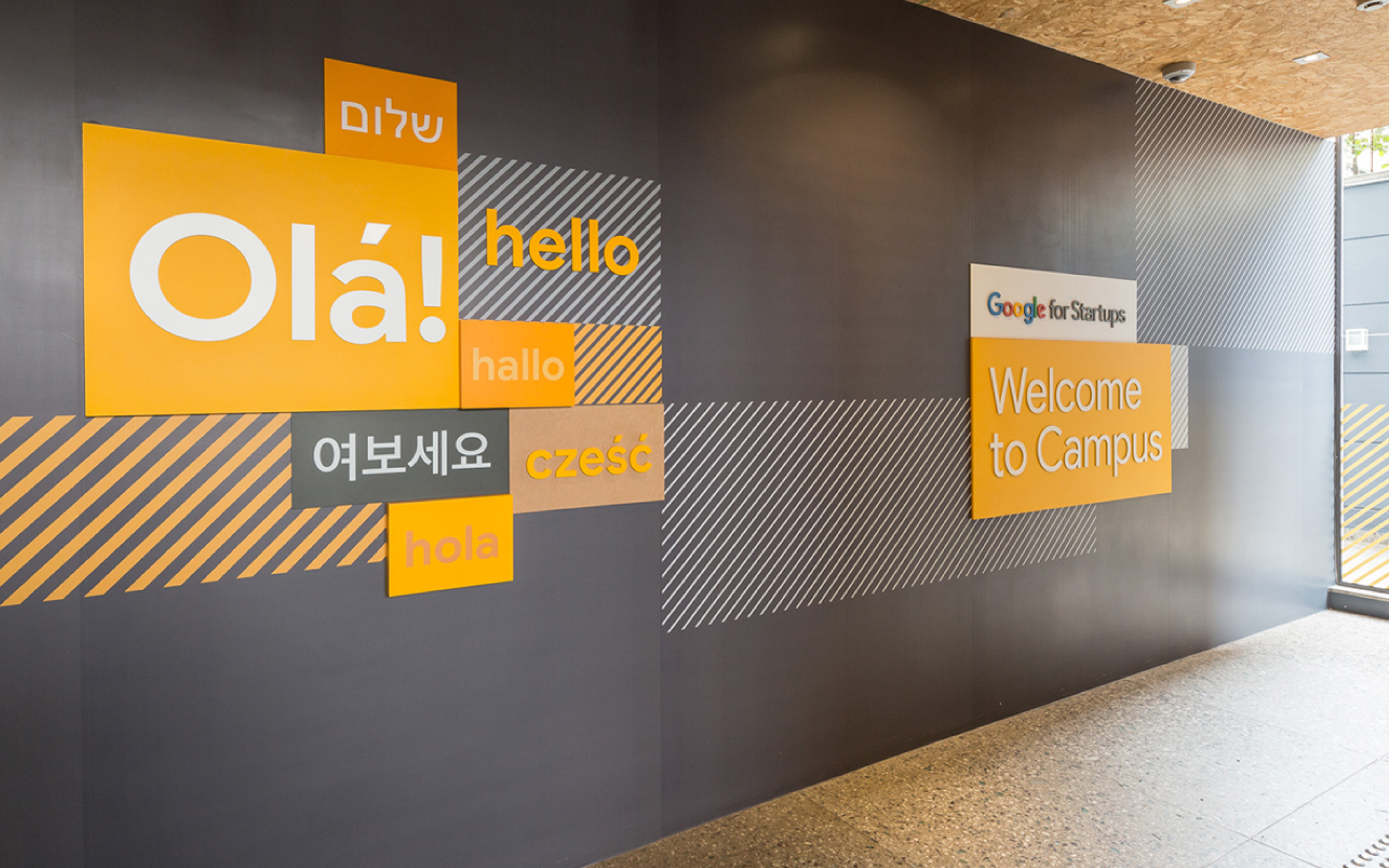
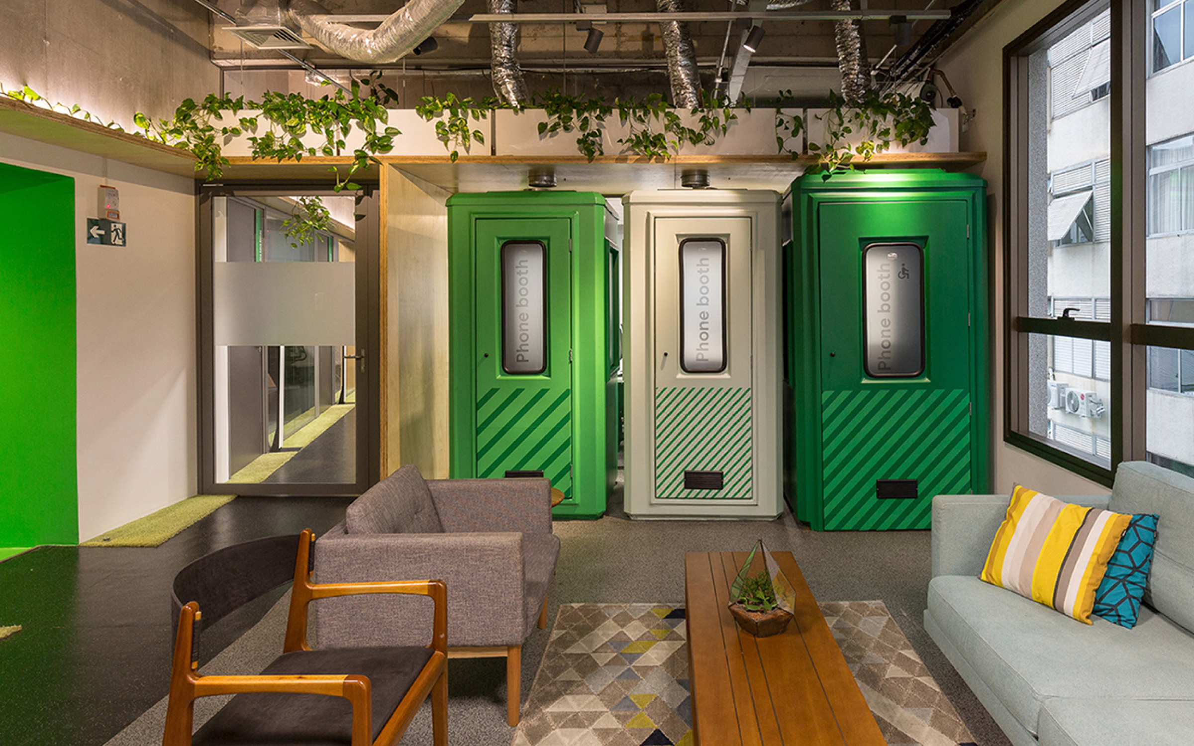
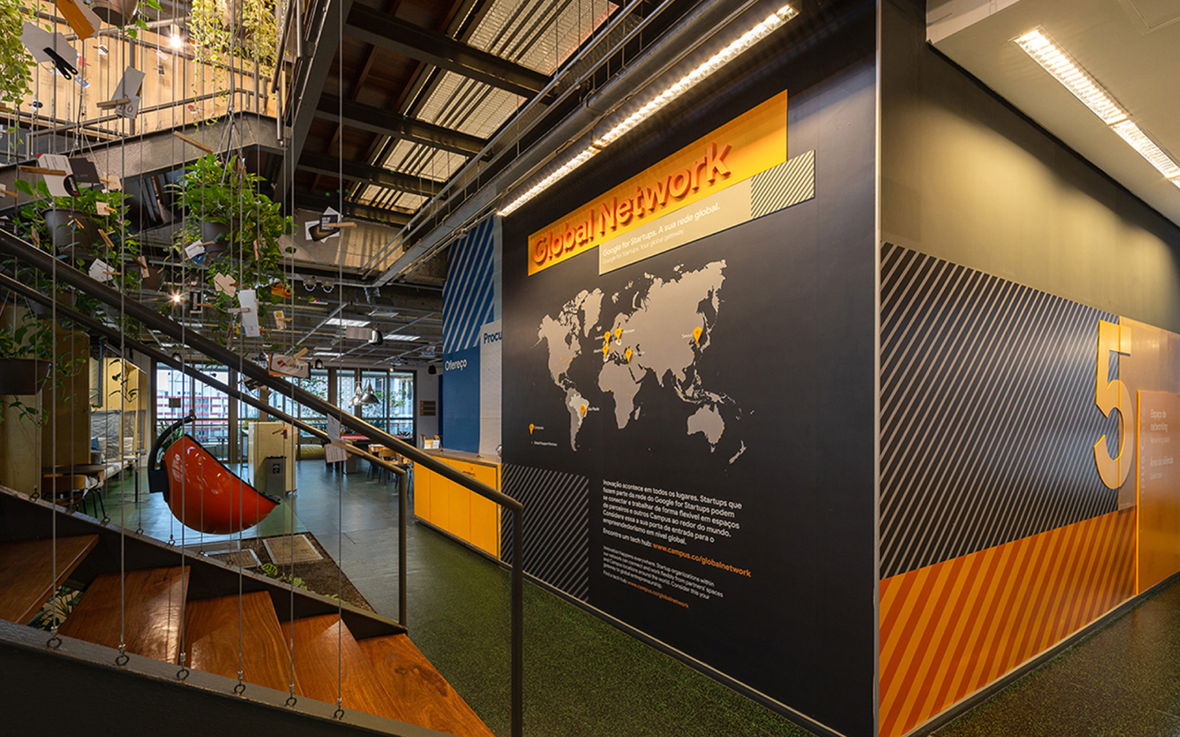
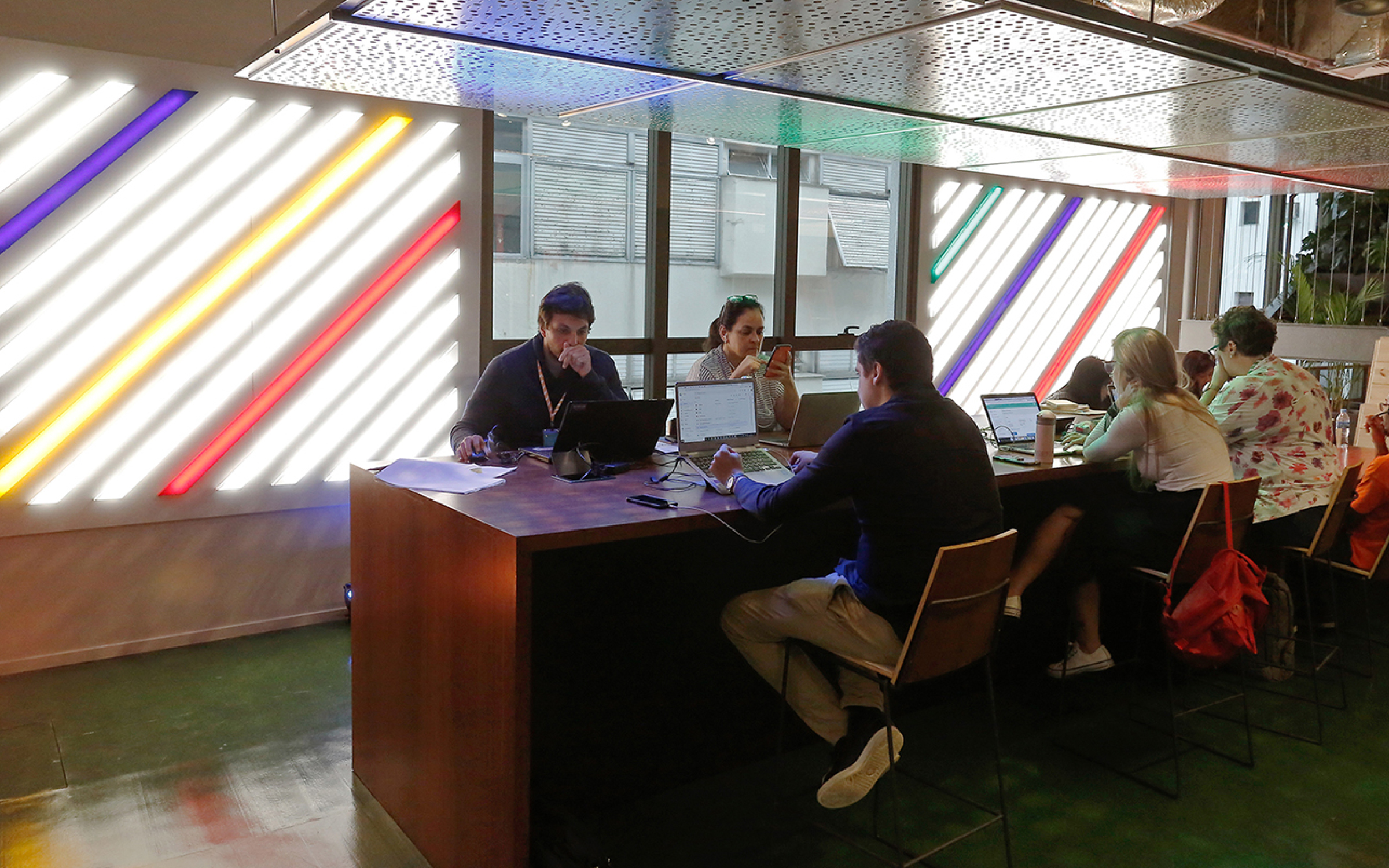
Signage and Environment Design for the Brazilian unit of Google’s startup campus in São Paulo. The six floors of the building were differentiated by color according to the use of the spaces: workspaces for resident startups, the Google team workplace, and coworking open to the public. The signage project sought to bring three-dimensionality to the boxes and other graphic elements present in the Google for Startups brand book, working with different overlapping thicknesses and materials with different finishes. The signage created met one of the project’s most significant challenges: to create harmony with the architectural language, which is very young and clean, while still being intuitive and functional.
Hardy Design
Creative Direction: Mariana Hardy
Executive Direction: Cynthia Massote
Design Lead: Pedro de Albergaria
and Délio Faleiro
Design: Délio Faleiro, Fernando Dias and Rafael Amato
Project Management: Mariana Muchon and Joana Rocha
Print Production: Mirelle Bairral and Rita Abdo

Award
2019 Brazilian Graphic Design Biennial︎︎︎
Shortlist · Identity and Branding
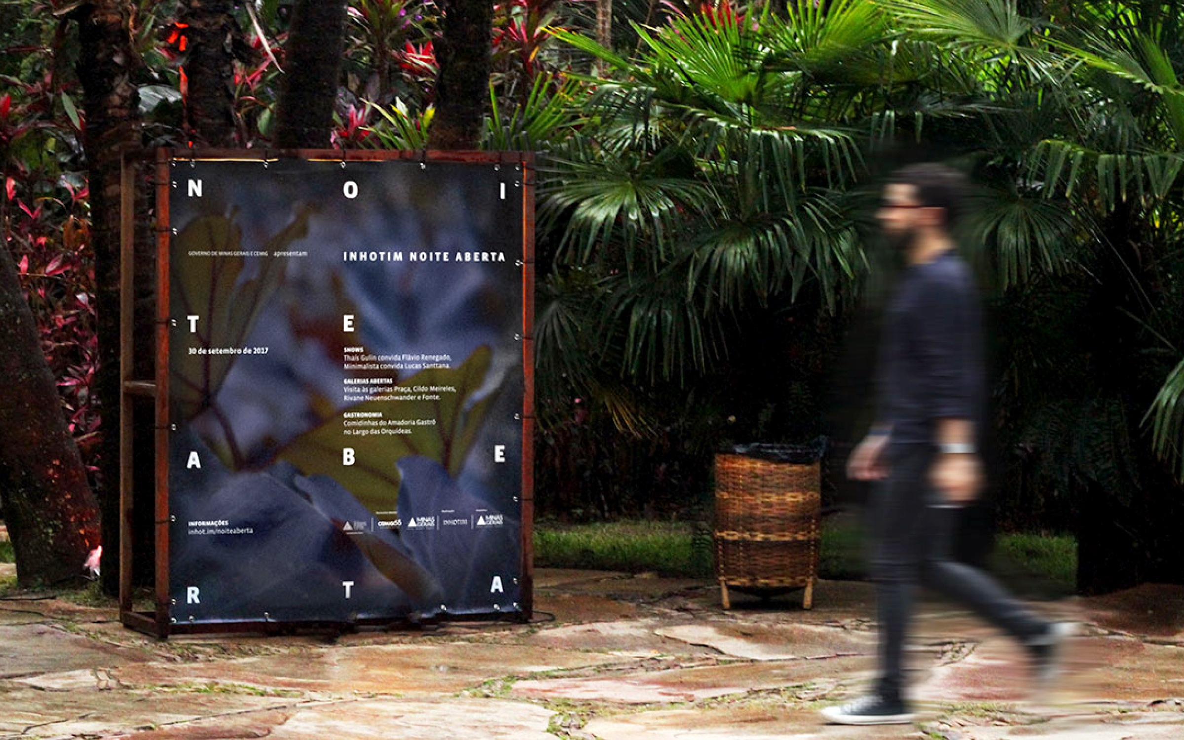
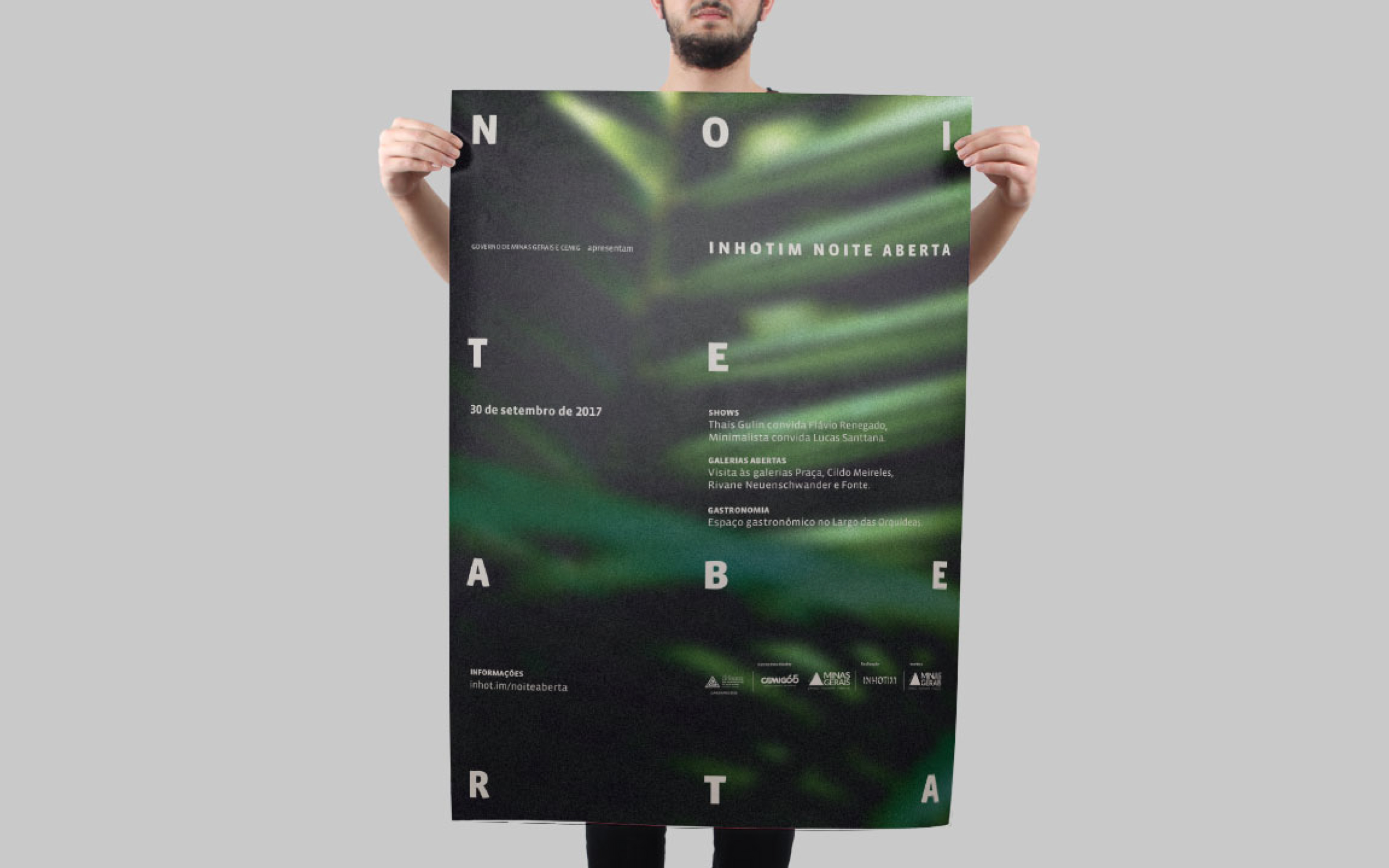
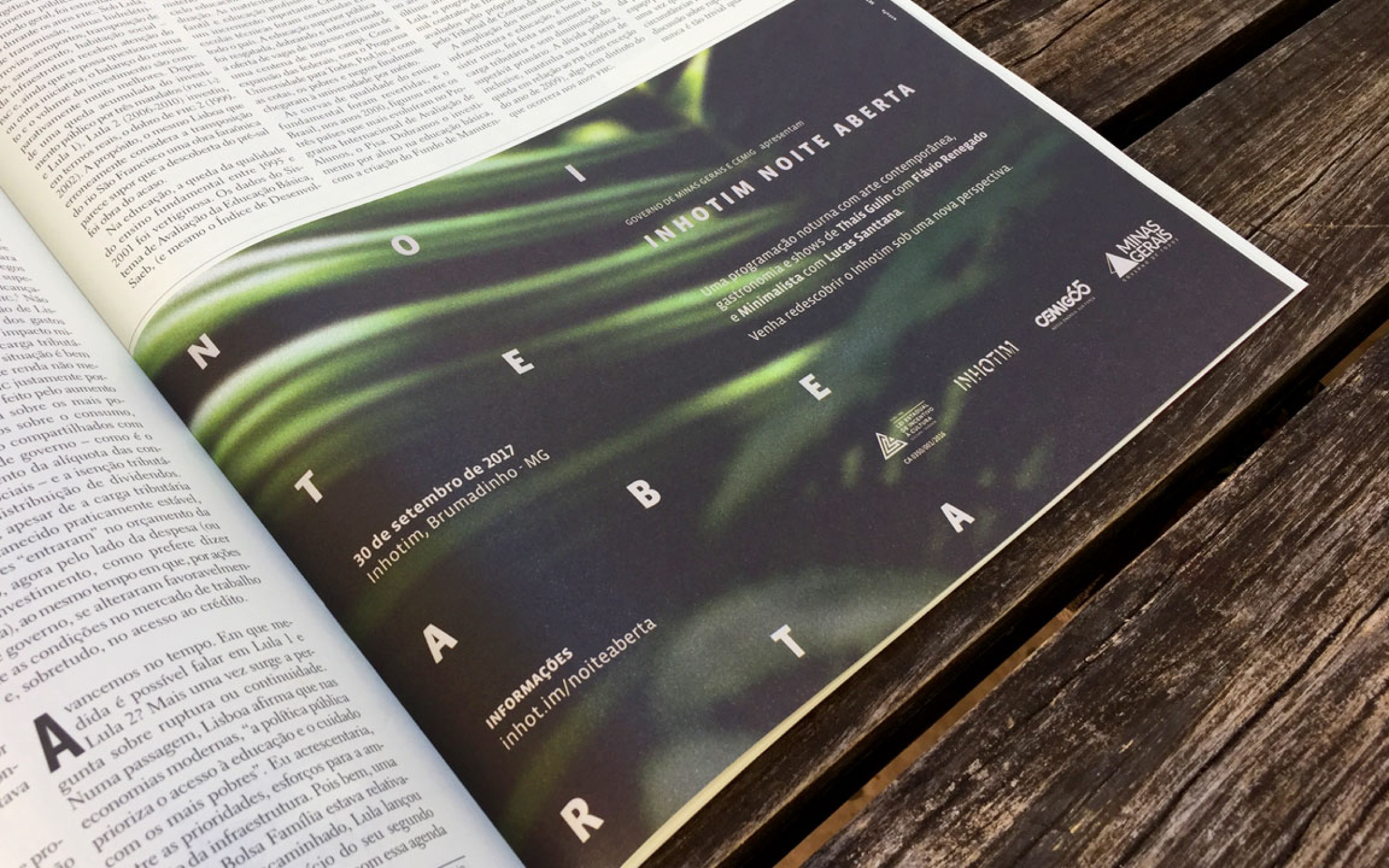
Visual identity and signage for Inhotim Noite Aberta, a nightly event that brought together contemporary art, music, and food. The inspiration for the identity was the nuances of dusk and how the sunset changes our perception of space, offering new sensations. The project also included creating a temporary signage system made of wood, designed to support customized content slides and serve as a scenic object. The system works in a modular way, which means that, by joining individual parts, it is possible to vary the size of the signs.
Estufa - Estúdio de Design Inhotim
Creative Direction: Mariana Hardy
Design: Pedro de Albergaria
Project Management: Ricardo Lopes
Print Production: Mirelle Bairral and Gabriela Silva
Photos: Pedro de Albergaria and Fernando Dias


Visual
identity designed for Café das Flores, a small cafe located at Inhotim,
the open-air contemporary art museum in Brumadinho, Brazil. The illustration
mixes the botanical exuberance of Inhotim’s gardens with the typical greens
cultivated in the region. The brand identity was designed to contribute to
creating a contemporary environment, intimate and integrated with nature.
Estufa - Estúdio de Design Inhotim
Creative Direction: Mariana Hardy
Design Lead: André Coelho
Design: Pedro de Albergaria
Project Management: Ricardo Lopes
Print production: Mirelle Bairral
Photos: Fernando Dias
Estufa - Estúdio de Design Inhotim
Creative Direction: Mariana Hardy
Design Lead: André Coelho
Design: Pedro de Albergaria
Project Management: Ricardo Lopes
Print production: Mirelle Bairral
Photos: Fernando Dias